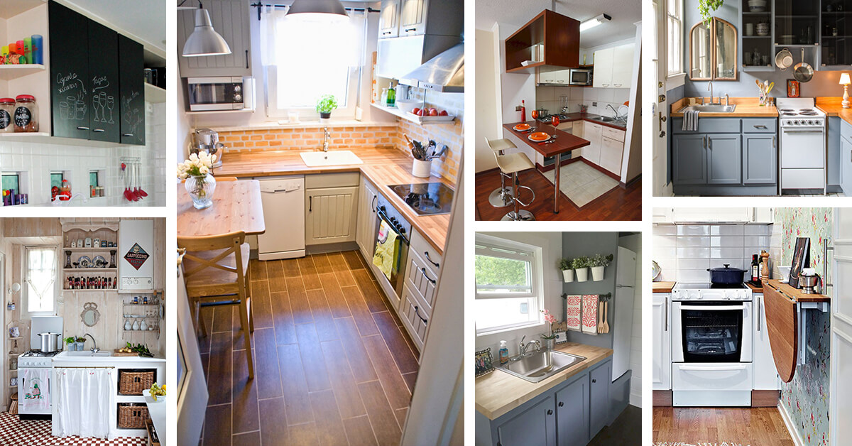
You finally have that home to call your own. It’s perfect, yet that kitchen is a bit tiny, but you are going to make it work in your own awesome way. There are so many different small kitchen design and decor ideas out there, and here is a great selection to help get your creative mind thinking.
30 Amazing Small Kitchen Design and Decor Ideas to Make Your Space Uniquely Yours
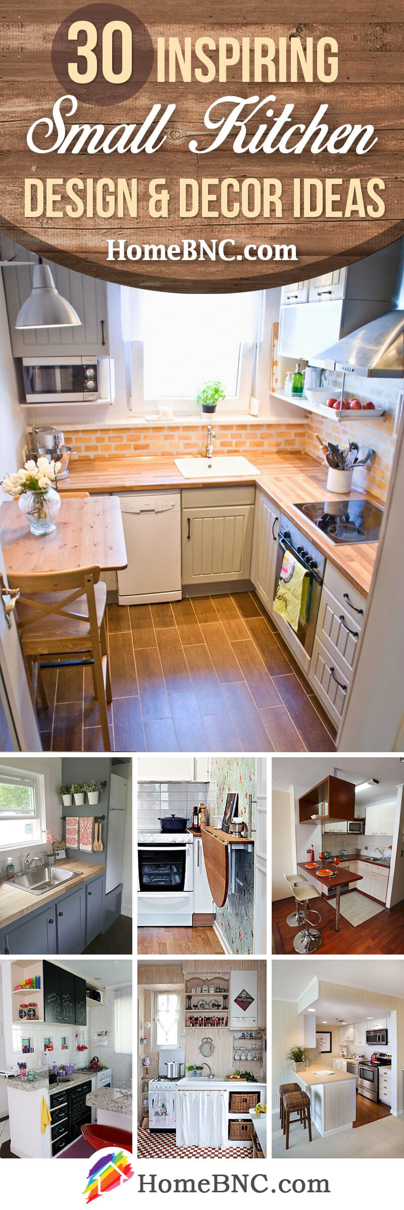
Even if you are not able to paint your small kitchen, some flowering plants with their vibrant green vegetation or a colorful rug with crazy designs will brighten up any space. Natural light, when possible, will give your kitchen a feel of comfortableness that you can enjoy.
There are also endless possibilities when it comes to tile, and wallpaper, and paint. From neutral colors, a traditional black and white, or even using stark contrasting colors will make your kitchen your own. Then there is paneling, and cupboards, and counter tops.
Don’t feel stunted by your small kitchen, but see it as an opportunity to make it as unique as your own personality. A message board for the family, or adding a personal touch with painted phrases, is another good way to show your own style. Make it cozy; make it homey; make it yours while letting these pictures inspire you.
1. Warm Colors With a Brick Back Panel
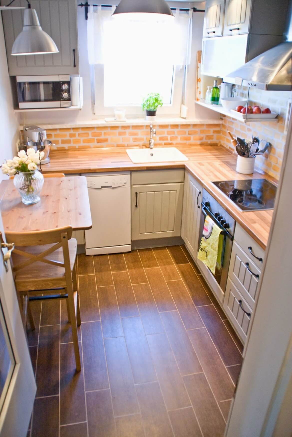
This small space kitchen design brightens the room up with a pleasing farmhouse style. There are warm colors used throughout from the brick back panel, to the countertops, and even the two-person table off to the side. By blending these color tones with the rural style, the kitchen feels more open and welcoming despite the minimal space allowed. Adding in just a bit of greenery breathes additional life into the kitchen too. Also, there’s a good blend of natural lighting with the ceiling lights.
2. Light Vertical Panels Lighten Up the Room
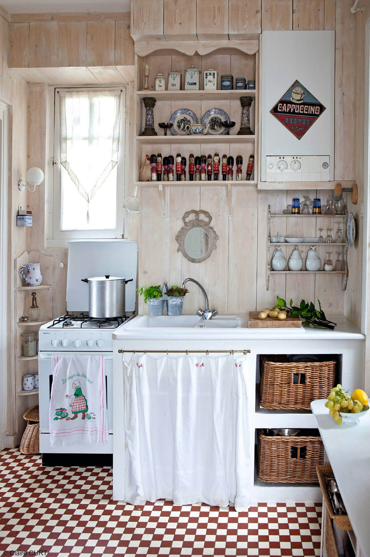
An old-fashioned style feels completely retro with this kitchen design. The use of vertical paneling pays off as it gives off the illusion of having more space inside the room. Meanwhile, there is a good deal of shelves that both provide room for storage and adds to the overall décor at the same time. Even the sink does this thanks to the open cabinet layout. The use of baskets further connects to this retro country-like style that’s going on. And the curtain below the sink alludes to the kitchen having more space to offer.
3. Old Fashioned Faucet Offsets Bright White Decor
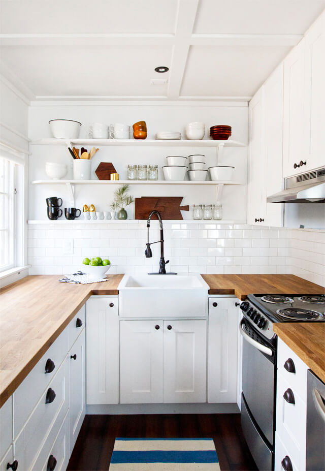
A good way to use up small spaces in a modern kitchen is with a simple and clean design. This kitchen does well at utilizing standard cabinets as well as open shelving for dishes and utensils. It’s such a good aesthetic choice as well as a practical one to make use of minimal room in a cooler way. Also, it frees up the countertop space even more, leaving it almost empty yet still full of style. The colors play off each other well too with the white cabinets and darker hardware.
4. Perfect Use of Vertical Space
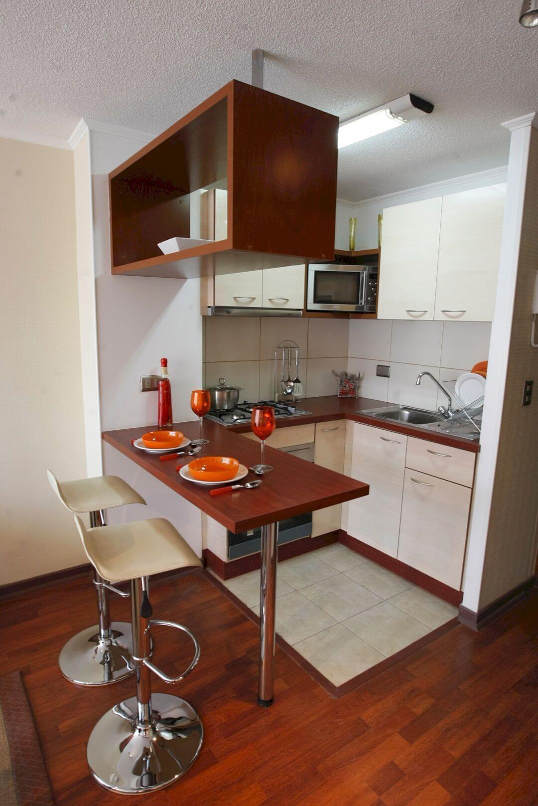
Tall ceilings play well with a smaller kitchen as this design demonstrates. There is nothing overtly loud about this kitchen, but it leaves a great impression thanks to how it succeeds in fitting everything it needs without feeling cramped. There’s a cute sitting area, and the countertops aren’t cluttered thanks to the cabinet space. However, it’s the hanging storage above the sitting area that takes advantage of the tall ceiling. This space is perfect to fit other items that you may not have room for in the cabinets.
5. Bright, Crisp, and Clean
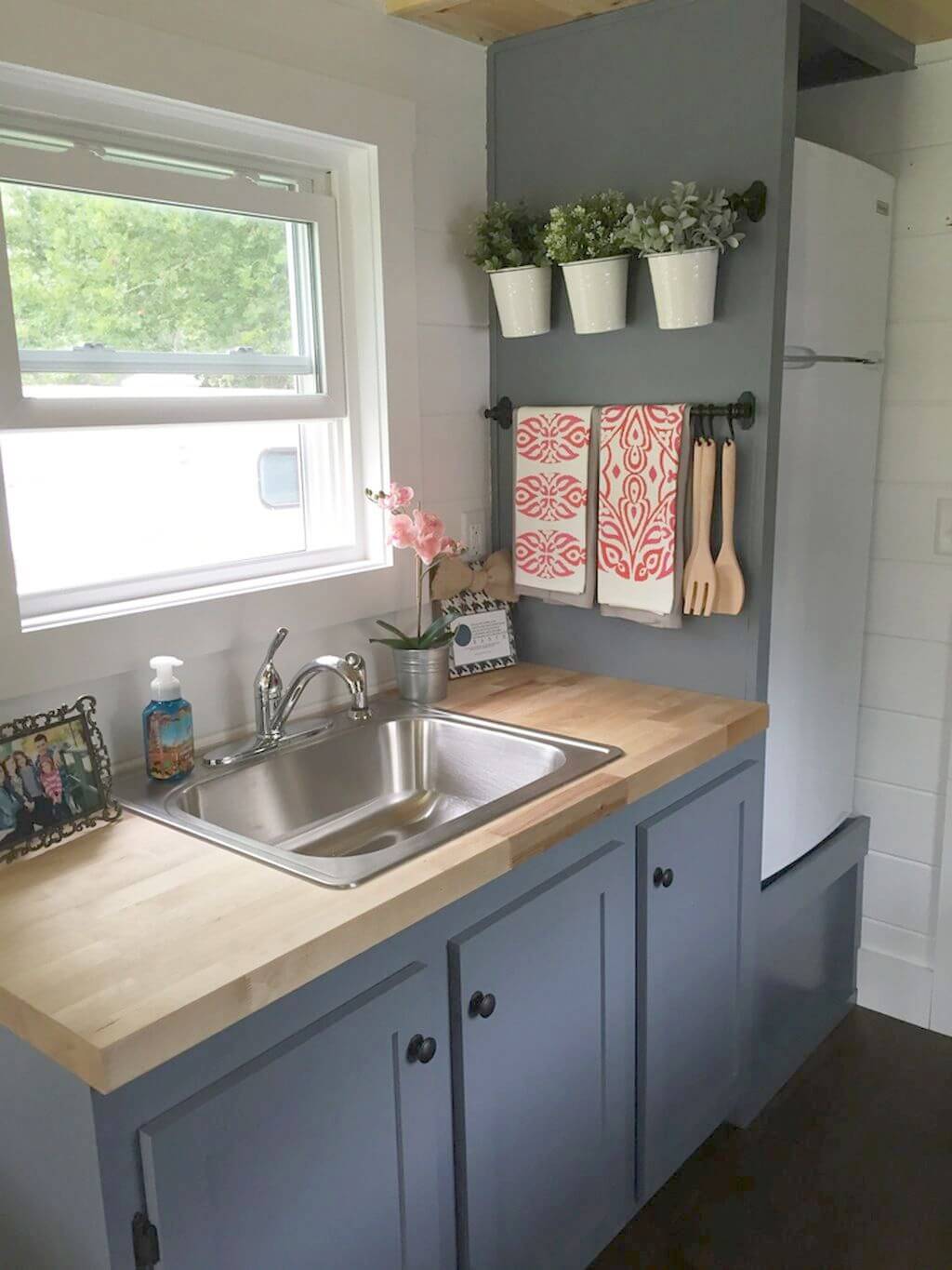
If there’s a window in the kitchen, it’s the perfect area to play off. With the window bringing in all that lovely natural lighting, the kitchen area can shine more no matter the size. Add in some wall-hanging plant life that will not only thrive in the light, but add some nice coloring to the room. These lighter shades work well against darker colored walls. Even the towels work out well since they help bring in some accent colors to the room.
6. Splashing a Bit of Wallpaper Color
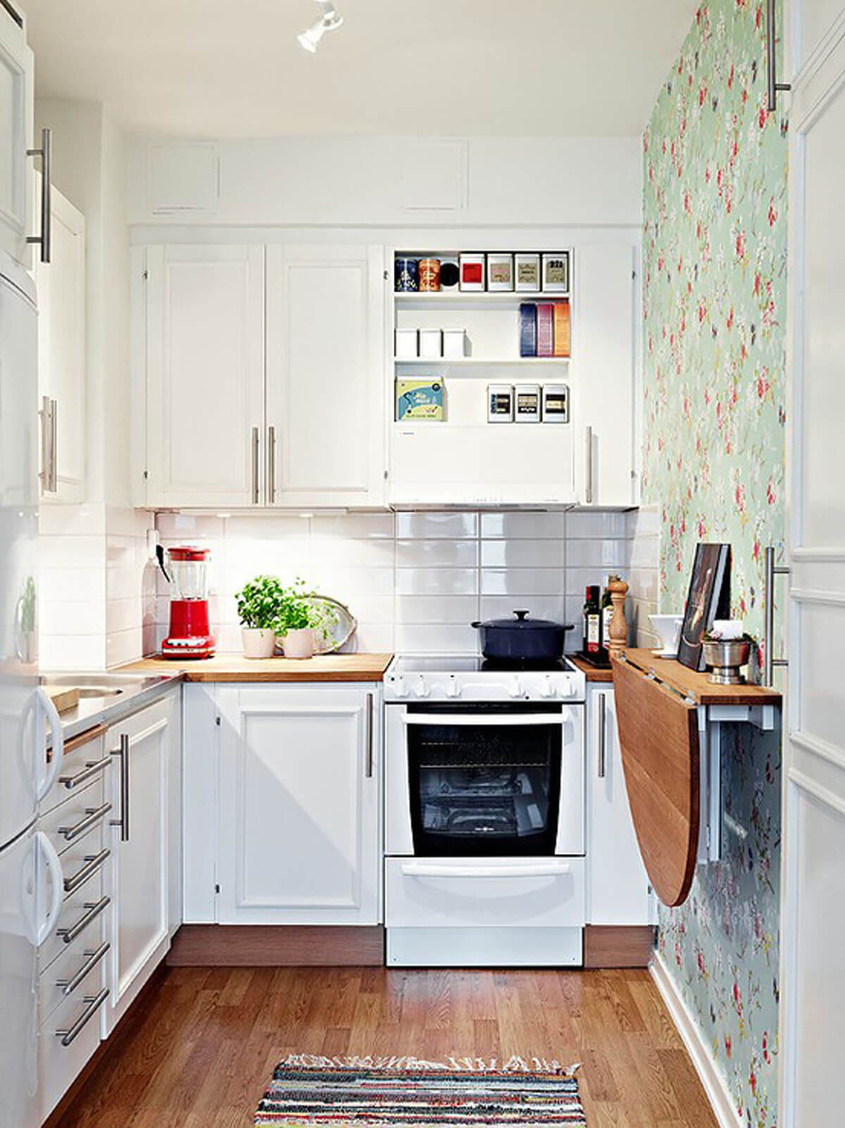
A mostly white kitchen can work out with just about any style you’re aiming for. In this case, it contrasts well with the wood countertops and wooden flooring. However, the accent wall stands to capture the most attention in the best of ways. It adds all the color the room needs, especially if you lack the room to place a lot of decorative items inside. Plus, it works out incredible near the fold-down table. Of course, the extra pop of color thanks to the small greenery on the countertop rounds it all out.
7. Stainless Steel Shining Within Crisp White
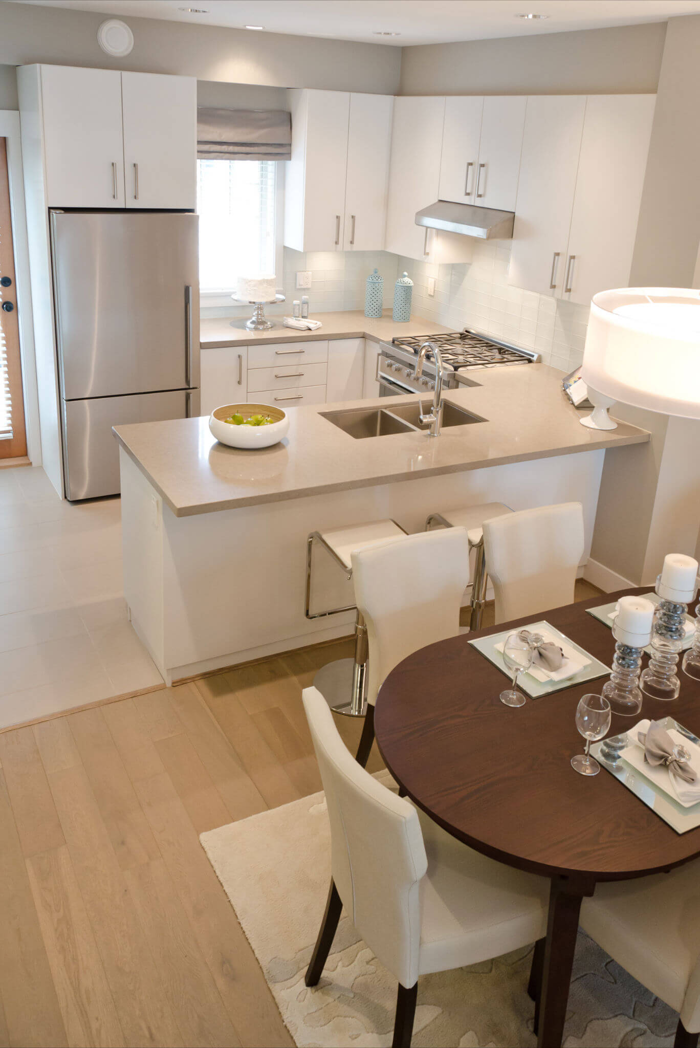
Stainless steel and lighter coloring always works out well with one another. This small kitchen easily proves that as every section of this area rightfully shines. The bold white cabinets are paired with countertop that is only a hint darker. This all pairs tremendously with the stainless steel appliances as well as the silver hardware on the cabinets. It is a stylish choice that especially works if you have light colored walls like tones of gray. More room and a lot of decorative items are simply unneeded.
8. Perfect Message Board Placement for Busy Families
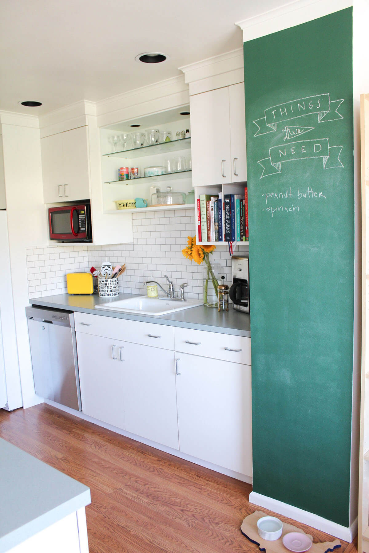
A good way to take full advantage of the height in your kitchen is with a cool message board. The chalkboard design is ideal as not only do you have all the room you need to leave notes (or perhaps some cute little doodles), but it also plays into the overall décor in the room. It gives a vibrant and bold pop of color, allowing the small room to have more movement as it readily attracts the eye. Also, the open shelving between the wall cabinets is another great stylish choice to make use of minimal room.
9. DIY Open Space Look
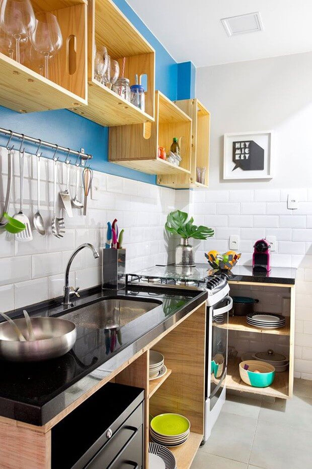
Rather than just a few floating shelves, why not play more into the open-space design by using it throughout the kitchen? The upper cabinets are given a nice rustic edge with the plain wooden style, and thanks to how deep they are, allows you to store plenty of items. This travels well to the rest of the room and cabinets too. Such a wide-open layout makes the room appear that it has more space too, and yet everything is given a place without feeling constrained.
10. Bits of Retro Color and Style
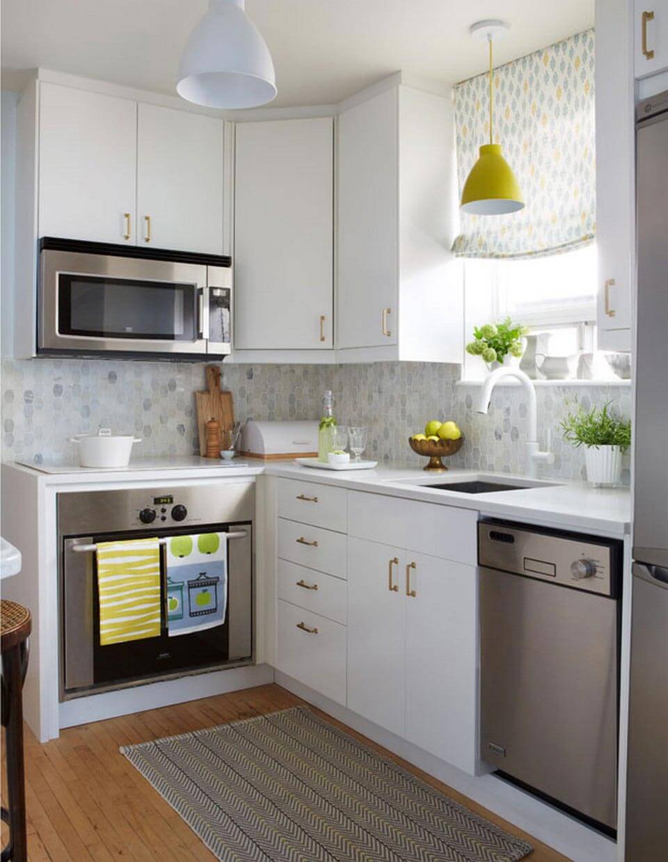
Use some retro chic to liven up a small kitchen. The cabinet hardware gleams, giving the cabinets a fresher look. Meanwhile, the simple stainless steel appliances provide a good contrast to the lighter-styled colors. The retro comes into play thanks to the small pops of color throughout from the vintage-styled hanging light above the sink to the cute, brightly colored curtains. The area doesn’t initially appear as though it can handle such décor, but there’s ample room to decorate more with some greenery and even colored hand towels.
11. Small Kitchen Design Idea with Open Shelves
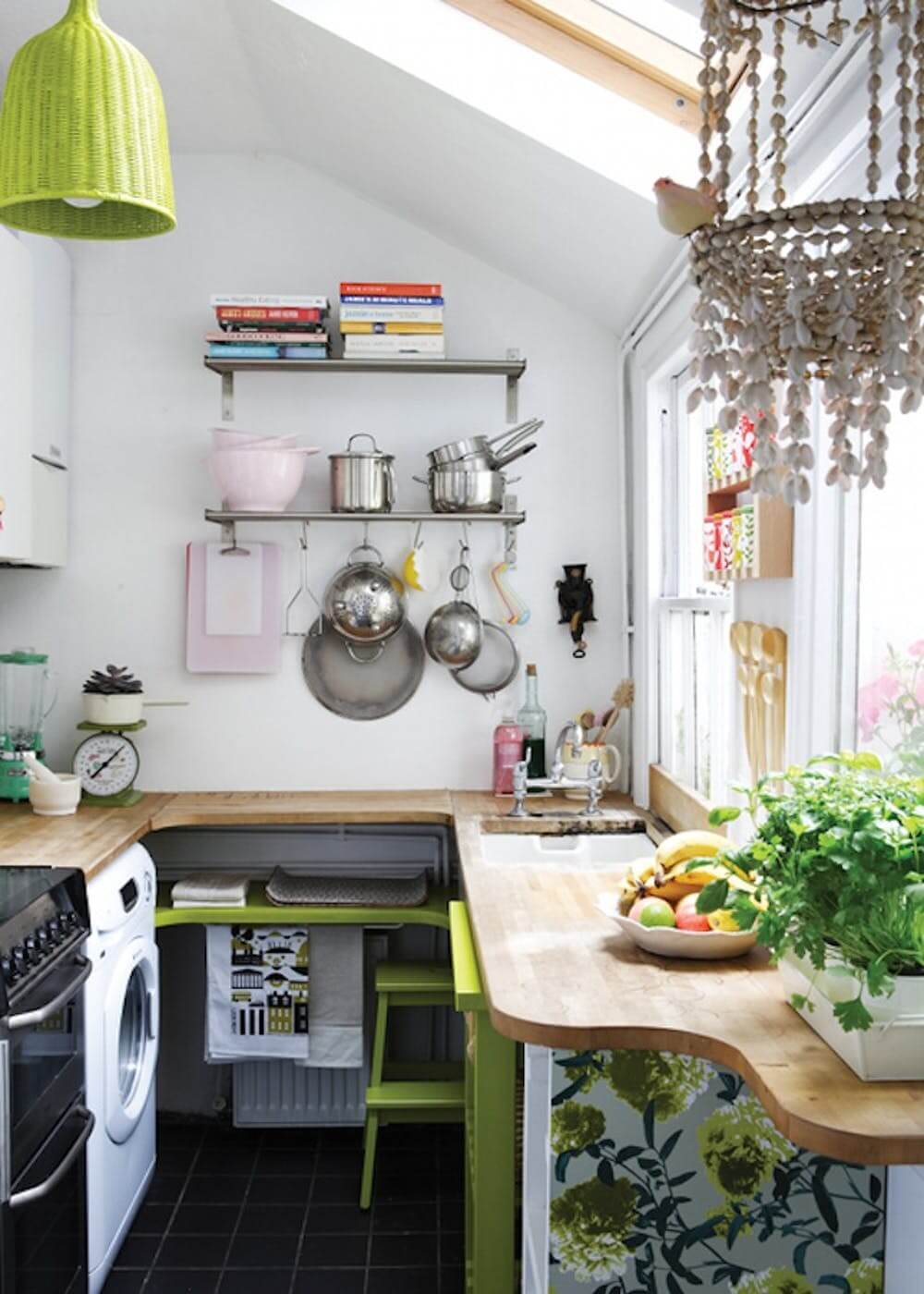
In this botanical inspired kitchen, you can freely adorn the area with greenery without limiting the space you have. Opting for an open cabinet plan is key here as this gives off the impression you have more room than you do. Plus, there’s no hindrance with opening and closing any cabinet doors. The use of extra wall storage for pots and plans is another bonus here as it further frees up your counter space. There’s even enough room in this small kitchen for a washing machine still.
12. Unique Wood With Slate
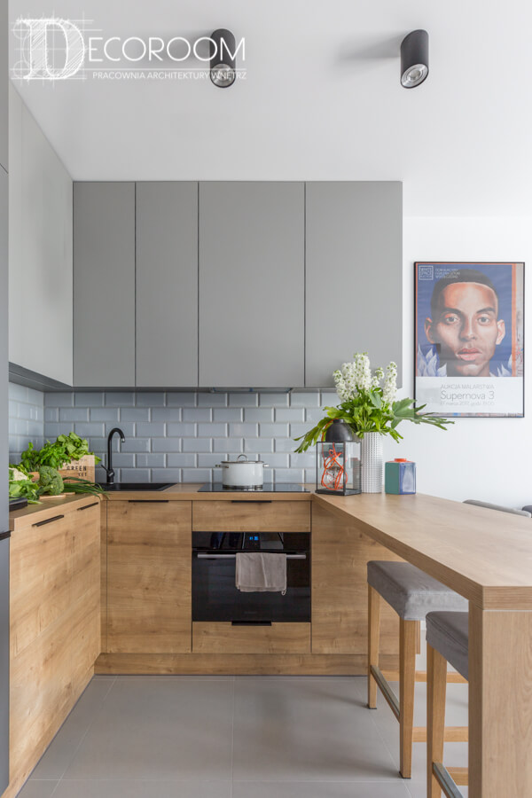
A straightforward contemporary design can make all the difference in a kitchen designed with a minimal footprint. The lines are all clean so it has a classy-like appearance. It’s the style in the wooden slate cabinets that helps to sell this idea that the kitchen may not be as small as it appears. Although there is greenery throughout, the décor boasts a more minimalistic look that works out perfectly. It certainly helps to expand the space on the counter.
13. Added Mirrors to Make the Kitchen Larger
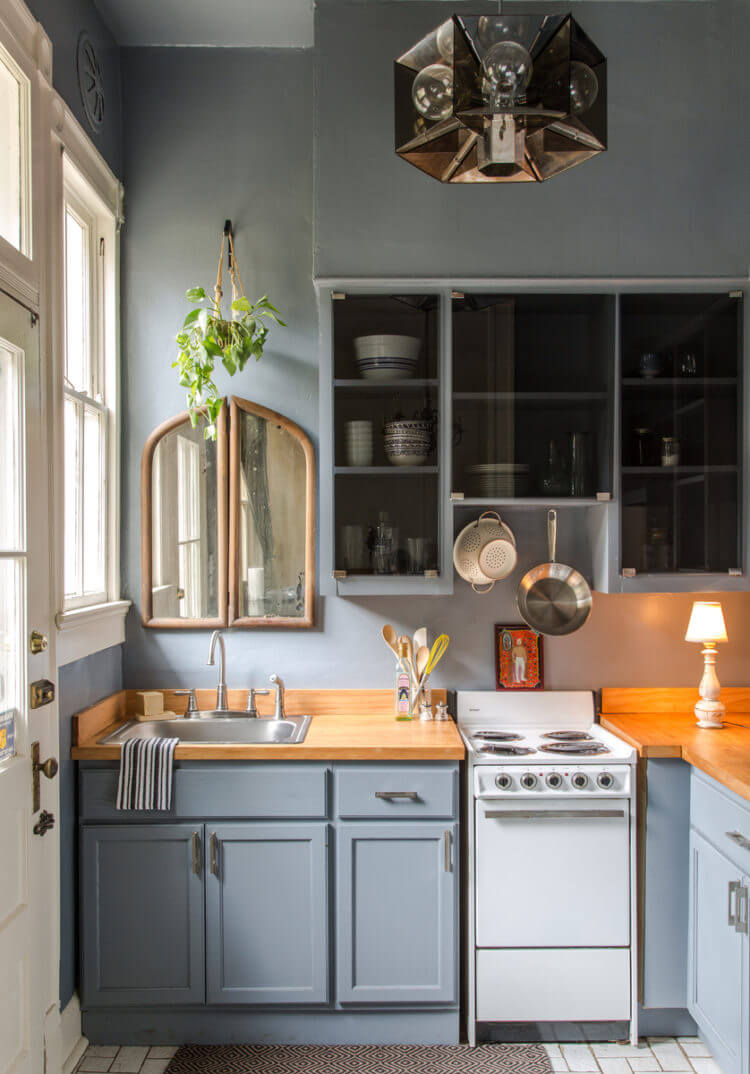
A cut and cozy approach, this simple kitchen layout balances darker cupboards with the wooden countertop so that everything stands out more in a decorative fashion. The cabinets may not be open, but the see-through doors can handle the job well enough in creating a more open-like style. What truly captures the eye though is the mirror hanging above the sink. Mirrors are an excellent tool to help give your room the appearance of having more space. Everything just seems more open with strategically-placed mirrors.
14. Keeping Rustic Alive and Well
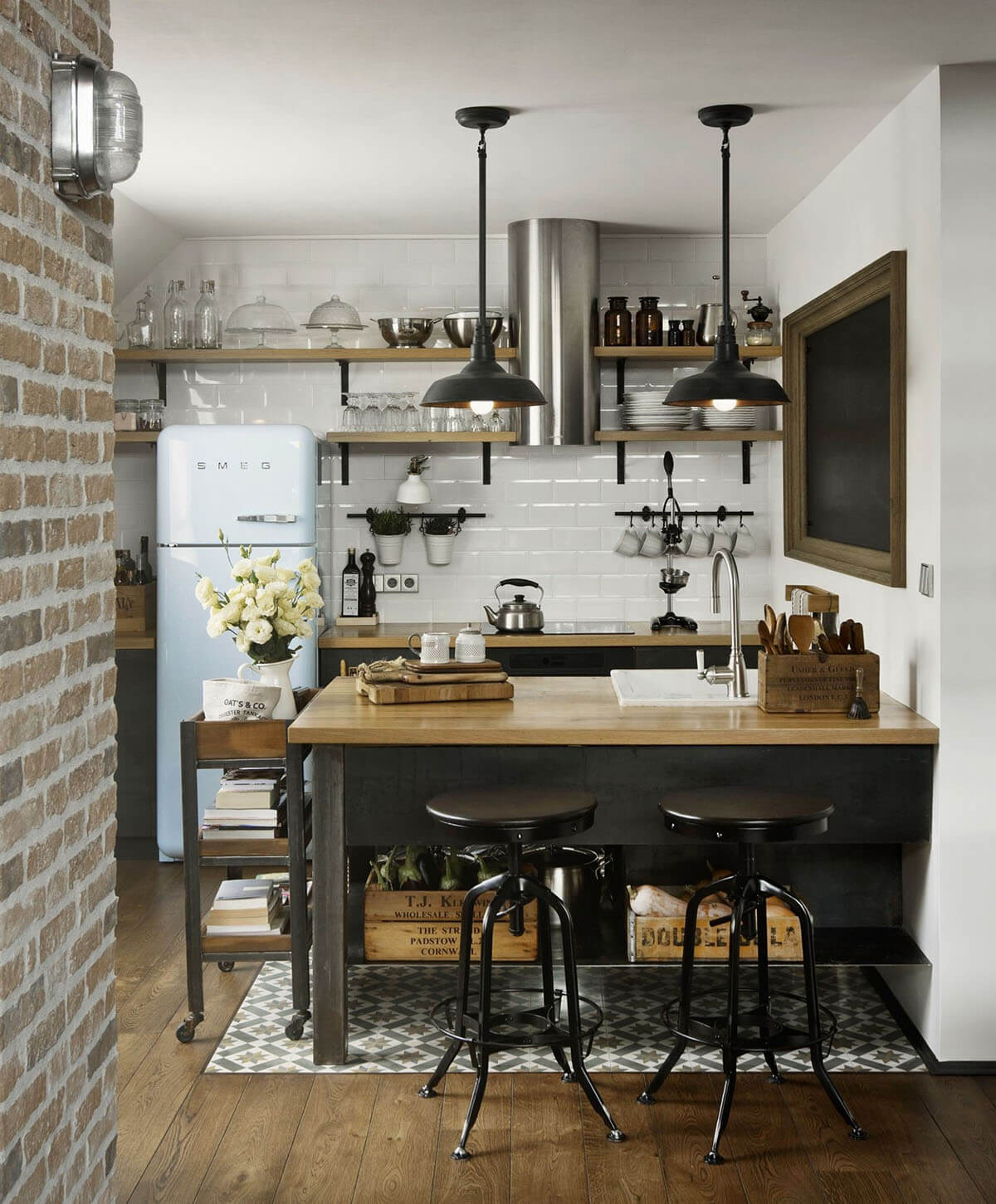
This small space kitchen design allows a rustic theme to shine through without becoming lost in the background. Vintage is seen throughout, but it does so in a way that takes advantage of the more minimal footprint provided. The refrigerator is cute and just fits into its spot, while the rustic ceiling lights saves you on floor space so you don’t need to set up a standing lamp. Meanwhile, there’s even an itchen island cart that fits well next to the seating area. Having one on wheels makes it even easier to scoot it aside when it’s not needed.
15. Colorful Rug Adds Contrasting Color
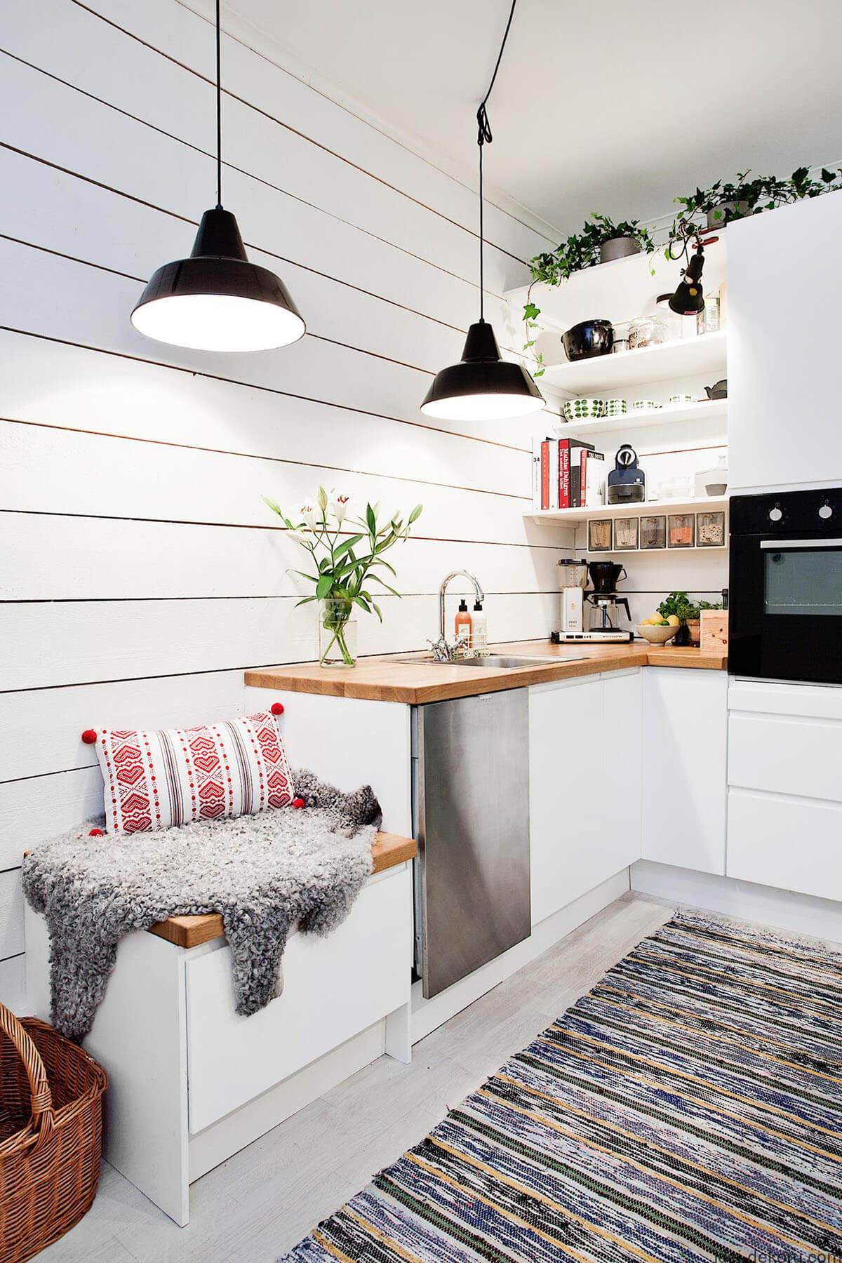
With an all-white kitchen, it’s far too common for it to come across as too plain. This can make the fact that you lack space even more apparent when there is nothing to catch the eye. Adding in some splashes of color will help prevent that from happening. Consider a boldly and vibrantly colored area rug. Not only does it benefit the kitchen overall in terms of function, but it also manages to capture attention so the room can flow better.
16. Snazzy Colored and Designed Backsplash
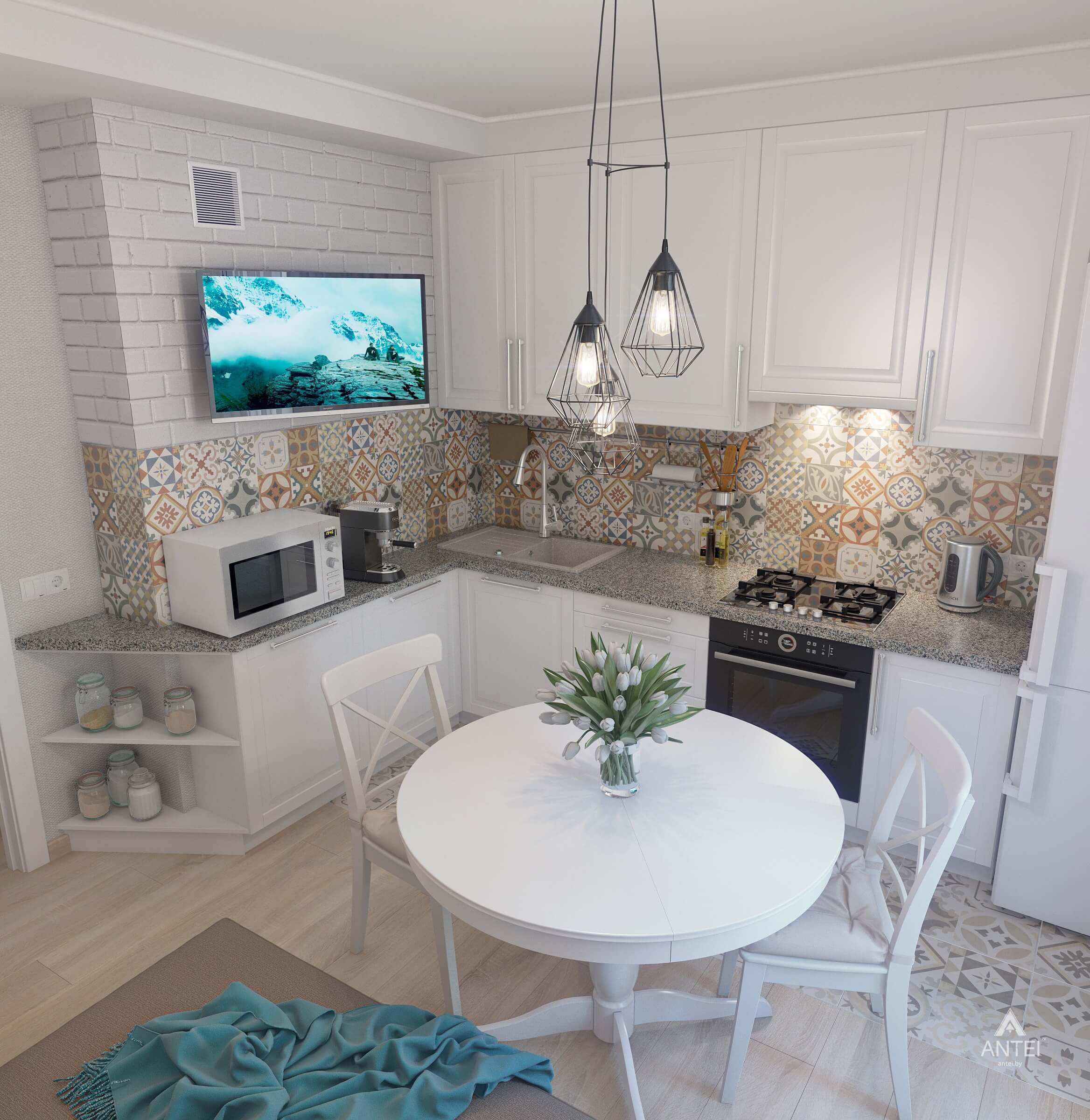
Never forget the backsplash when you’re redesigning your kitchen. This is because a backsplash can be one of the first things anyone sees when they come into the room. The right type can ensure that a small kitchen is given a larger-than-life decorative flair. With this one, there are multiple warm colors and patterns throughout, and it’s tall enough that it stops at the cabinets so that the design takes over this little bit of wall space. Adding in a small table is an adorable way to finish off this cozy kitchen.
17. Painting With a Personal Touch
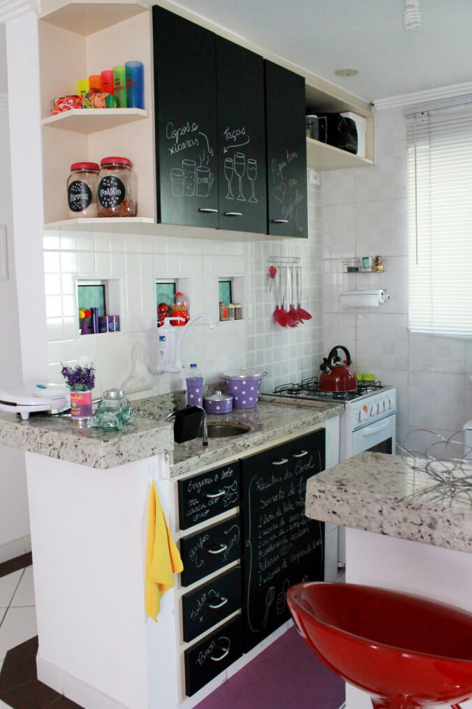
Make the most out of your minimal room with some surfaces anyone can draw or write on. Chalkboard cabinets exist all over this kitchen, and it is fitting when you don’t have much room to write things down on otherwise. Besides that, there is openness found in other areas of this cute kitchen such as the shelving design above that houses items that would typically take up counter space. Even the larger utensils hanging on the wall is a great decision to allow everything to be within reach without looking crowded.
18. Natural Light and White Brightens Narrow Space
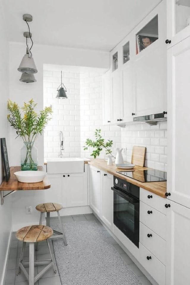
When there is a lot of white in the kitchen, a safe way to make it look more full of life and spacious without actually adding room is to use lighting. If you don’t have a window, the right ceiling light can work all the same. The lighting adds a different layer of brightness to the room so that it looks more inviting. Also, the use of darker hardware on the cabinets as well as the wooden counters contribute to the various layers the room has. Of course, if there is some color needed, you can’t go wrong with a couple of plants here and there.
19. Traditional Black and White With a Twist
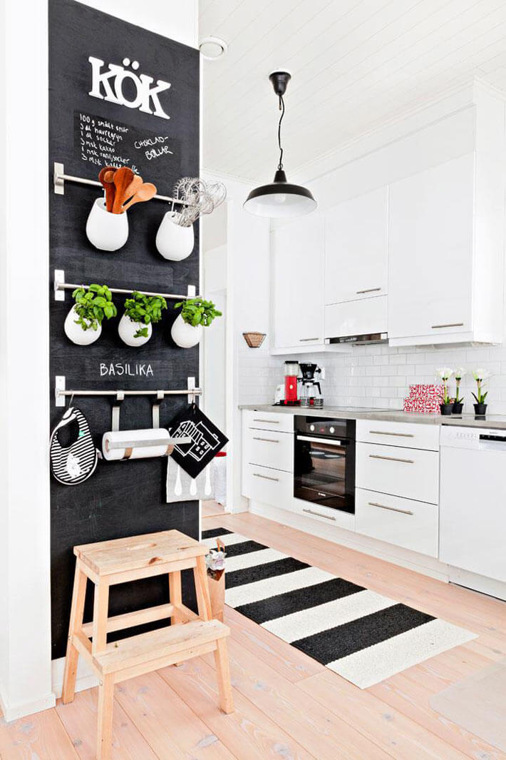
Perhaps you don’t have a lot of space to walk around in the kitchen, but you do have tall ceilings. If so, then a great way to utilize that space is to decorate an entire wall from top to bottom. A section of wall can be used for storage and decorations at the same time. It can hang oven mitts, utensils, and even some herbs useful in a kitchen environment. The black and white color pattern is perfect as well since it gives the room movement and an extra bit of style.
20. Pretty With Pink to Sweeten the Room
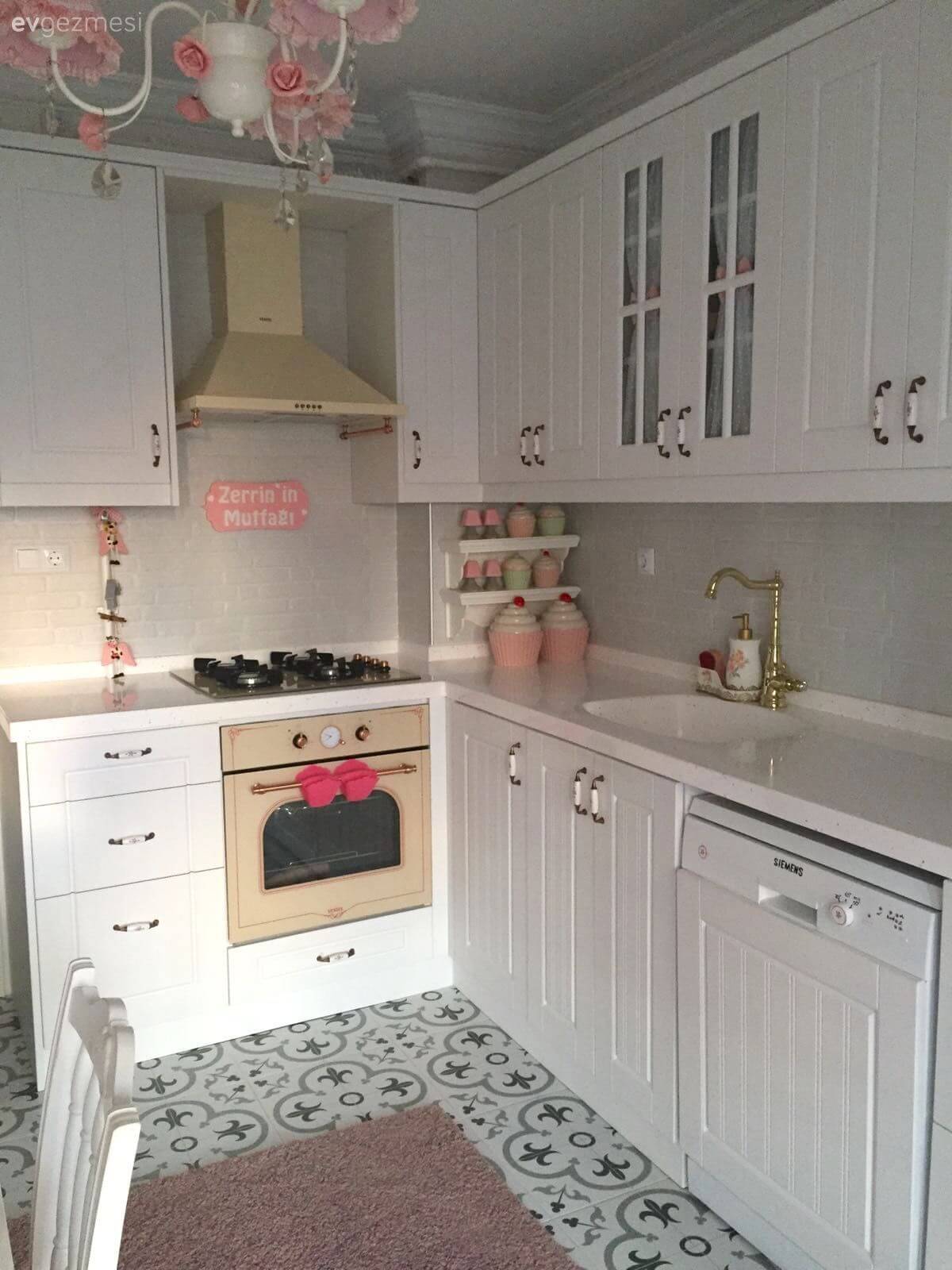
An old-school kitchen is granted a pretty and sweet style thanks to the use of a pink cupcake theme. It is such an effortless way to add your personality into a kitchen that doesn’t have much room for you to do anything else. Tucking the décor into the corner surprisingly doesn’t hide it away. Instead, it serves to brighten up that particular area. If you have the means, consider decorating a hanging ceiling light too with the same coloring style so that the look travels around the room.
21. Small Kitchen Decor Idea with Practical Table
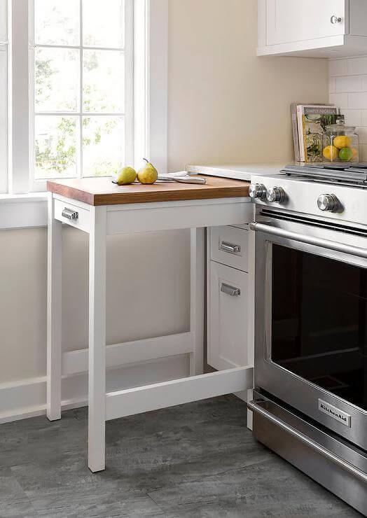
When space is a concern, you need to do anything you can to have some sense of room. Well, a pull-out table can be an ideal investment. This can automatically extend the counter room you have available, giving you a sort of itchen island so you can prep whatever you need. Some a simplistic look can help transform some of your kitchen décor into something that is practical. Beyond the table, the coloring in the kitchen is simple enough that it can pair well with anything else wanted in the room.
22. Amazing Neutral Colors Paired Well
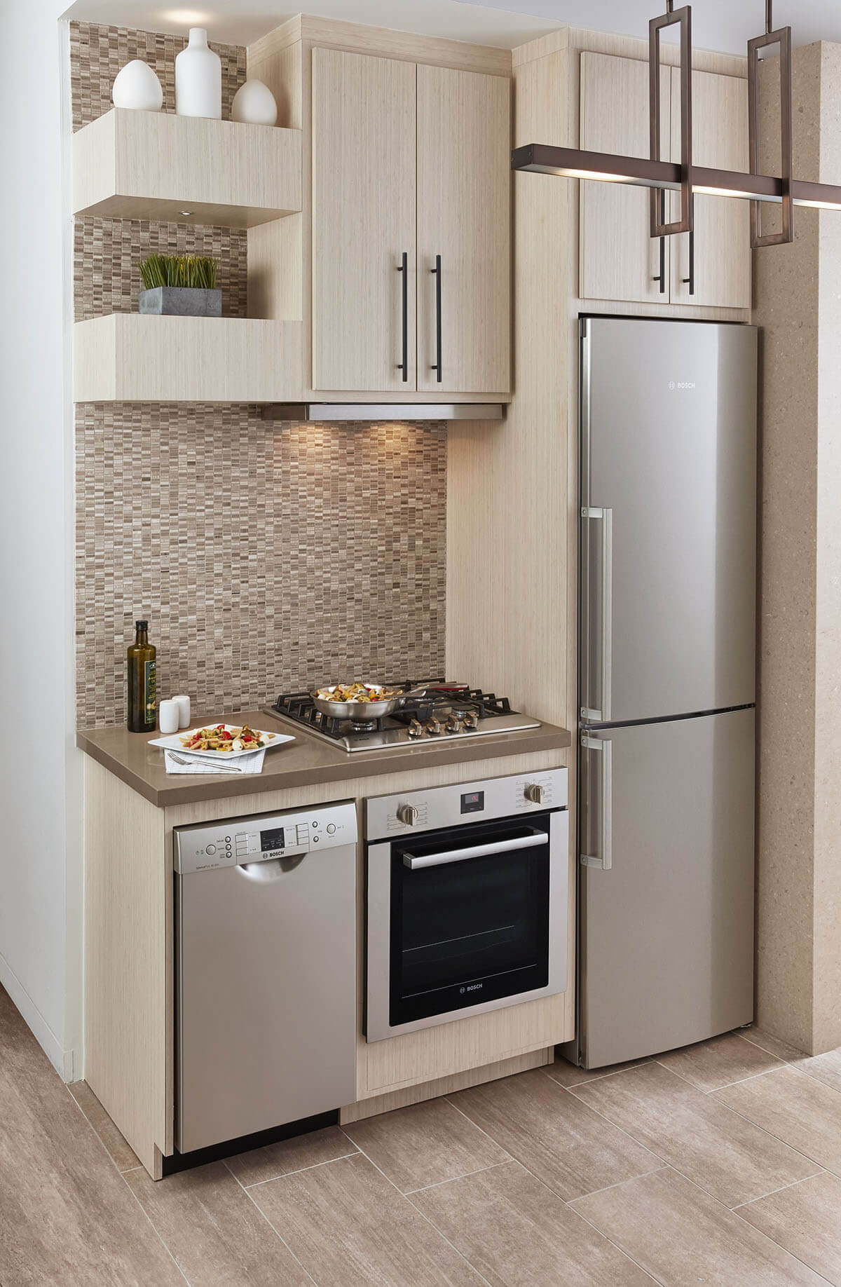
Having a more sleek design is a good way to stretch out a small kitchen. The stainless steel appliances serve to elevate the sophisticated cabinet choices. Even the cabinets are tall, taking advantage of the vertical space that’s offered instead. Light and dark colors work hand-in-hand here too so that not one aspect of the kitchen stands out over the rest. Additionally, the simple pattern on the darker backsplash helps tremendously in keeping up with the room’s overall aesthetic.
23. No Cupboards, No Problem
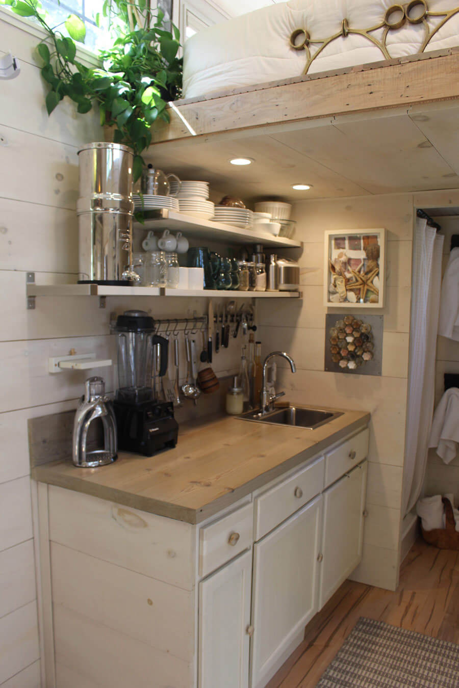
Cabinet space isn’t needed in those incredibly small kitchens. It’s because there’s not much space for cabinets since you need to open and close them, making doors challenging to use when there isn’t that much room around. Two incredibly strong floating shelves solve that problem well enough. The shelving is plentiful here too, easily housing numerous dishes, pots, and even cups. This gives you a good deal of space on the counters.
24. Great Use of Space Without Cluttering
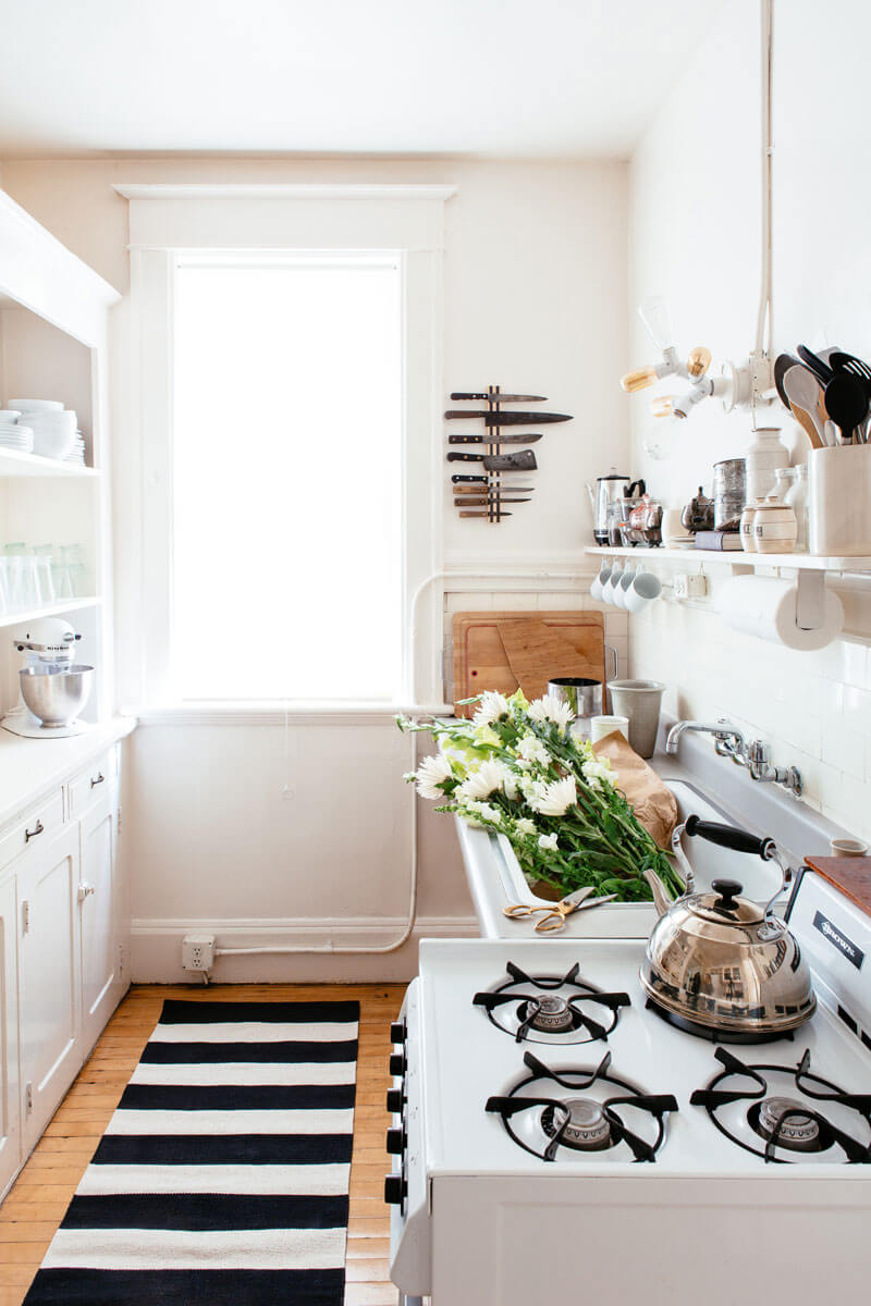
You can fill up a kitchen in terms of décor, functional and otherwise, all around even in a small space situation. This is because both sides of the room are focused on, leaving an area that is almost open on both sides. The open shelving and floating shelves gives you a near-endless supply of storage space that transforms also into décor. Even the space on the wall is perfect to keep knives out of the way without using a knife block that can get in the way.
25. Bright White With Contrasting Woody Browns
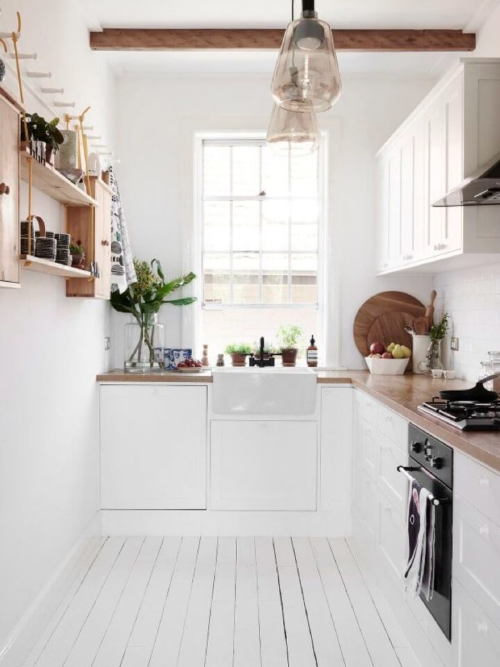
Wood always seems to work well as an accent color with an otherwise entirely white kitchen. The contrast granted to the room works in its favor as it all but guarantees that the attention of guests will travel all around. They may not even notice the lack of room in the kitchen. This looks also comes across as simple and clean. Even the natural lighting plays into it all so that it looks like a place everyone likes to round up.
26. Cozy Shelves in a Unique Space
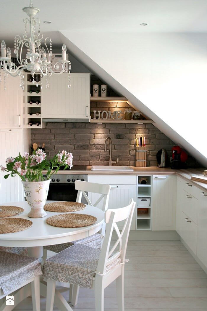
Not all ceilings and walls are created equal, so if you have a slanted and unique design, it’s best to work with it. This can help you set up some distinctive and attractive open cabinets or floating shelves. As long as you still have other cabinets, you can keep your counters relatively clear. There is still even room for a small table so that everyone can appreciate the cool setup of your storage.
27. Splashes of Colorful Designs Within Tiny Space
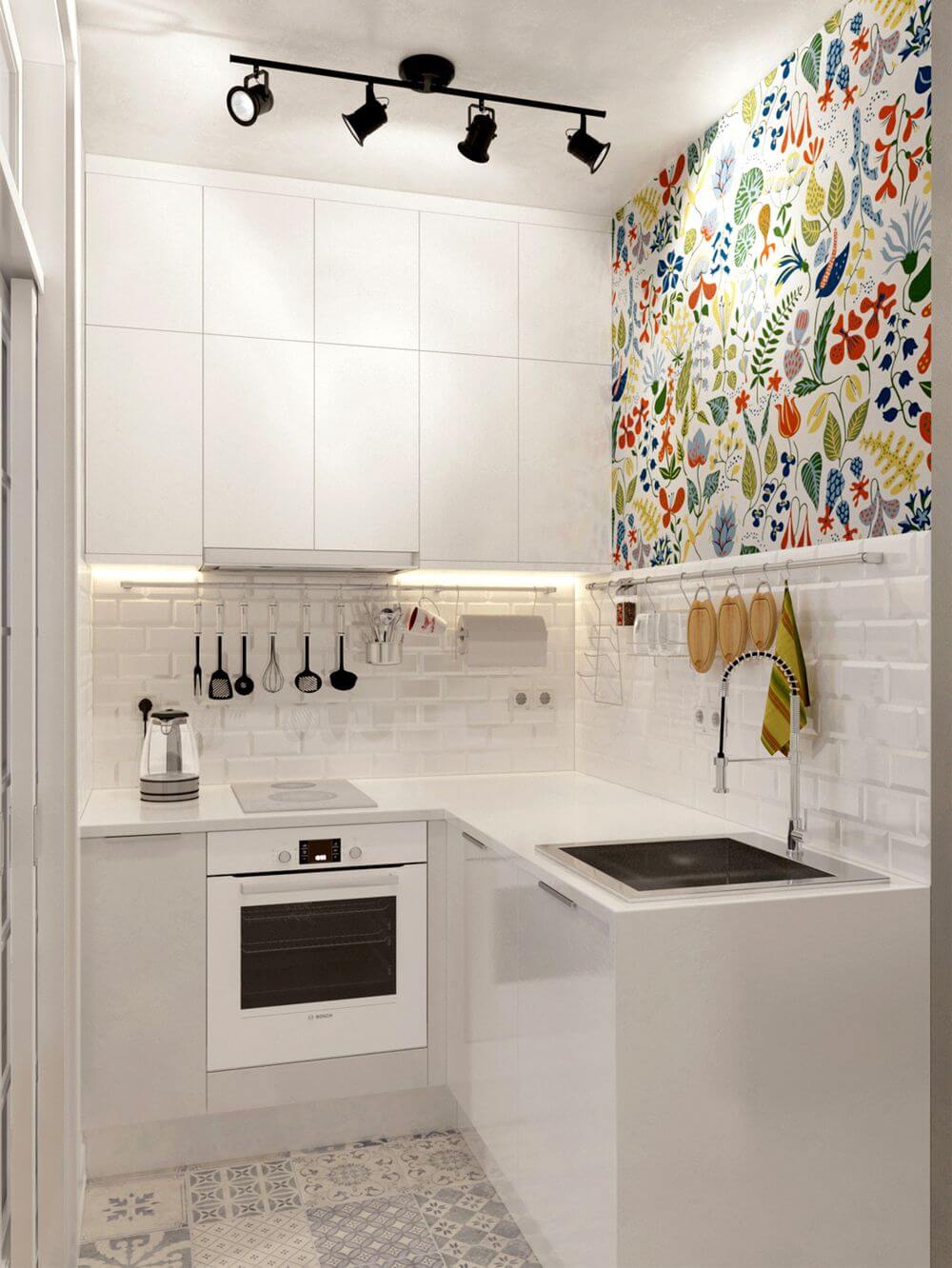
Sometimes, all a tiny space needs is some incredible colors to spice things up a bit. Things aren’t even totally wild in this case either. A single accent wall speaks a lot more and in such a wonderful way. Everything else in the kitchen is all white too. So, the accent colored wall provides the area with some useful contrast, stopping it from ever feeling one-note and thus looking a bit smaller at the same time.
28. Dark Wood Paired With Bright White
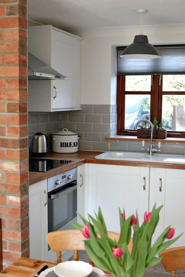
If you have an adorable kitchen nook, there is still some good deal of decorating you can do with it. The cabinets are simple enough, yet they still have a nice style to them that gives this kitchen a farmhouse feel. The upper cabinets have a nice length to it so that you can store plenty inside, freeing up the rest of the kitchen to look just a touch more spacious. The wooden and white coloring design play well with each other, but it never hurts for a pop of brighter color that plants can provide.
29. Vertical Lines Adding Height to the Room
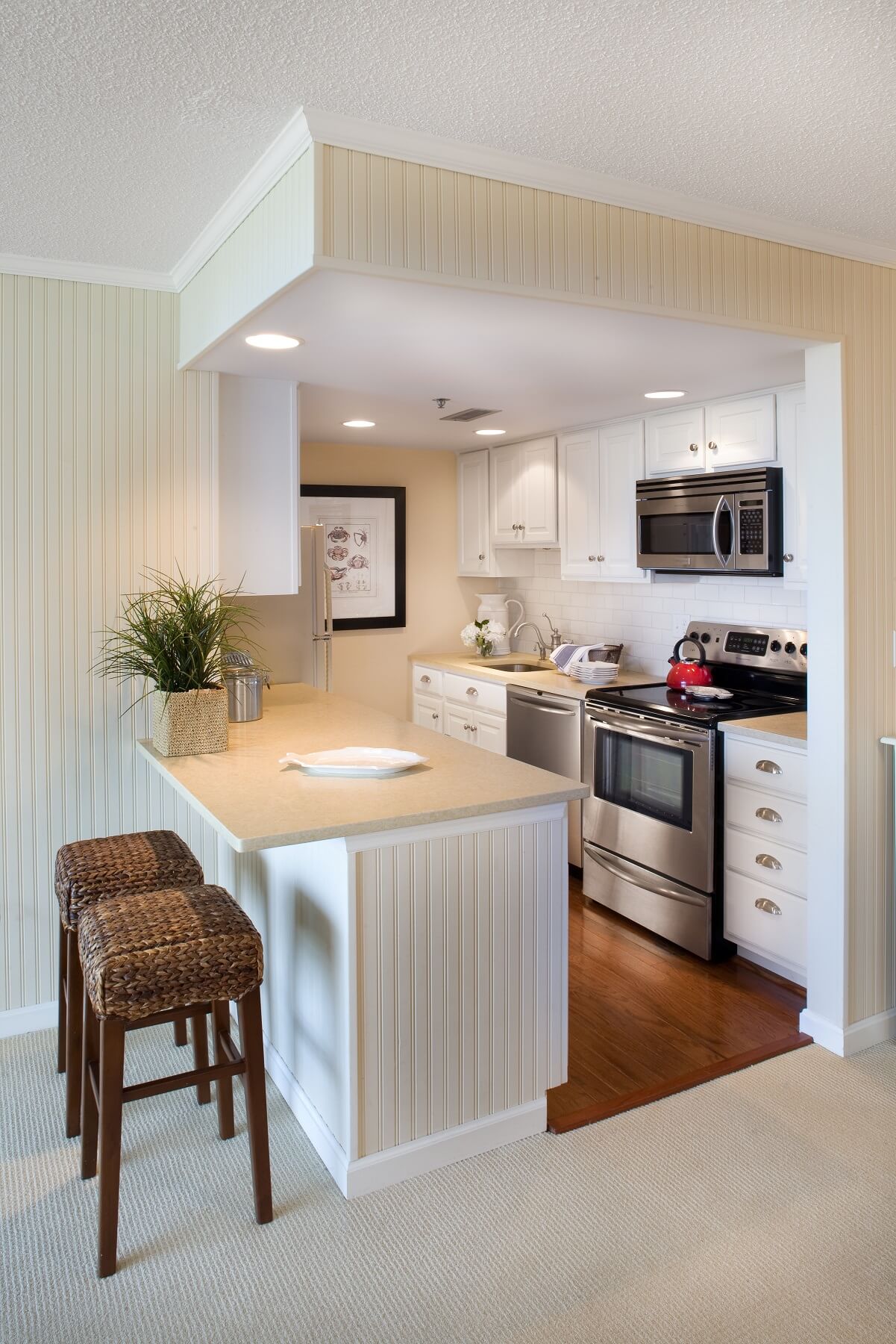
A good way to give off the impression that you have tall ceilings is to utilize vertical lines. Vertical lines add some helpful stretch to a design, and using this around the kitchen area can make it seem like it isn’t that small. The ceiling lights save up on even more space, there is ample use of plenty of cabinets so that there is more than enough space for all your storage needs.
30. Old Fashions Meet New Styles
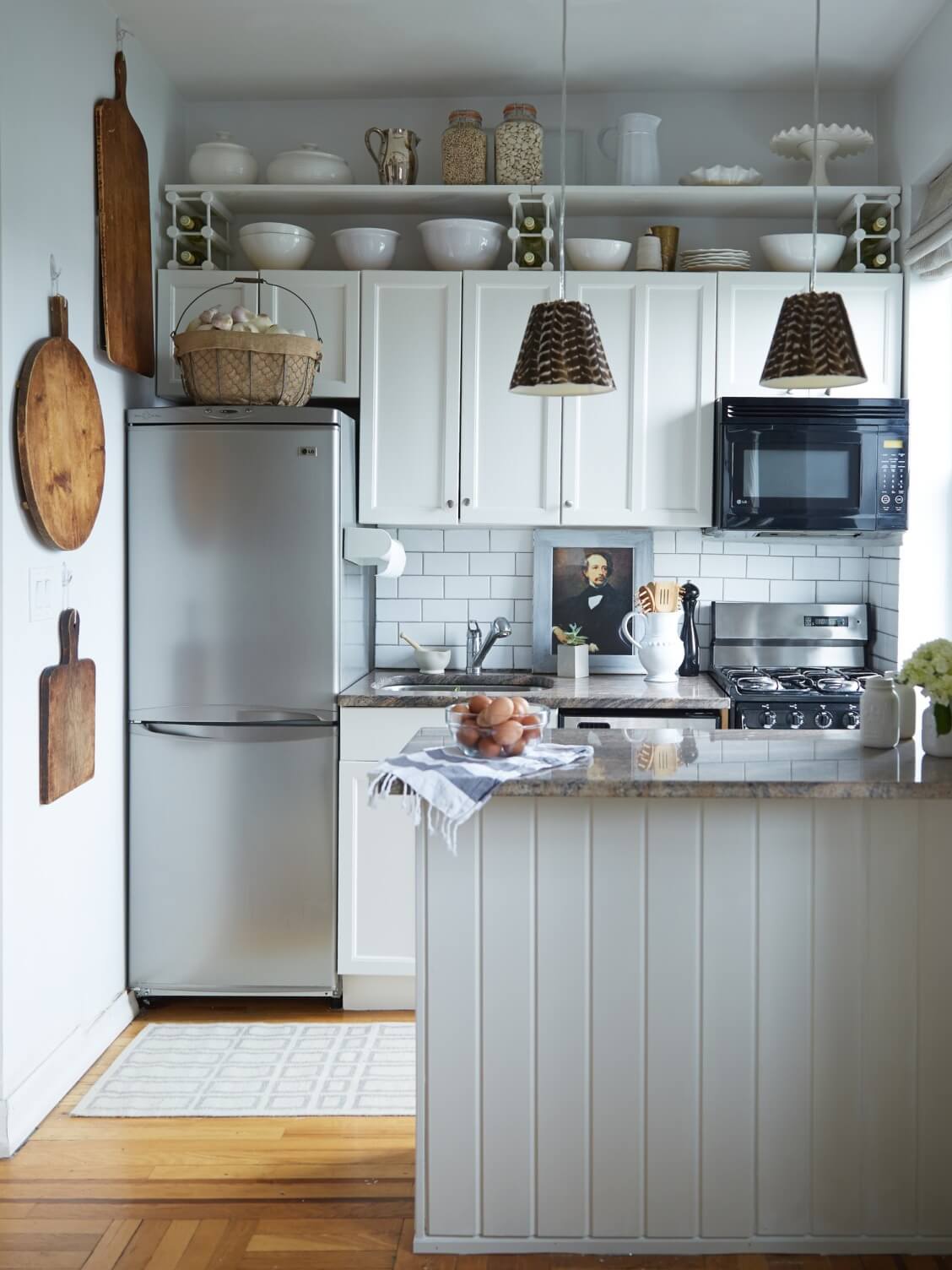
This kitchen blends a good deal of vintage with a modern style, showing that you do not need a spacious kitchen in order to decorate well and express yourself. Not only are the cabinets here a good height, but there is still room on top of them. The open shelving system there leaves a lasting impression, using everything stored there to act as functional décor.
Our Favorite Farmhouse Kitchen Decorations to buy on Amazon


