There’s something about a cozy farmhouse that emotes images of warm apple pie cooling on the kitchen counter, antique furniture passed down from generations, beautiful oil paintings of country scenes adorning the walls, mason jars filled with lemonade, porch swings and old rockers…you can almost smell that sweet country air!
27 Ways to Transform your Home into a Farmhouse Look Using Rustic Shiplap Decor
So maybe you don’t exactly live in the country, or even the suburbs, but you love that warm farmhouse style look. Think shiplap! Rustic shiplap decor for a farmhouse look will transport your living space into the open country and give that farmhouse appeal you’ve been looking for. You can incorporate shiplap decor in almost all corners of your home from headboards to bookshelves, even entire walls!
Whether you use large or small planks, stain them, paint them white or keep that ‘au naturel’ look, rustic shiplap decor for a farmhouse look can add wonderful texture to kitchen furniture, bathroom walls, and small accent pieces like clocks or wall art. It doesn’t even matter if you don’t live out on the range – create your own rustic shiplap decor for a farmhouse look in a weekend with inexpensive panels bought or found! With these diy ideas, you’ll be sipping sweet tea and enjoying the farmhouse feel in your own home.
1. Clean Lines and Bright White Bathroom
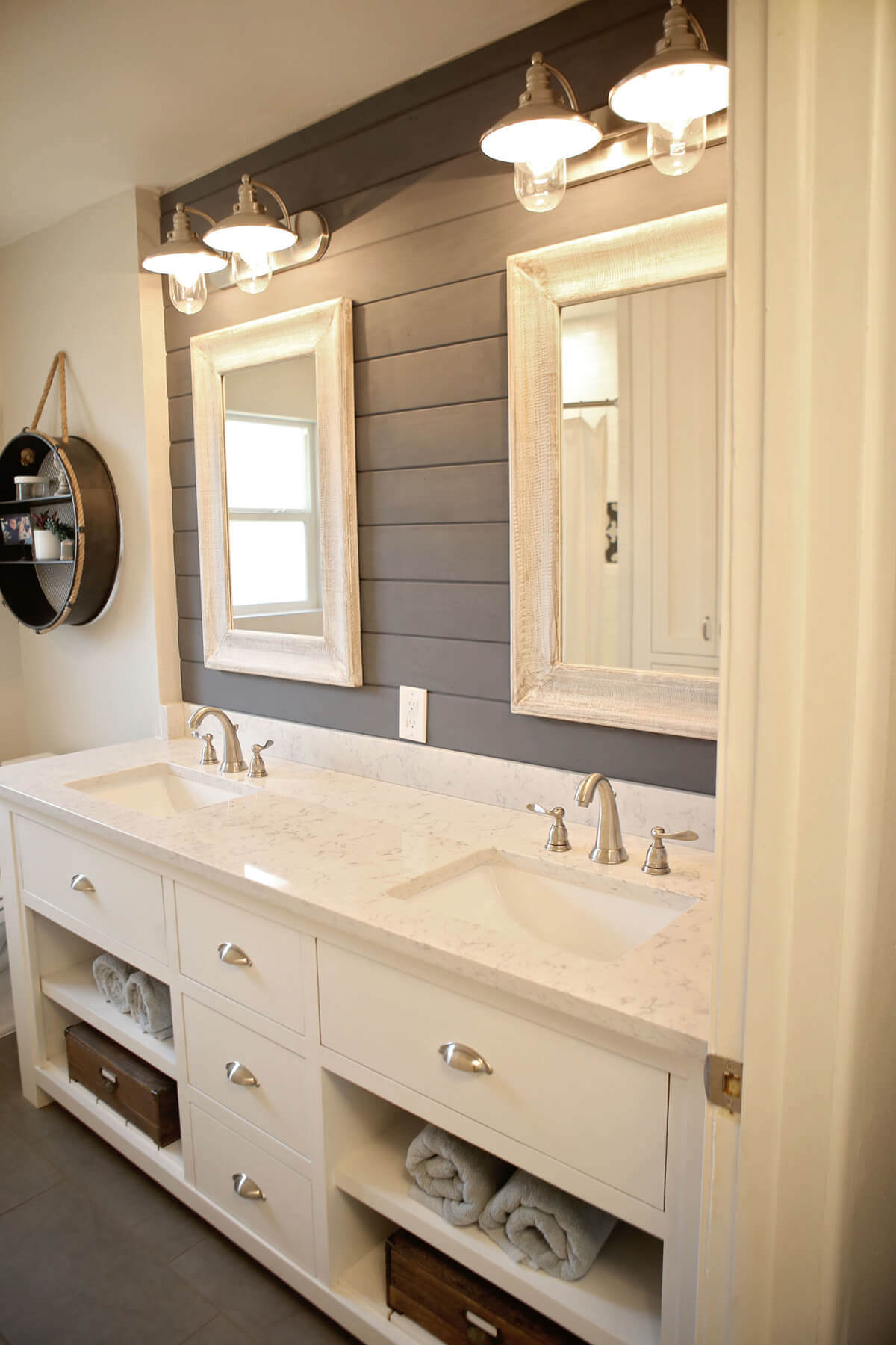
The clean lines has a striking effect in this chic bathroom while the sharp vertical and horizontal lines give a cool and collected air. The white frames of the mirrors, contrasting with the shiplap of the bathroom wall, give this room the appearance of an old farmhouse. Even though the appliances are modern, the aesthetic reads as older and rural.
2. Modern Country Style Mud Room
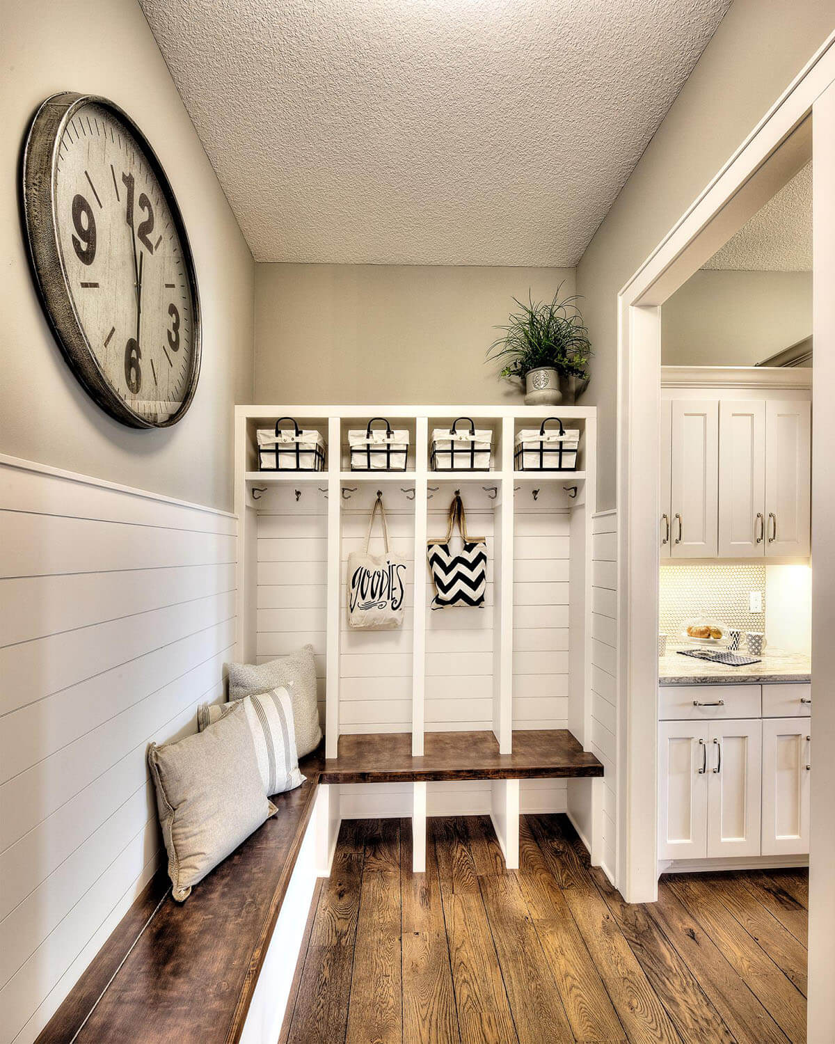
Covering the bottom half of the room with shiplap lends this mudroom a put-together, sophisticated air. The clean lines resemble siding on a house. The wooden floor, polished wooden bench, and understated color palette add to the reserved air. The room is cozy, though, with cheerfully hung tote bags and multiple comfortable pillows. For an added touch of color, the DIYer has used a potted plant.
3. Large Panel Rustic Dining Table
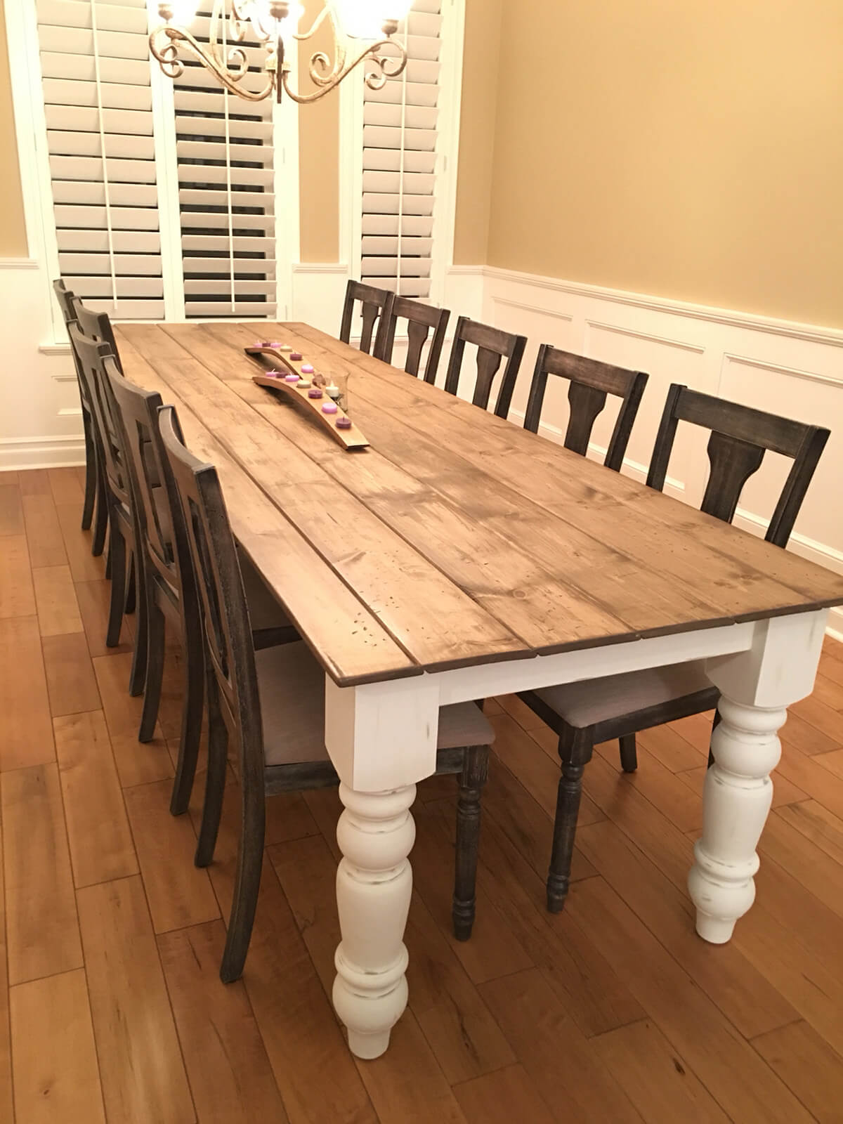
Shiplap isn’t just for walls — a great DIY project is using it for a dining table! This gorgeous dining table looks as though it’s made from the side of a ship. The wooden planks are juxtaposed with the pure white table legs for a striking contrast. For anyone who wants to feel as though they’re living in a rustic farmhouse, this kind of table is a must-have.
4. Shabby Chic Weathered Look Dining Cabinet
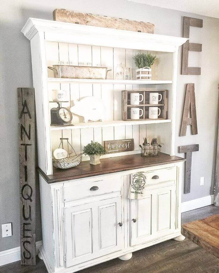
The shiplap is more understated in this image — it might take you a moment to notice it. The back of this dining cabinet is made from the material. The cabinet is designed to look weathered and antique, coated in peeling white paint. Only the shining surface of the desk belies the cabinet’s actual youth. It’s an interesting combination of the practical and the old, great for people who love a rustic look.
5. Beautiful and Bright Seascape Kitchen
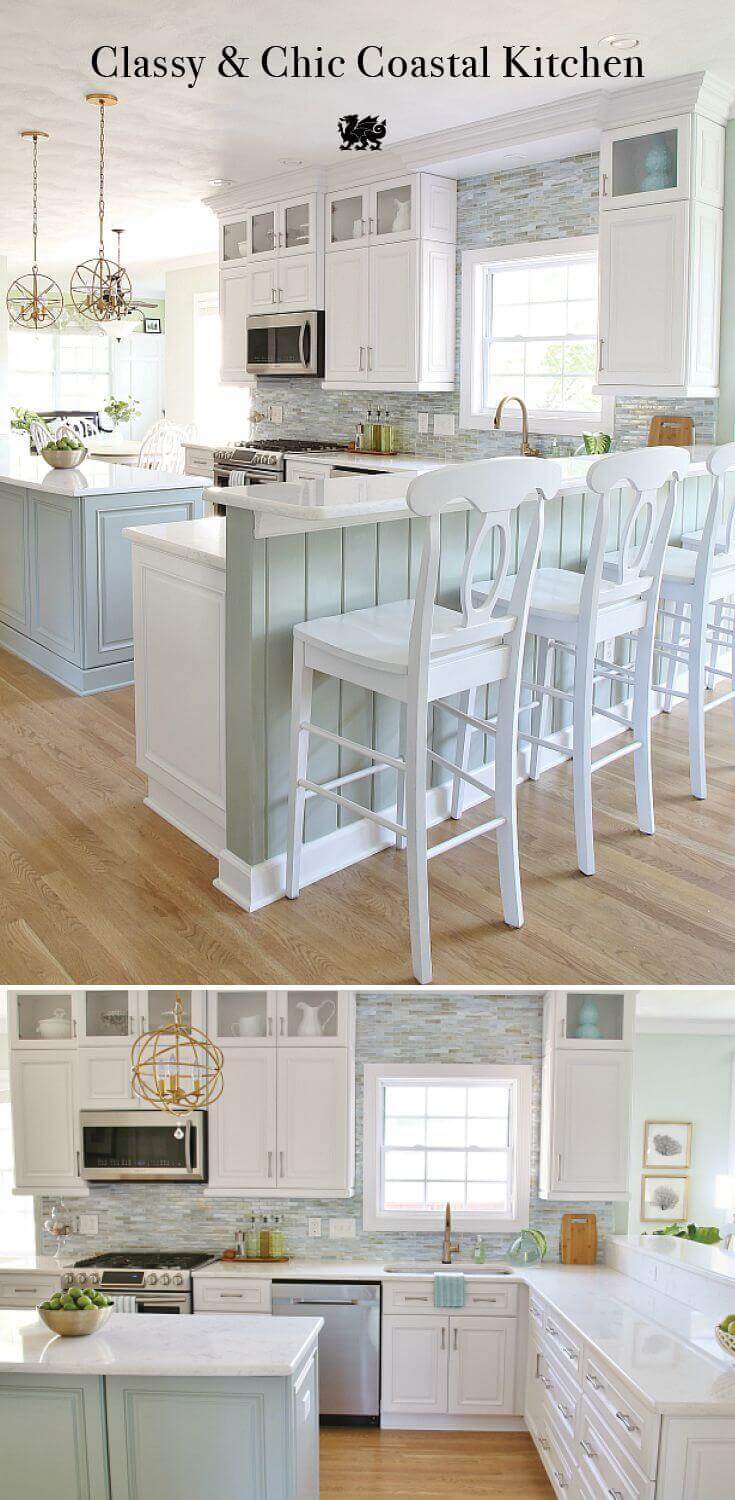
This gorgeous kitchen uses pale blues to the fullest effect. One wall is made entirely from blue mosaic stones, making the white cabinets and windowsill brighter by comparison. The pale gray shiplap making up the base of the counter helps to add pleasing lines to the area. All of the combined lines draw the eye around the photo.
6. Rustic Paneled Wall Meets Classic Wood Staircase
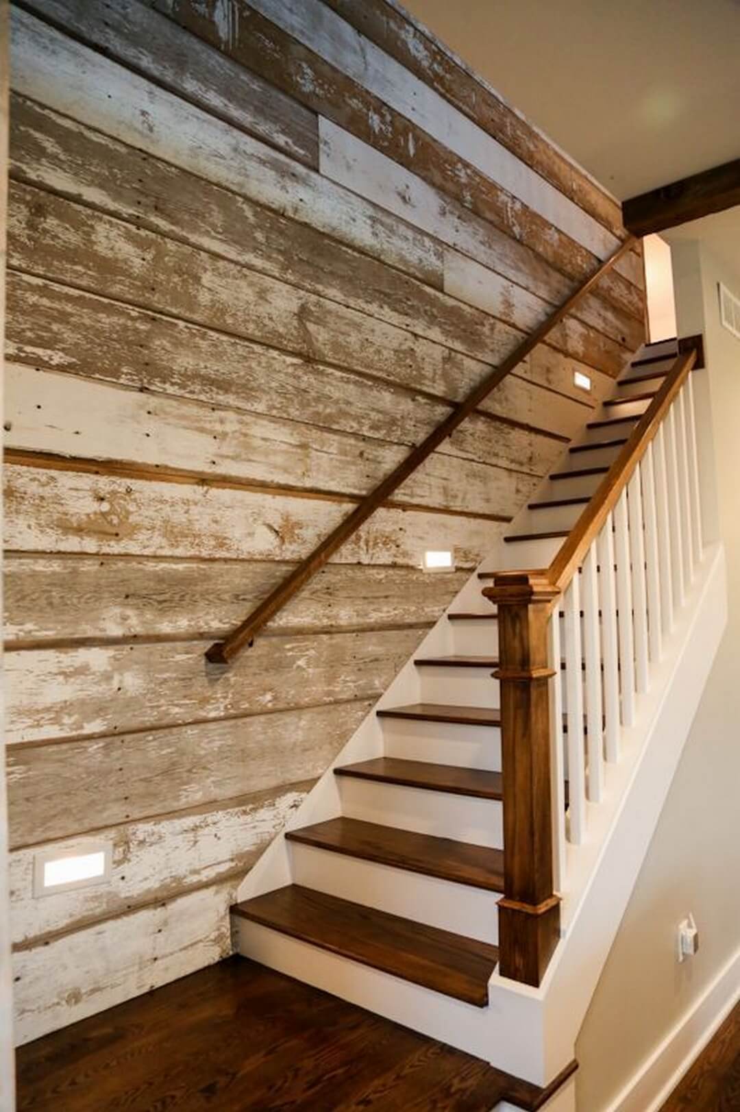
Blending aesthetics like this can be risky. You never know whether the effect will be conflicting or harmonious. In this case, it’s a little of both. These sleek wood stairs seem to disappear into the rustic paneled wall. The components look like pieces of two different houses. Overall, it’s a bold move, and we kind of love it.
7. Rich Umber Stained and Earthy Headboard
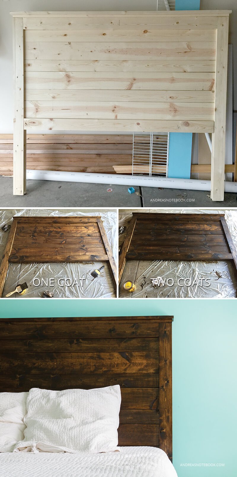
This DIY project helps cheap wood to look more expensive with an extensive staining project. Originally, the wood was pale and washed out. After one coat of stain, it looked like a rich oak. After two coats, it resembled cedar wood or cherry. The final product looks so beautiful and natural that it’s hard to believe that the first photo is the same headboard. Staining is a great solution for people who want an expensive-looking wood but lack the budget.
8. Framed Farmhouse Welcome Wreath
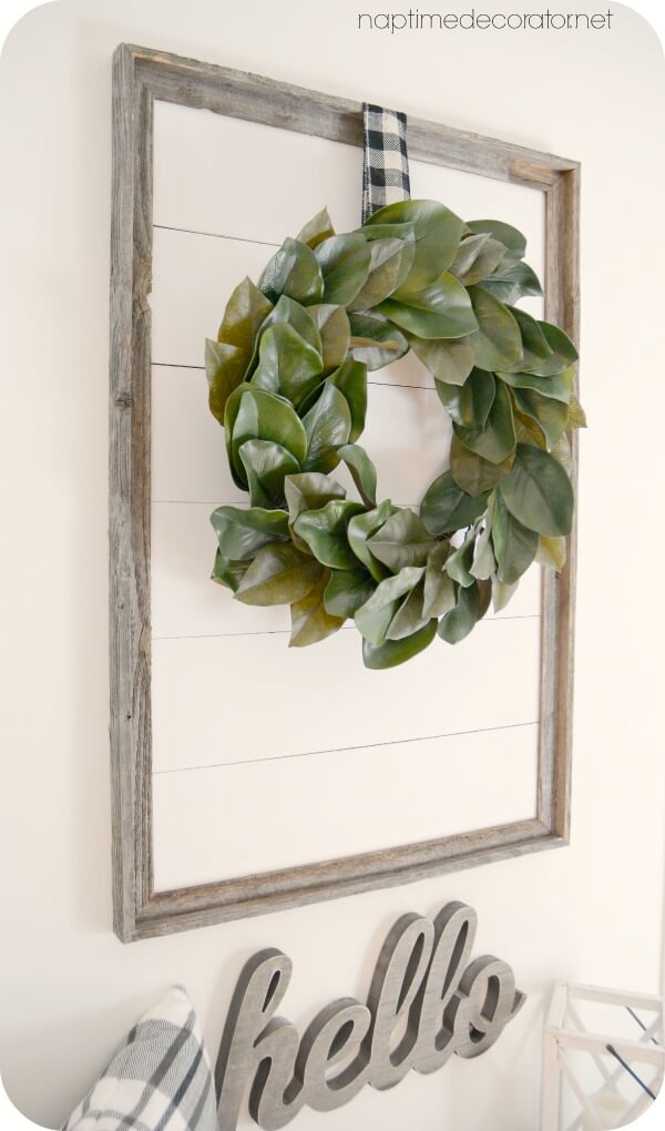
In this quaint project, wooden slats have been framed in a whimsical pallet. The planks are painted a thick, opaque white. Meanwhile, the frame is made from untreated wood. Mixing untreated wood and opaque colors is always an interesting aesthetic choice. A wreath hangs in front of the panel, its leaves bright and cheerful against the white and gray. Underneath the piece, a cursive carving spells “hello,” welcoming visitors into a cozy space.
9. Fun and Functional White Washed Mud Room
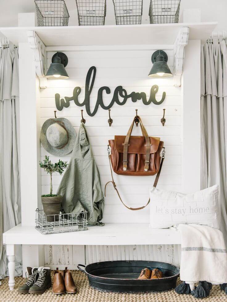
The funky design elements here prove that shiplap can work even in rooms without sharp lines. The horizontal lines make up the back wall of this mudroom. The soft lighting keeps the lines from being harsh, while the decorations keep them from being overwhelming. Funky cursive letters spell out “welcome,” and hooks house jackets and hats, a practical use of storage space.
10. Sturdy and Elegant Pantry Shelves
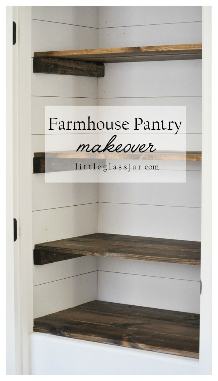
This design combines shiplap’s aesthetic appeal with the technique’s more practical properties. Pantry shelves are much sturdier when they’re installed between wooden slats. Each of the installed shelves aligns with the seams of the shiplap. The aesthetic is elegant and refined, while still evoking a rustic and homely air.
11. Country Stables-Style Decorative Shelves
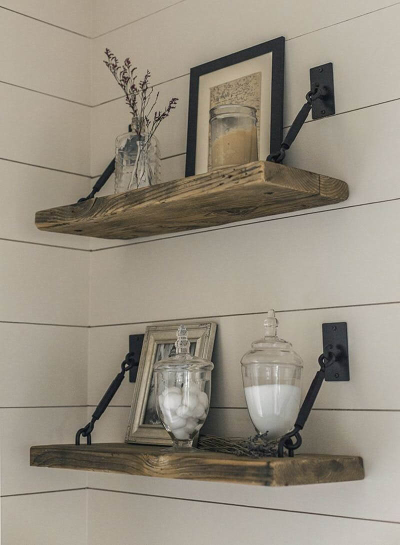
The fastest way to evoke “farmhouse” is to combine shiplap with rustic-looking wood. This designer accomplishes that and beyond. It’s a cozy little corner that seems to be tucked away from the entire world. This is a place where you can curl up in a patch of sunlight, with a mug of tea and a cat or two, and read the day away.
12. Glam Style Farmhouse Fireplace
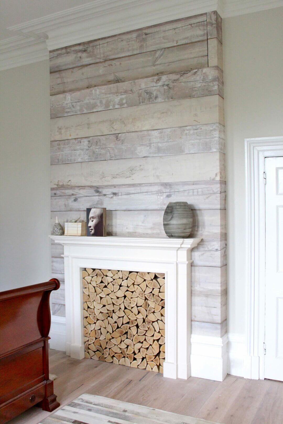
These wooden planks are fitted so well that they appear to be a perfect architectural project, stacked atop one another without any nails. Though that isn’t true, the effect remains striking. The different grains and textures are clearly visible, making the fireplace totally unique and completely congruent simultaneously. The bright white of the fireplace’s edging serves to accentuate this effect.
13. Cozy and Cushy Breakfast Nook
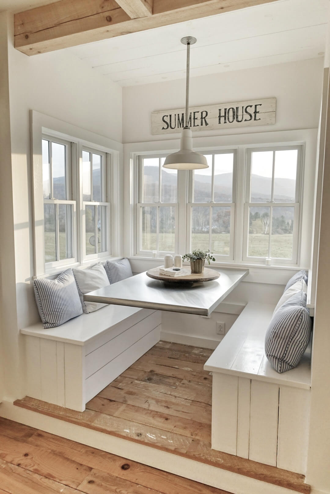
Have you ever seen anything more peaceful than this breakfast nook? We haven’t. In the early evening light, the lines from the shiplap are softer than they are in harsh lighting. The breakfast table has been polished to perfection, and each bench is covered with comfortable pillows. The view from the windows is breathtaking, and the “Summer House” pallet art is the perfect final touch. It’s a perfect place to vacation; it looks like the kind of place where lifelong memories are made.
14. Lovely and Simple Cursive Text Art
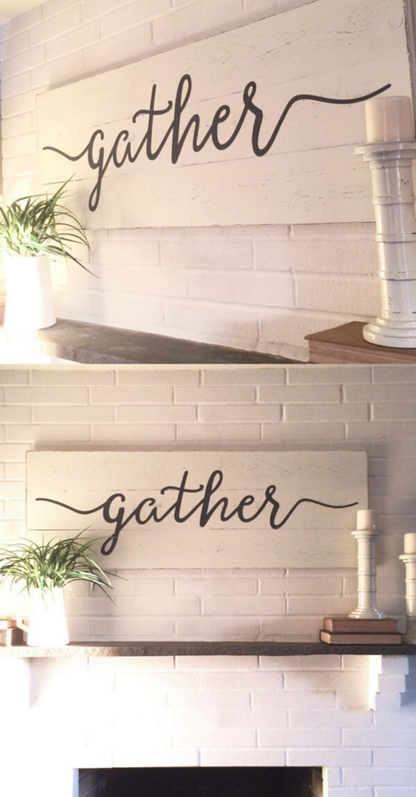
Pallet art is a gorgeous way to add decoration and character to a room. The pallet has been painted with an opaque finish, the paint so thick it’s difficult to tell that the surface is made from wood. Across the expanse, a warm message invites families to spend time together. The flow of the word is soothing in itself, and the room conveys innumerable positive vibes.
15. Warm Whites and Natural Wooden Panels for the Kitchen
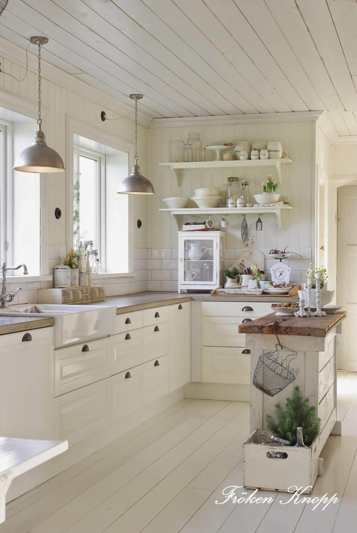
Using shiplap for the ceiling is an unusual choice, but it’s gorgeous here. The contrasting lines, textures, and lighting in this kitchen all combine to create a masterpiece. The whites are soft enough not to reflect harsh glares, and the softness of the natural light from the windows helps with aesthetic balance. Green sprigs of flowers are natural pops of color against a creamy background.
16. Polished Powder Room with an Earthy Element
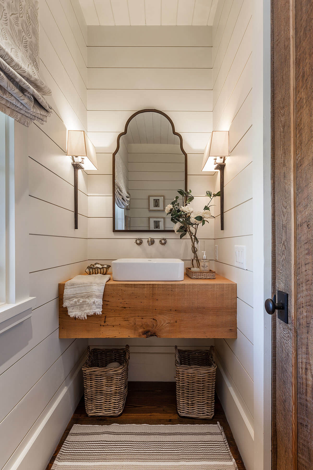
With a room this tiny, it’s tempting to cover the space with muted paints and stencils. But the shiplap here emphasizes the size of the room — which in turn emphasizes the brilliance of its little design. The lamps provide enough light for you to see, while the wooden sink gives a grounded earthy feel to the overall area.
17. Folksy Art and Woodsy Warmth
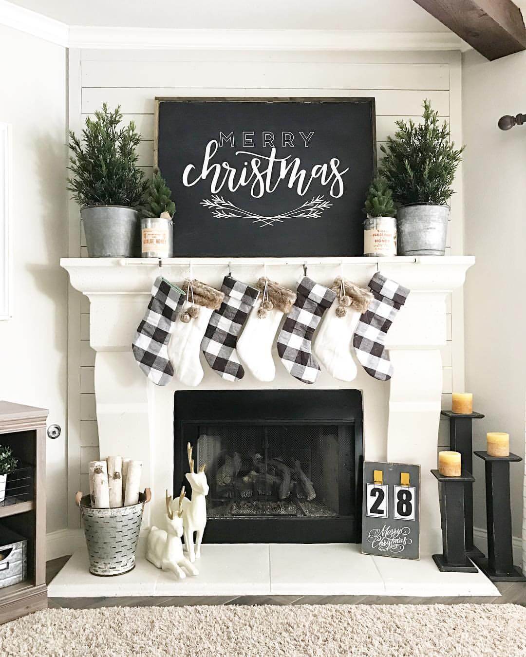
Despite the lack of color, this room feels warm and homely. The chalkboard over the mantle is a neat idea, especially when it’s used to impart messages of holiday cheer. The plants on the mantle emphasize the season, and the candles add just enough color to keep the image from washing out. That rug certainly looks soft. This is a beautiful room to curl up in with a mug of hot chocolate.
18. ‘Au Naturel’ Tack-Board
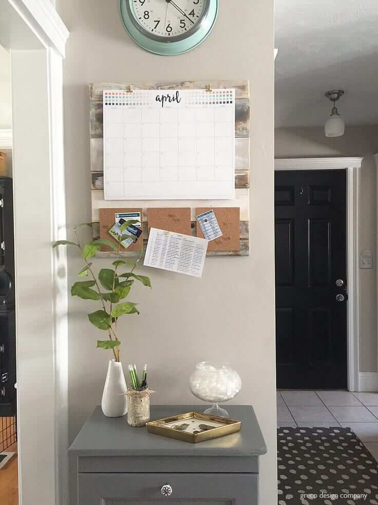
What a clever idea! Rather than hurting your walls with pins and tacks, this homeowner is using a wooden pallet to mount their important information. The calendar takes up most of the surface space. Three small bulletin boards are covered with pinned reminders and to-do lists, a perfect use of organizational storage space. The wooden slats are hidden, but you can tell they’re full of different colors and marvelous to behold.
19. Classical Chic Country Bedroom
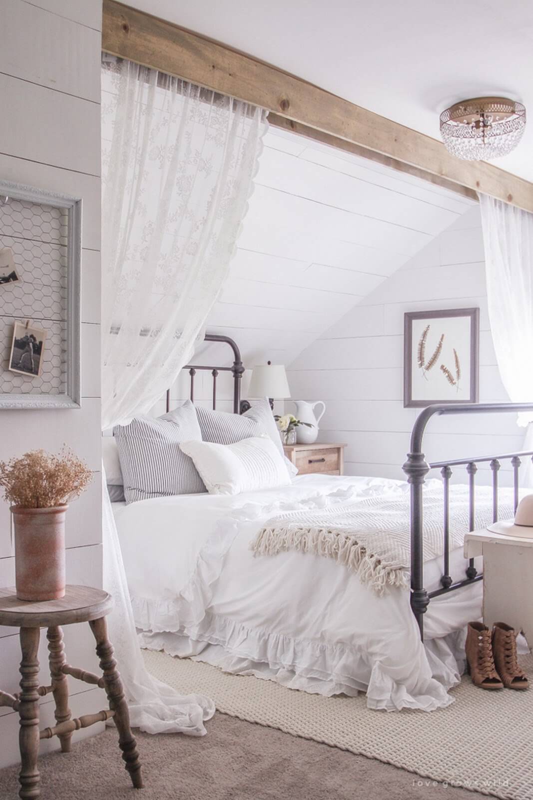
We are absolutely in love with the way this designer has used shiplap aesthetic. The main ceiling of the bedroom is smooth, but a comfortable nook is partitioned with a firm wooden crossbeam. The sloping ceiling of this nook is made from congruent slats that perfectly complement the overall aesthetic. The entire corner can be closed off by sheer, lacy curtains. The setup, from the color scheme to the decorative choices, screams comfort and home.
20. Show the Love Paneled Word Art
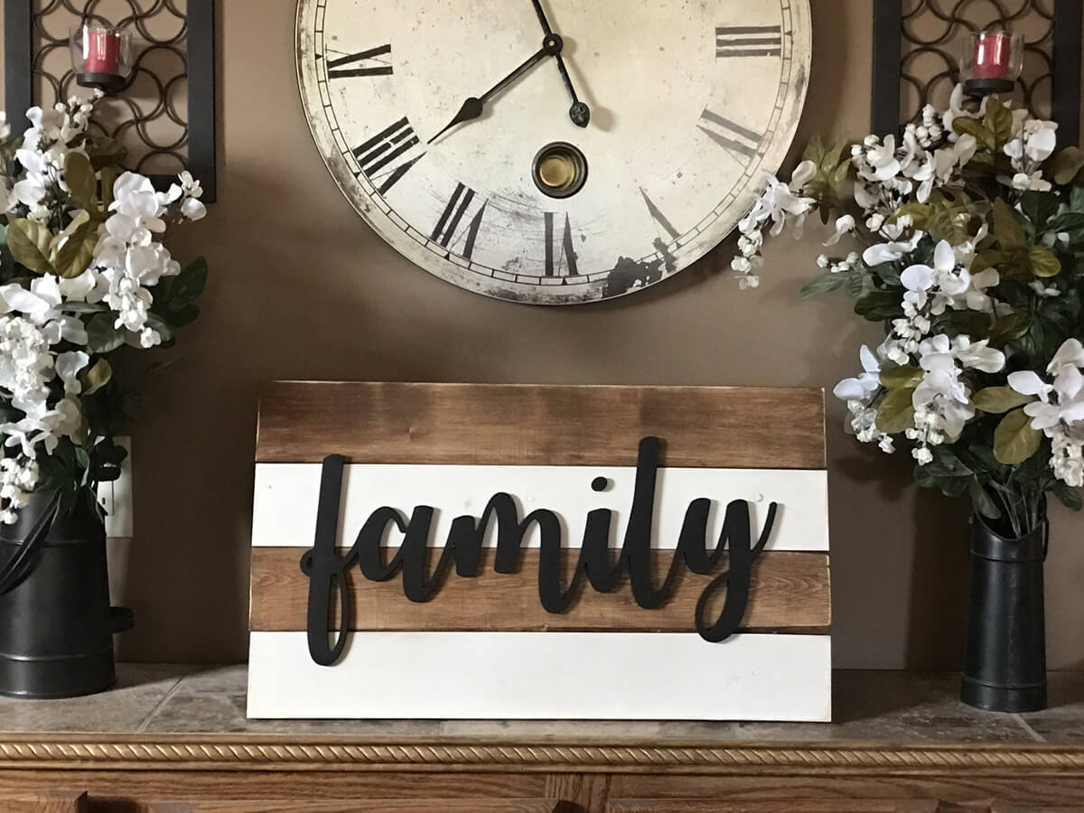
Even the tiniest wooden panels can serve an important aesthetic purpose. This sweet pallet features four short, narrow wooden slats. Particularly striking are the contrasting background colors, the slats arranged in a brown-white-brown-white pattern. The stripes make the “family” carving more stunning.
21. Beautiful Bold Beams in a Modern Country Kitchen
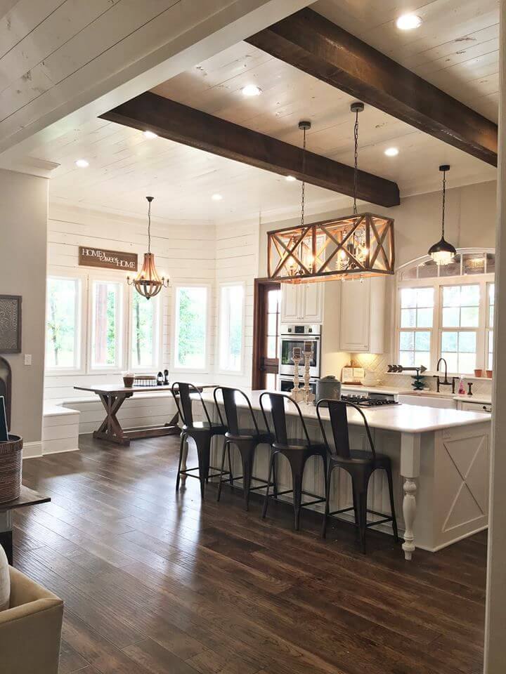
This kitchen is a dreamscape of different lines. The hardwood floor is full of lines, the walls are full of lines, and the ceiling is full of lines. The wooden beams interrupt the flow of the lines, making a bold statement that draws the eye. It’s also notable that the beams are dark brown while most other aspects of the kitchen are white, making them an even bolder statement.
22. Organize Your Life with Classic Wood Panels
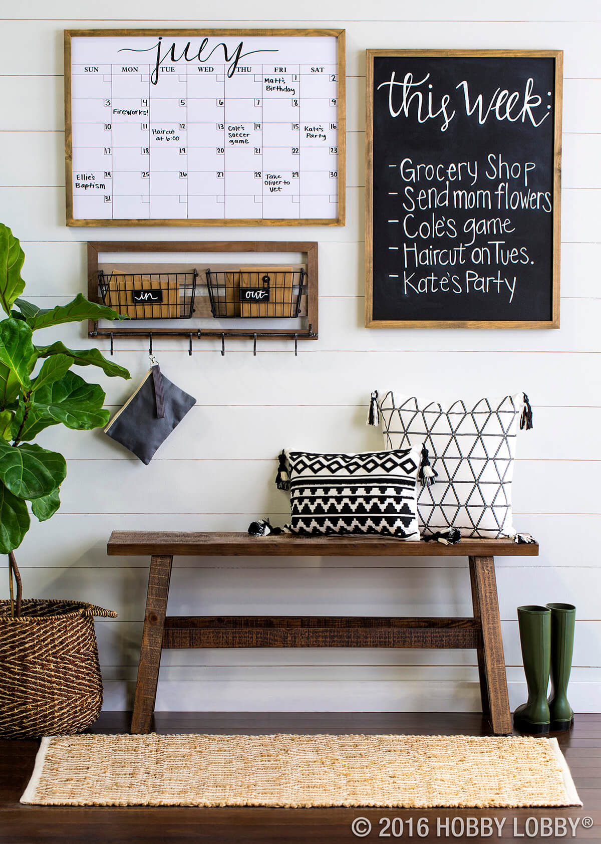
The paneled wall here draws the eye to the non-lined parts of the photograph, turning them into striking accents. This whiteboard calendar is an excellent way of organizing your life, and the calendar provides a peek into the week ahead. Also helpful are the “in” and “out” baskets mounted on the wall, allowing you to sort your paperwork and important missives.
23. Entryway Organized Oasis
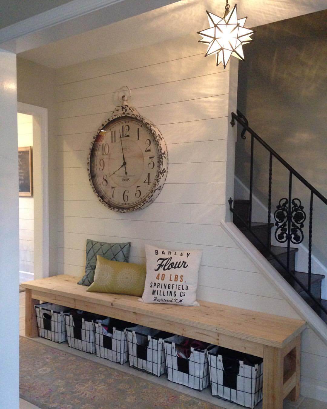
The use of shiplap lines in this room is a stroke of genius. This entryway is a place where people are constantly moving, flowing from one area to the next. The horizontal lines seem to point you to your destination. The star-shaped light fixture throws ribbons of unusual light on the walls, casting everything in a soft glow. It’s an inviting space that manages to be efficient without being cold.
24. Chunky Wooden Shelves for a Compact Space
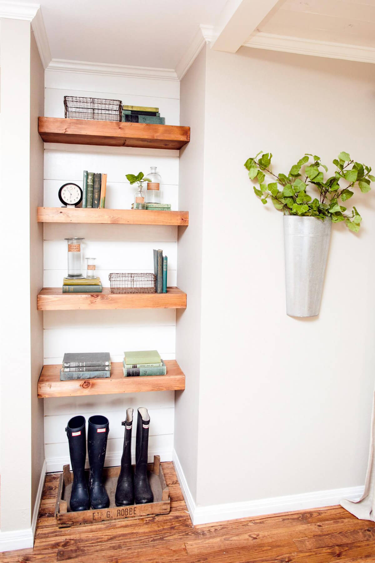
Most people have one of these “nooks” somewhere in their home. Oftentimes, they go ignored, or they’re used for storing things that people need out of the way. This DIYer’s use of shelves is a way of revolutionizing the space. We’re also huge fans of the chunky structure of the shelves, as thin shelves wouldn’t mesh as cohesively with the surrounding space.
25. Classy Cabin Style Bathroom
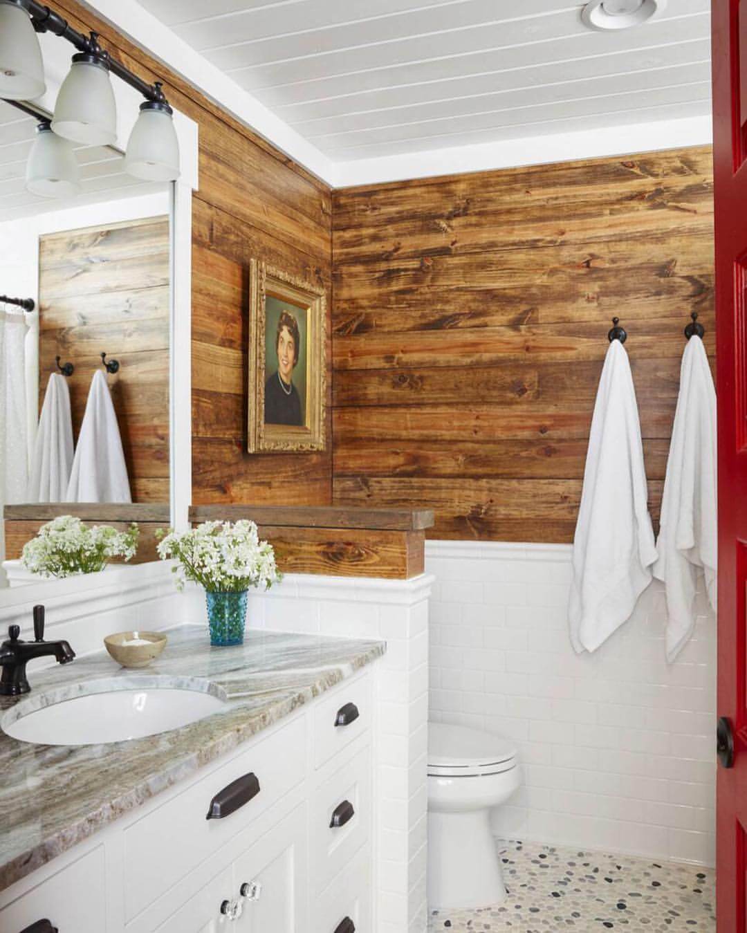
This is a marriage of aesthetics that should clash but somehow work in harmony. The porcelain on the lower walls shouldn’t match the wooden slats. On a basic level, square tiles and long wooden panels shouldn’t go together! But this risky maneuver pays off. The gorgeous wood finishing evokes a log cabin or a ship, while the appliances are sleek and beautiful.
26. Naturally Framed Bouquet
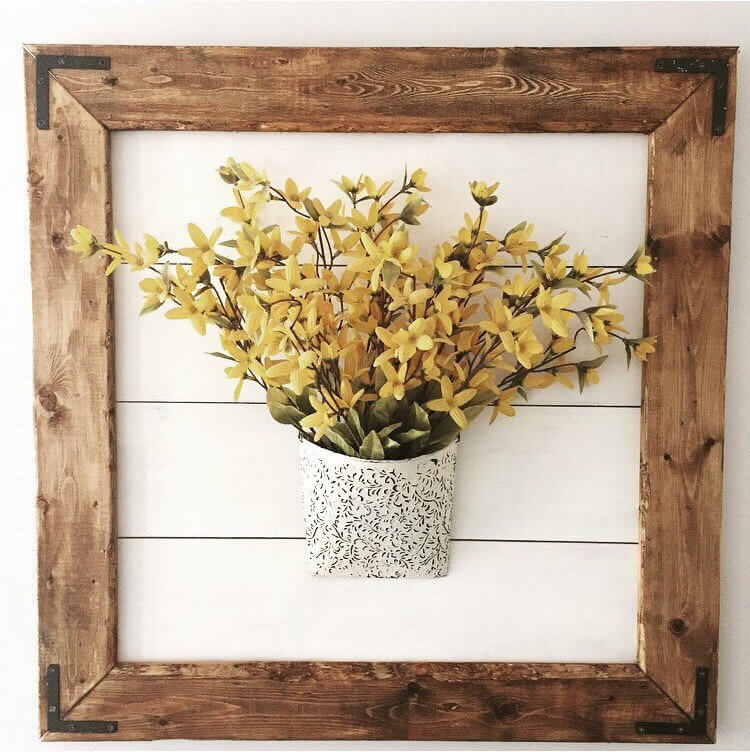
Another subtle “blink and you’ll miss the shiplap” design, great for DIYers who like a more understated tone. This bouquet of forsythia is framed by a square of finished wood. At first, that’s all you might notice. The slats that comprise the back of the frame are painted the exact color of the walls. It looks like the bouquet is floating in midair, but in truth, it’s mounted on the pallet. The neat eye trick has been perfectly pulled off.
27. On Time and On Style Living Space
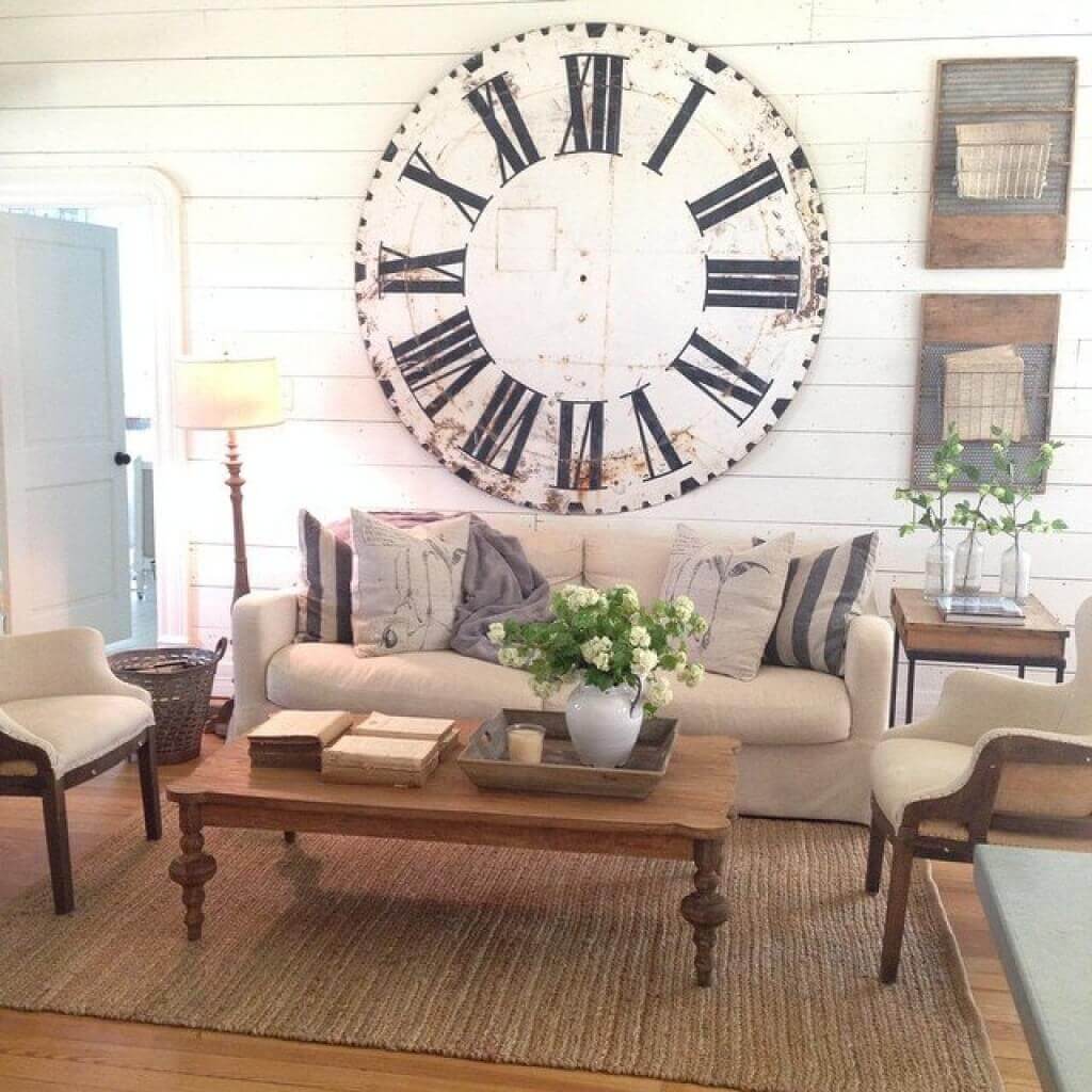
What a neat concept! This stylish living room looks like it belongs in a new edition of a home magazine — except for that stencil of a clock on the wall. Curiously, the clock appears dilapidated, but the rest of the room is in perfect repair. It’s another purposeful marriage of the rustic and the modern.
Our Favorite Rustic Chic Decorations to buy on Amazon


