Almost any homeowner can complete basic kitchen makeovers to make an old work space look new. This may increase the value of the home and it may make the home more likely to sell if it goes on the market. However, because it is so easy for homeowners to complete these simple makeovers, those looking for something truly unique and different must buck those trends and find a way to make their kitchen stand out from all others.
Modern kitchens offer something more than a makeover
Modern kitchen designs add a unique touch of elegance and class to a home that otherwise might be just like every other home on the block. That’s why the concept of modern kitchen decoration has become so popular in recent years. The prominence of modern kitchen design in the entertainment industry has also contributed to this trend. While the everyday television and film viewer once saw standard, basic decor like that in their own home, today’s TV shows and movies feature the modern home decor that has become commonplace in celebrity homes and design magazines. This presence of modern-style home decoration has resulted in a surge in the number of homeowners and designers attempting to replicate these designs and seeking out modern kitchen ideas.
Those looking for inspiration on how to make their kitchen stand out from everyone else in the neighborhood should find the following 50 modern kitchen design ideas helpful in planning out a cooking and entertaining space that will wow the family, neighbors, or buyers alike.
1. The Clean and Clear Modern Kitchen
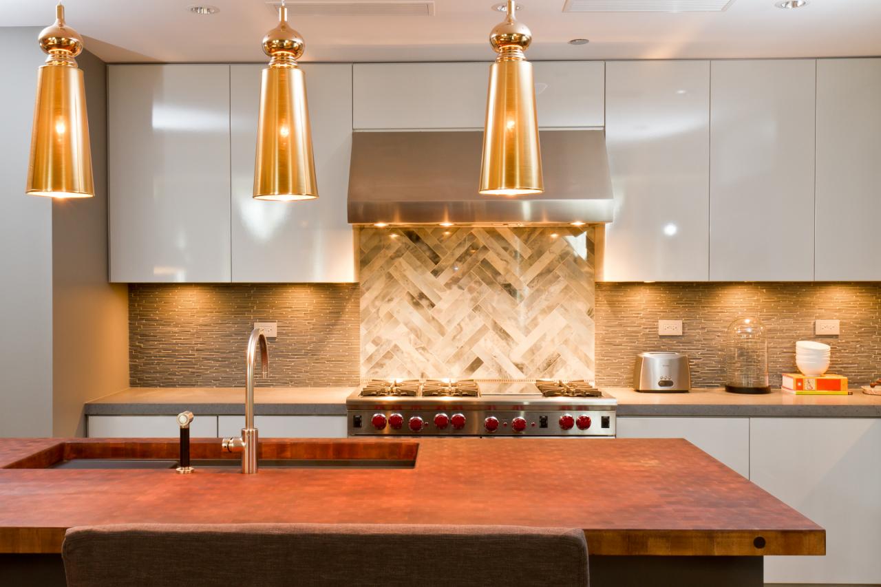
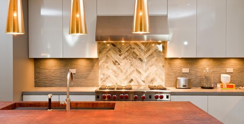
With its earthy tones, basic structure, and freedom of space, this modern kitchen design offers a good balance of masculine and feminine accents to meet the needs of any person or family. The stone countertops and backsplash offer a nice contrasting texture to the smoothness of the lacquer millwork cabinets. The warm tone of the island butcher block top creates depth in the space while functioning as the perfect prep area or space for entertaining. Stainless steel appliances and plumbing fixtures are enhanced by the translucent gold light pendant lights. Finally, the smooth marble backsplash pattern behind the stovetop lightens the back wall for a third texture and color combination.
2. The Hive
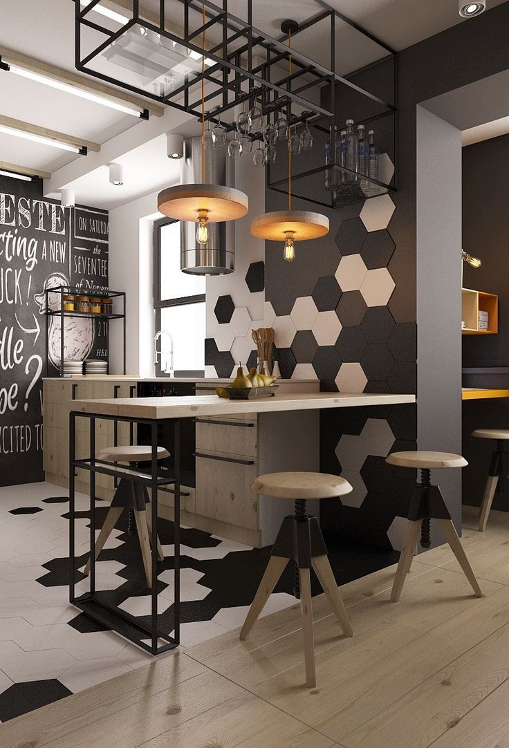
Blending a mix of classic industrial decor with a modern twist, The Hive skimps on color, but not style. The black and white honeycomb pattern floor accent continues up the wall seamlessly blending both parts of the room together. The purity and cleanliness of bare wood on the industrial stools, countertop, and modern kitchen cabinets offer a beautiful respite from the otherwise black and white scene while the wood-disk light fixtures meld with the other furnishings. Ample storage space above the seating peninsula provides an out-of-the-way solution for glassware without sacrificing cabinet space. What the space lacks in color variety, it makes up for in design features.
3. The Fluttergon
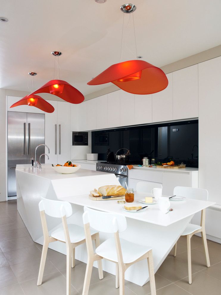
The clean, smooth white surfaces of this modern kitchen design are offset by the dark amber butterfly-style light fixtures. A modern kitchen island of Corian in a polygonal shape offers a unique divergence from block-shaped islands most kitchens host and an attached built-in dining top provides makes efficient use of the space. While the backsplash material appears to be a window, it is actually toughened glass spray painted a dark, jet black. This helps to elongate the room in an otherwise narrow space. Built-in storage in both the island and back wall provide more than adequate storage while remaining hidden from view.
4. Orb-ital
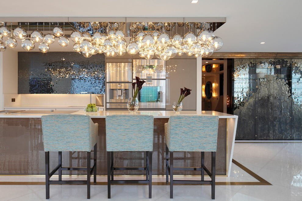
Walking through this space, one can hardly tell it serves as a fully-function kitchen. Appliances are cleverly hidden in the space to keep the flow of the open floor plan from being broken. The uncommon style of the modern kitchen island combined with materials not normally found in modern kitchen designs can leave visitors feeling as though they’re just sitting down for a drink at the bar. The real feature of the room, though, is the exquisite set of chromed glass orb lights above which add warmth without being overbearing. A dark mirror-glass tiled backsplash deepens the back wall while the teal-blue upholstered stool-chairs add softness to the space.
5. Chocolate Marble Cake
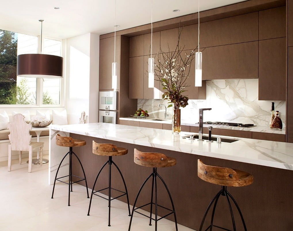
One look at this modern kitchen design will have viewers thinking about the smooth taste of a chocolate marble cake. The sweet chocolate brown of the modern kitchen cabinets makes a stark contrast to the slick frosting texture of the marble countertops and backsplash. The cork-like coloring and grain of the bar stools atop cast iron footings accent the space and add a touch of rawness. Thin silver and glass pendant lights present a sleek line in an otherwise broad space. Large plate-glass windows allow the perfect amount of light in to accent the space and highlight its openness.
6. The Unfinished Dream
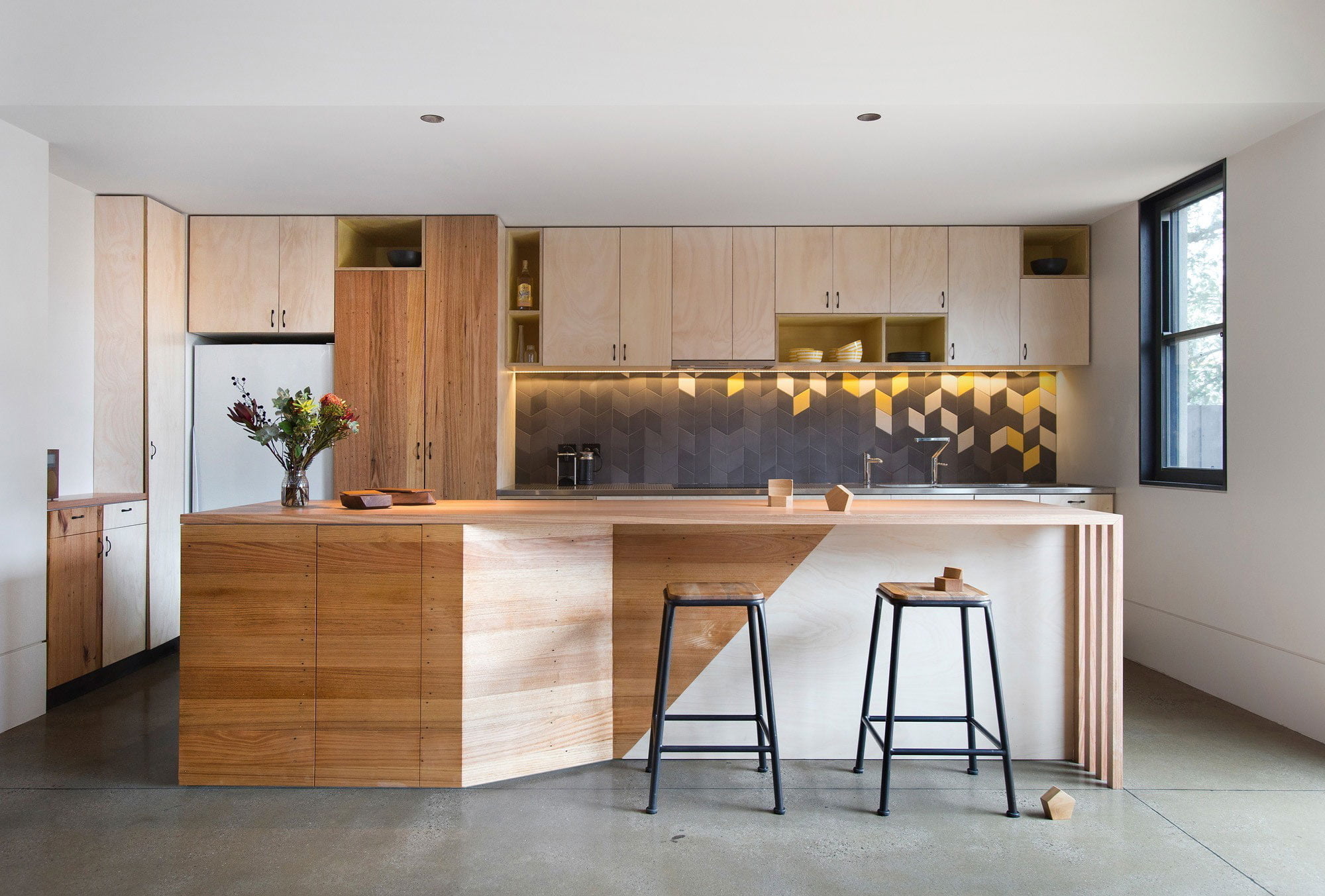
While the look of this modern kitchen almost seems unfinished, the bare wood is a highlight of the bright space. At first it evokes memories of a high school shop class, but the chevron-style backsplash brings just enough of a color scheme to deepen the space and bring out the natural, unstained colors of the modern kitchen cabinets. The slate-gray tiles mesh unbelievably well with the buttery yellow and cream tiles spaced just so. The added focal point of light stain on select cabinetry and the front of the modern kitchen island lend just enough finishing to complete the space. This design proves that the knots and grains of wood alone is enough to modernize a space without going overboard.
7. The Color Block
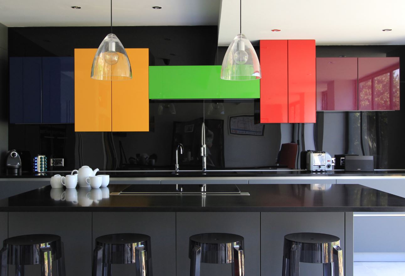
The contrast in this modern kitchen decoration is what brings the space together. Pops of color burst from a black and gray scene. Every surface is slick either by the nature of its material or by the addition of a thick layer of glass-like lacquer. Perfect color selections enabled the designer to create a space that would otherwise be lost in darkness. Color blocking, the use of bright contrasting colors on an otherwise bland background, is the key to making this space jump out at the viewer. Clear glass pendant-style light fixtures provide lighting without detracting from the intended focus of the color blocks. Cleverly placed white accessories (in this case a tea set) add a bit of dimension to the foreground to separate the island space from the back wall.
8. The Sculpted Beauty
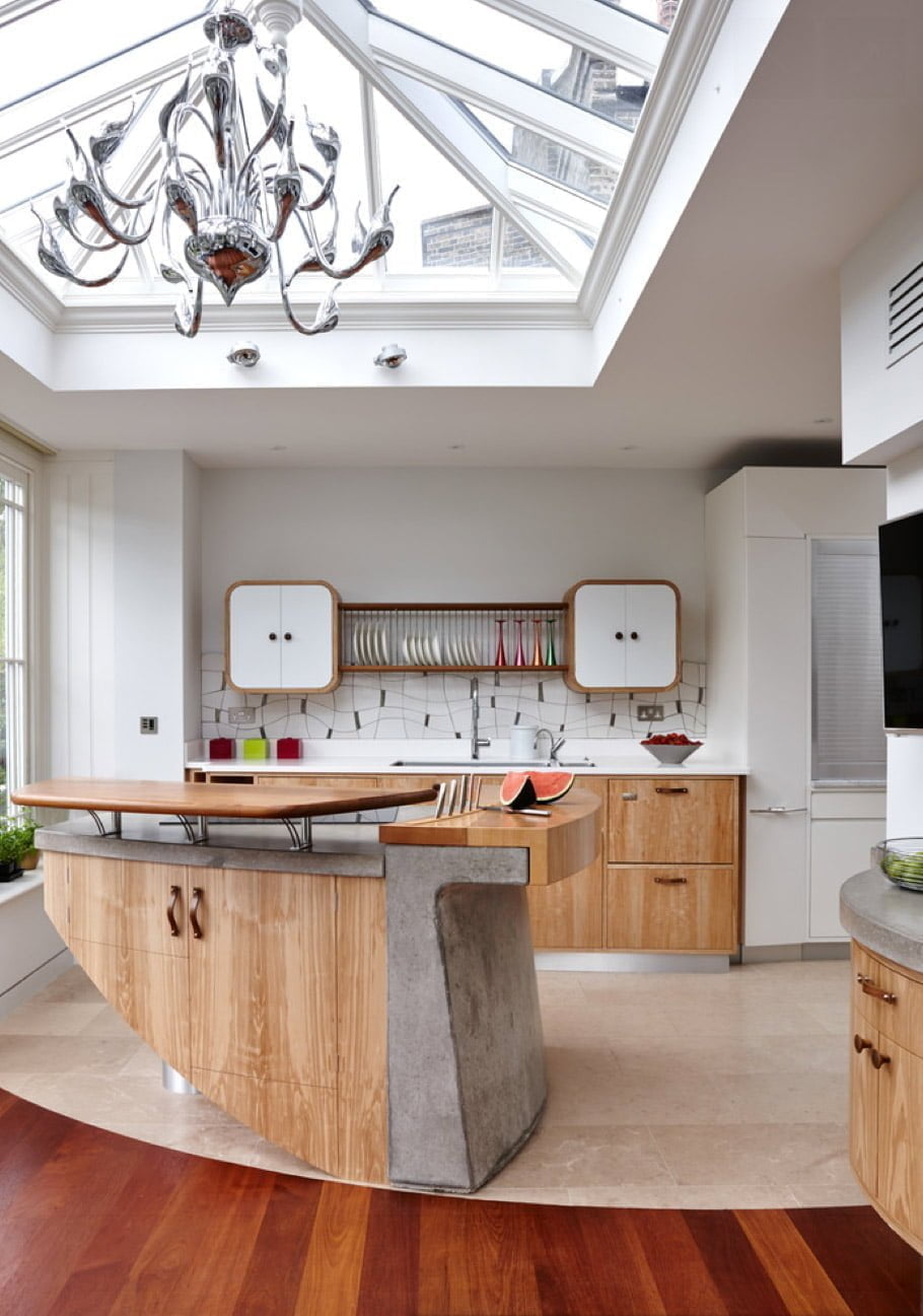
Modern kitchen decoration means sometimes using unusual materials. Many designers in recent years have begun utilizing concrete as a kitchen texture for countertops. However, few have thought to incorporate it into the structure of the kitchen island. This design melds concrete, stainless steel, and wood together in a sculpted island that is a work of art in its own right. Butcher-block style countertops provide a prep surface with the addition of convenient knife storage. Highly modern kitchen cabinets on the back wall provide abundant storage options without detracting from the focus on the artful island. It’s a room that’s light on color variety, but heavy on modernity. The room-wide skylight above provides the perfect lighting source for daytime entertaining while a gargantuan silver chandelier sculpture brings both evening lighting and another piece of true art to the space.
9. The Fuchsia Fusion
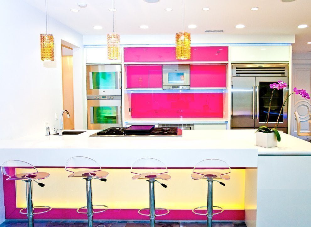
At first glance this space might appear to be some sort of futuristic diner scene. Yet, it is a clear example of how modern kitchen ideas can incorporate both classic and revolutionary styles of design. Bright white and fuchsia are clearly the ruling colors of this space. Super smooth surfaces run from walls to cabinets to countertops and the texture even flows to the clear plastic stool tops. The fuchsia accent on the inset of the dining island adds a nice rush of color in an area the may have otherwise been washed out. Amber pendant lights add a third dimension to the two-tone color scheme bringing together a triad of hues that can only be described as striking.
10. The Espresso Elegance
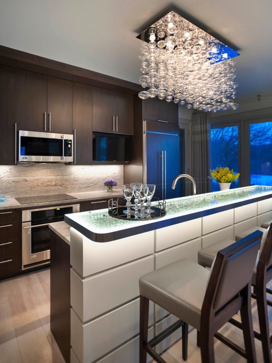
With its deep tones this kitchen proves that espresso brown has still not fallen out of favor in home decor. The timeless combination of espresso tones with stainless steel hardware lends itself well to dressing up a back wall with a lovely marbled backsplash and countertop. To add a bright focal point the designer has chosen to light the space with two impressive pieces. The first is the hanging chandelier composed of hundreds of oblong clear glass orbs. This, combined with the underlit ice glass bar top, provides a beautiful focus around which to center any entertaining event.
11. The Looking Glass
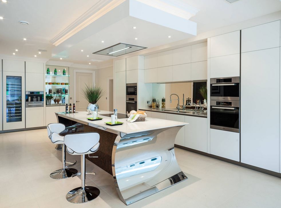
The openness of a space is often its biggest asset. The designer has made use of this fact to make the room look even larger with the use of multiple reflective surfaces. Instead of a traditional backsplash, the area has been opened with the use of oversize wall mirrors above the countertop and behind display shelves that only serve a utility purpose, but also serve as a form of home decoration. This not only makes the room appear to extend beyond the bounds of its walls, it also raises the brightness by reflecting other light sources. Cabinets along the walls are just the right amount of off-white to look pure and clean without becoming overly stark. The true feature of the room, however, is the custom island. Indented end pieces of polished steel continue the reflective theme of the space and the dark cork island front adds a nice contrasting scheme to the cabinets. Ultra-modern appliances finish the look by adding yet another touch of modernism to the design.
12. The Glowing Marble Kitchen Design
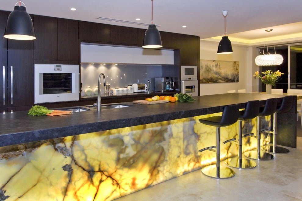
The feature of this space is clear at the first look. A backlit marble island front sets a cool and soft mood for entertaining. The back wall provides copious amounts of storage in gorgeous, dark-toned, flat front cabinets. Brushed nickel appliance fronts and a soft gray backsplash keep the focus on the marble island while still adding to the smooth elegance of the design. Large dark stone countertops provide an expansive area for food prep or an entertaining space. Black industrial-style hanging lamps bring together the look while black matte leather bar stools carry the modern feel to the seating options.
13. Beyond the Sea
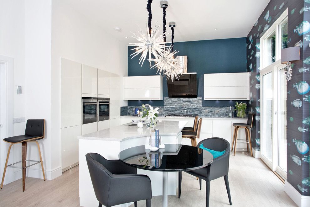
Modern kitchen designs sometimes mean blending an elegant space with a quirky element. This design is no exception. White walls, cabinets, and a kitchen island in the space are broken up by a beautiful ocean blue accent wall in the back of the kitchen. The backsplash melds stones of blue, white, and silver in a mixture that reminds one of ocean waves at the beach. A semi-circular cutout in the kitchen island leaves the perfect space for a breakfast nook for two to share an under the sea dining experience. Sputnik-style icicle lights not only provide a soft light in the space, but also help make the ultra-high ceilings seem cozier. As an added feature to the room, the designer has added quirkiness with a fish print wallpaper on the side wall. This wacky wall casts a fun factor to a room that would otherwise be just another modern design.
14. The Flowing Forties
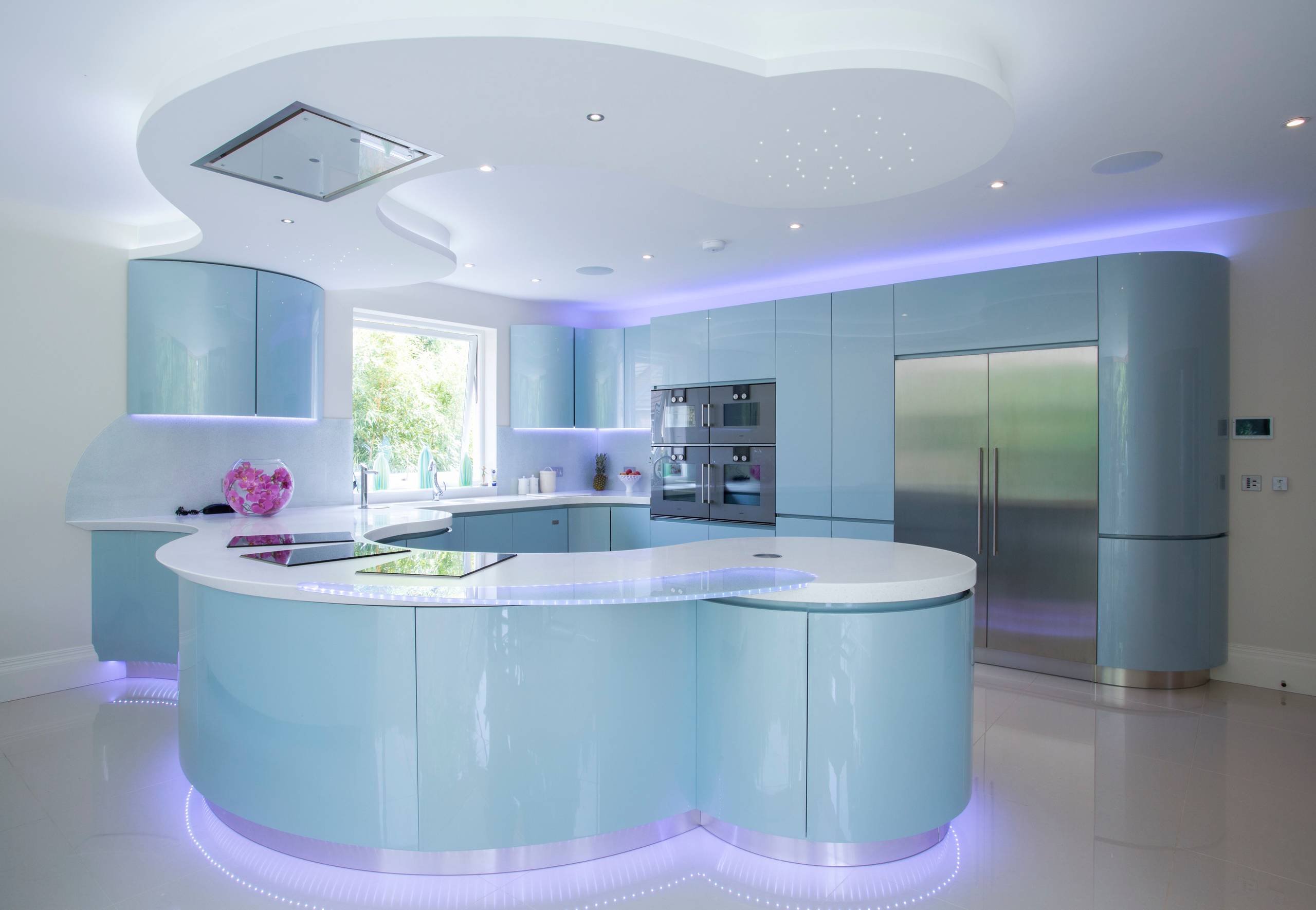
The soft, shiny teal of the cabinetry and island in this kitchen invokes a feeling of nostalgia with a modern twist. With white walls as a backdrop, the almost translucent blue is reminiscent of the hue used to paint many appliances and accessories of the 1940s. The rounded edges evoke memories of the automobiles and airplanes of that decade. No hard corners can be found in this space. The LED backlighting throughout the room offers a soft light that feels like the glow of a neon light. This design shows that the basic design elements of days gone by have not gone away completely, but morphed into the elements used in today’s modern designs.
15. Ebony and Energy Kitchen Design
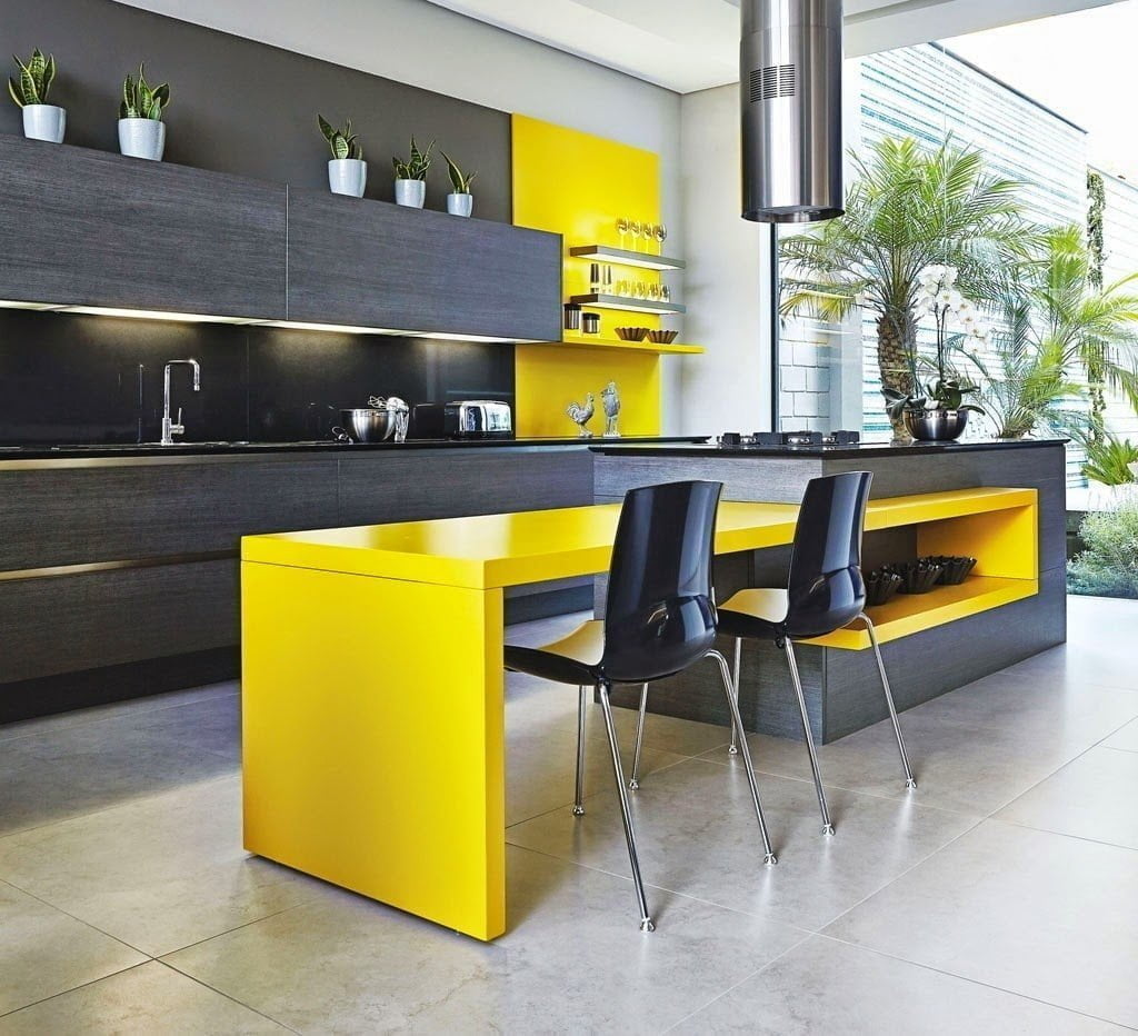
The somber darkness of this kitchen’s color palette is hit with the bright energy of yellow at two points in the room. A jet black wall holds cabinetry with a black veneer finish and black countertops. This wall is broken up with a brilliant yellow accent area. The kitchen island features this same yellow highlight in a dining area built into its side. Both yellow features are painted with a high gloss paint to raise the energy level even more. Beautiful creamy marble floor tiles lend a nice contrast to the dark cabinets and bright highlight pieces. The design is an excellent example of the use of two contrasting intensity levels in one space.
16. The Wishbone
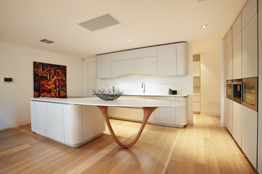
Like many other modern kitchen ideas, this space makes the island the focus of the room. Cream-colored storage areas are cleverly tucked into the side wall to save space while retaining functionality and the same cream color is on the back wall round-edge cabinetry. The designer was cautious not to use a color scheme that would detract from the real feature of the room: the wishbone leg kitchen island. While the island could have been a basic polygon shape, the designer chose to use a gorgeous piece of wood sculpted into a wishbone shape as the leg of the island’s right side. The cedar tone finish of this beautiful wood piece blends amazingly well with the blonde floor boards to create a flow of wood grain through the room.
17. The Pampered Chef
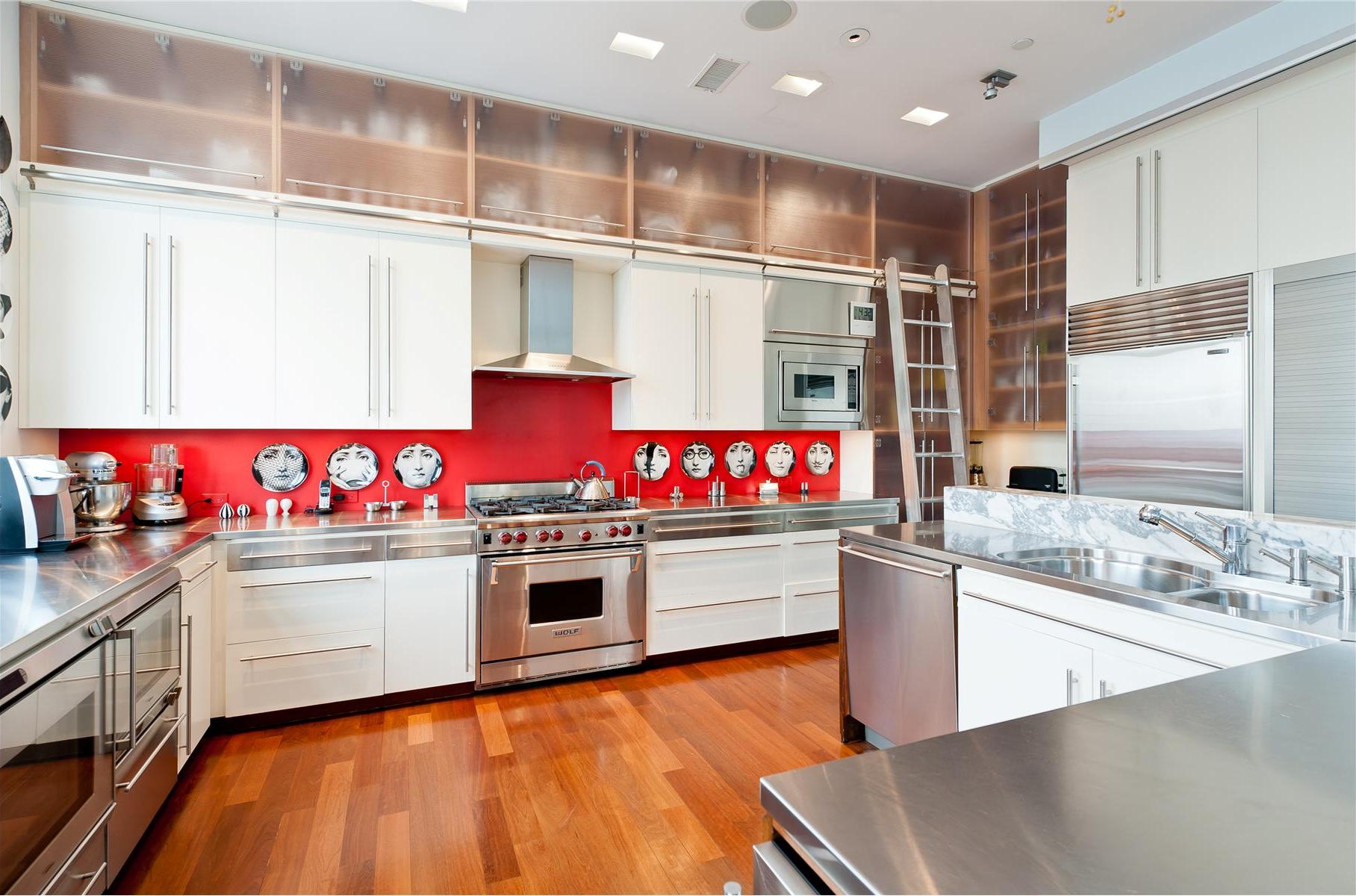
Efficient use of space as a design element is fundamental when modern kitchen designs must also take into account the utility of the space. This full chef’s kitchen demonstrates how a space can keep its full functionality without sacrificing design quality. The skillful use of space above and to the side of everyday cabinetry allows the user of the space to have all of their tools on hand, but incorporates glass cabinet faces to provide a contrast to the wall cabinets. Adding a rolling library-style ladder allows the chef easy access to anything he or she might need. The stainless steel appliances take up a large portion of this kitchen, but the use of the stainless steel countertops helps to keep them blended with the design. The bright red backsplash adds a nice pop of color in an environment that might otherwise look sterile while vintage-style plates hung on this backsplash adds some emotion to the scene.
18. The Clean Slate Modern Kitchen
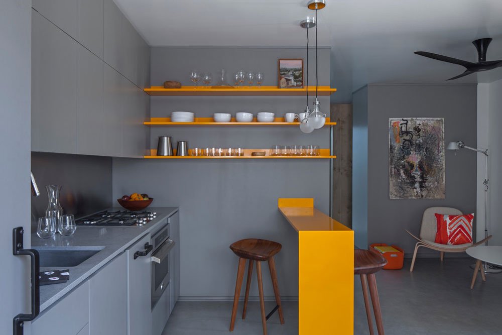
This design shows that gray is anything but drab when used in the right design. The slate-gray tone flows from cabinets to walls to floor. Light orange wall shelving and a mini-island add just a bit of vitality to the design while adding space for storage and a small dining area. A stainless steel backsplash melds with the gray countertop while a small area of stained wood above the sink adds just the right amount of wood grain to accent the wall. A set of two half-frosted globe style pendant light finish the look and provide a delicate source of light for the dining bar.
19. The Sophisticated Splash
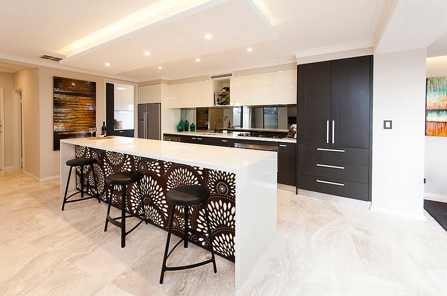
Lacquered white upper cabinets and dark matte finish lower cabinets in this kitchen help to draw the eye down and toward the unique island front. The high-gloss countertop on the island provides a beautiful frame for the splash design laser-cut screen on its front side. The coloring of the screen matches the coloring of the kitchen’s lower cabinets pulling everything together. To avoid drawing attention away from the island’s design feature, the designer has used recessed lighting in the room and a partially-dropped ceiling with backlighting for a bit more glow. A mirror backsplash also helps to reflect natural light to keep the space bright.
20. Layered Dimensions
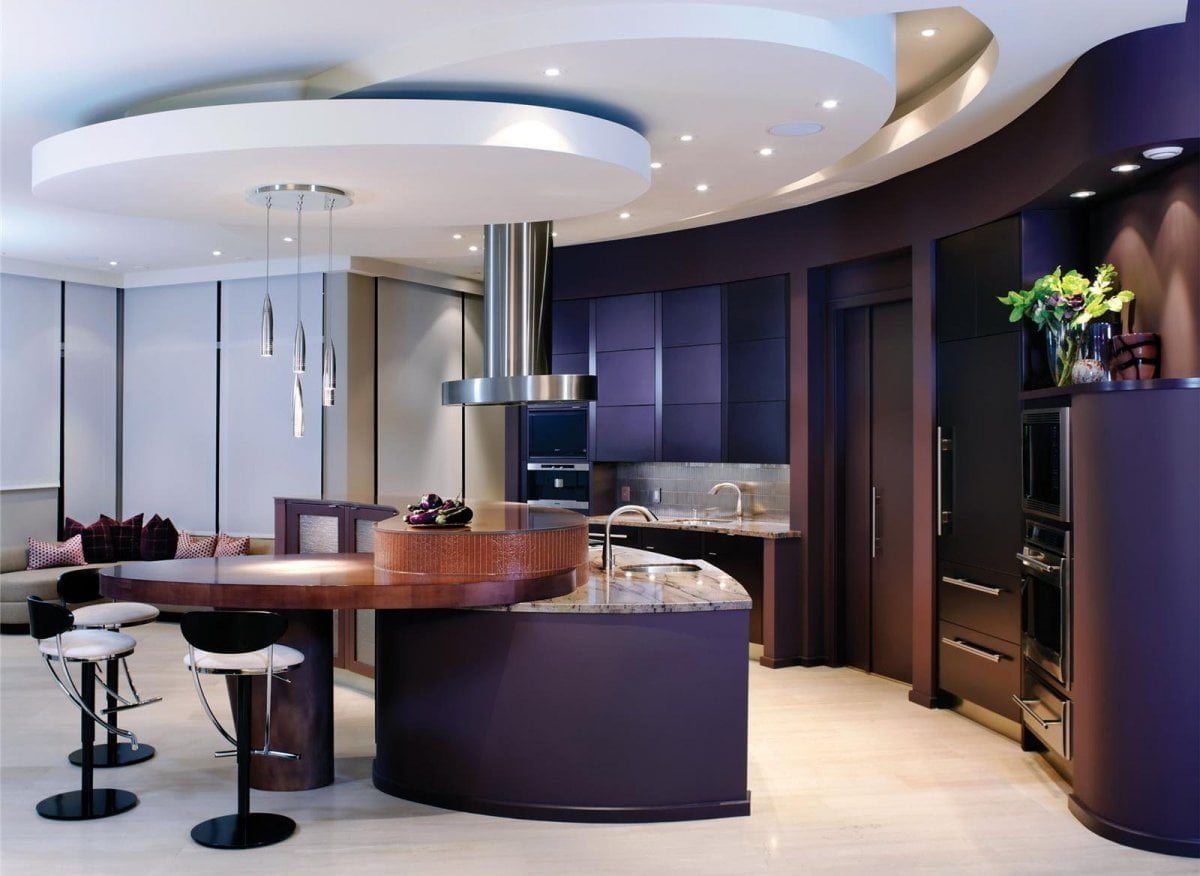
The three-dimensional technique used in this kitchen design layers different materials together to form a stacked effect. This technique begins at the ceiling where different rounded dimensions drop toward the floor in increasingly lower spirals. This spiraling approach ends at its lowest point with the stainless steel range hood and the stainless steel pendant light fixture. Another set of dimensions winds its way upward with the island cabinets. Cabinet layers are stacked with a marble countertop, then a lovely wood piece which juts out to serve as a seating area. This is then topped with a slick-top bar which runs the length of the island providing space for entertaining. The designer has also used this stacking technique in the color palette. Different shades of violet stack together throughout the back wall with different hues on walls and cabinet faces. The stacked dimensions in this design show that the concept of layering is not reserved only for clothing.
21. The Teacup
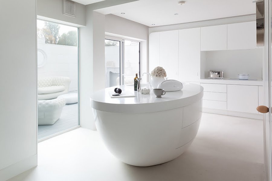
The minimalism in this design ensures that the creative kitchen island is the focal point of the room. Basic white walls, cabinets, and flooring follow the rules of minimalism making the kitchen island seem gargantuan in the space. The teacup shape of this kitchen island is truly unique, but the incorporation of storage space and a sink ensure that it also serves a utility purpose. The minimalist design is carried onto the outdoor patio to make certain the large windows do not allow any non-minimalist design elements to bleed in.
22. The Limelight
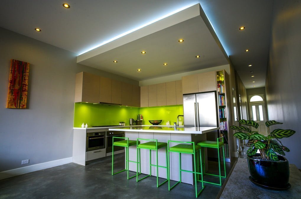
The bright lime green accent color of this space pulls in the eye and makes the space seem larger. Lightly finished cabinet faces make a nice boundary between the gray-blue wall color and the green backsplash. A lack of counter space has been aided by adding a large kitchen island which also serves a purpose as a seating area. The nearly-neon island stools draw more of the wall’s accent color out into the room. Gray walls outside the space and on the front of the island are an excellent complement to the brightness of the green. A dropped ceiling with backlighting helps to keep the space separated from the rest of the open floor plan.
23. The Cedar Hug
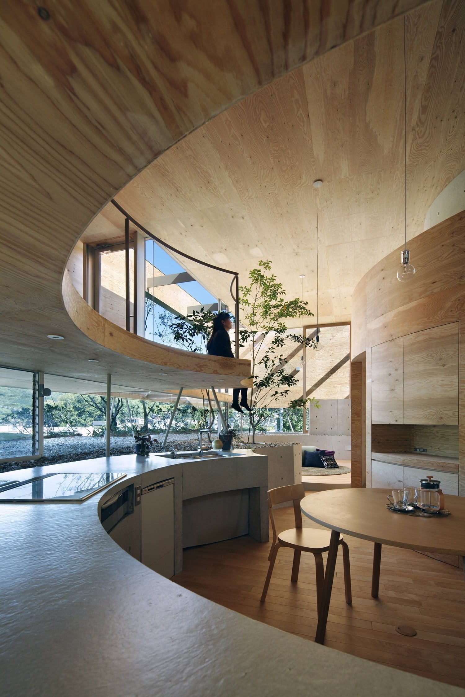
The circular shape of this room is meant to provide a feeling of protection. Cedar-paneled walls wrap around the space like a warm hug. A wooden cat walk from the loft level above extends above the kitchen counter area. Slate-gray countertops are composed of a rippled painted concrete surface. The area behind the kitchen counter serves as a rock-filled planter where trees grow within the living space. Plenty of natural light flows in from the multi-level plate glass windows, but simple clear globe pendant lights provide more than sufficient light at nighttime.
24. The Brick and Mortar
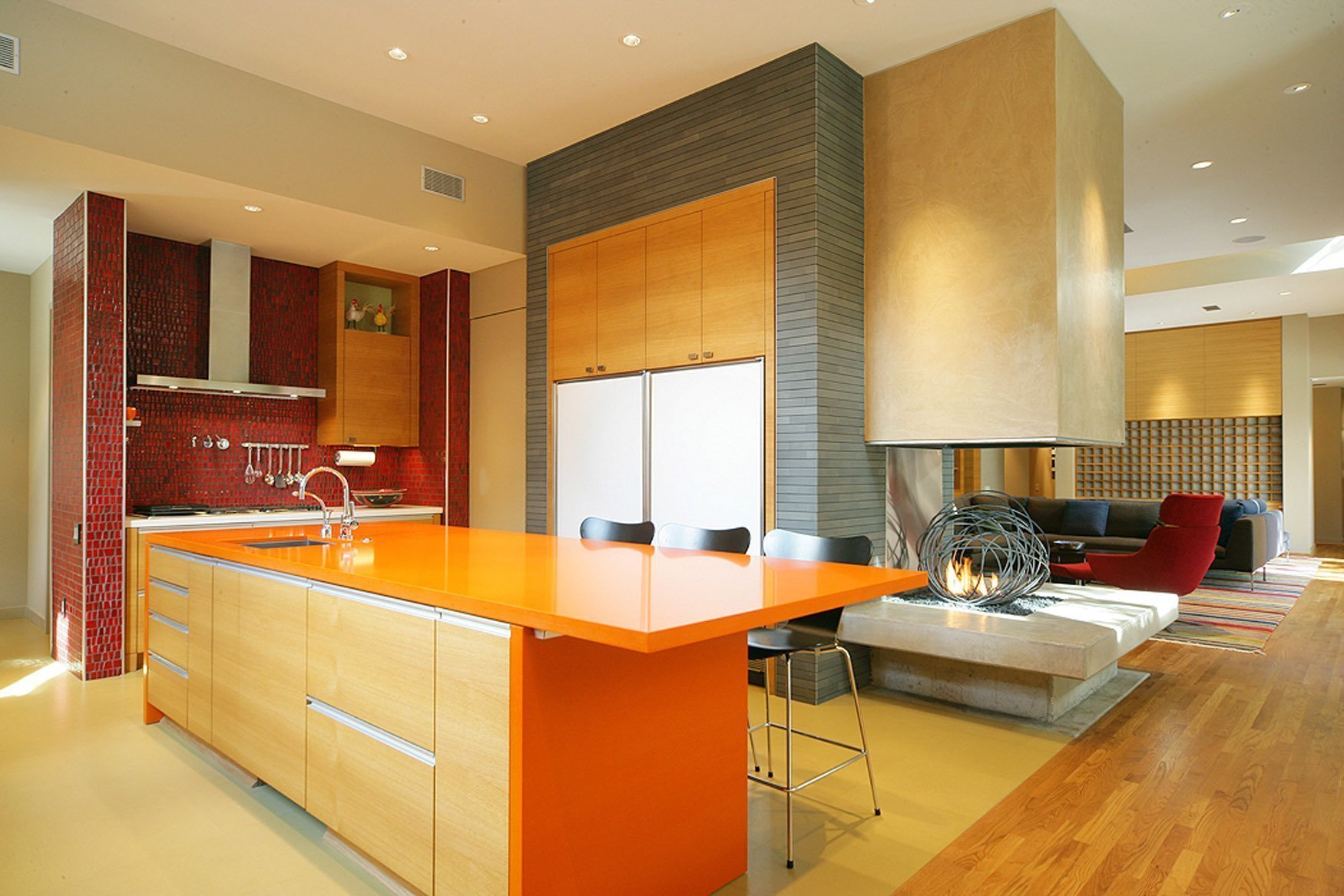
Many modern kitchen ideas make use of materials or styles that have been used for centuries. This design is one example of how these materials can be combined with modern materials to great effect. A beautiful gray brick wall fills the side wall of the kitchen and carries through into the adjacent living area. The back wall, tiled in a mosaic that resembles classic red brick, puts a punch of warm color into the area. The kitchen island’s toasty orange countertop brings together the brick red and gray in a triad of boldness. On their own, the red and gray might have blended into the background, but the orange makes all three seem bold. While the room has many features that mingle into a modern blend, the fireplace shared between the kitchen and living space finishes the room’s look. The wire sculpture in the flame box sets this fireplace apart from others.
25. Posh Polish Modern Kitchen Idea
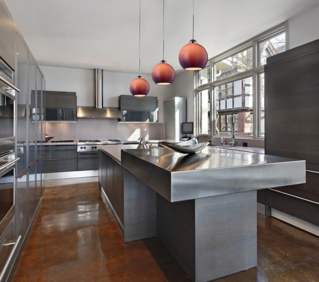
Smooth, polished surfaces are a big element of modern kitchens and this design is no exception. A fluid-like stainless steel island top begins the look with some cabinet faces carrying the same polished feel. Other cabinet faces have been finished in a smooth, but not shiny slate finish. Concrete floors have been stained a deep brown, coated, and polished until they shine. Appliances have been carefully chosen to match the stainless steel on the island and they blend seamlessly into the space. Ombre pendant lights hang over the island and add a reddish accent to the room.
26. The Cozy Cove
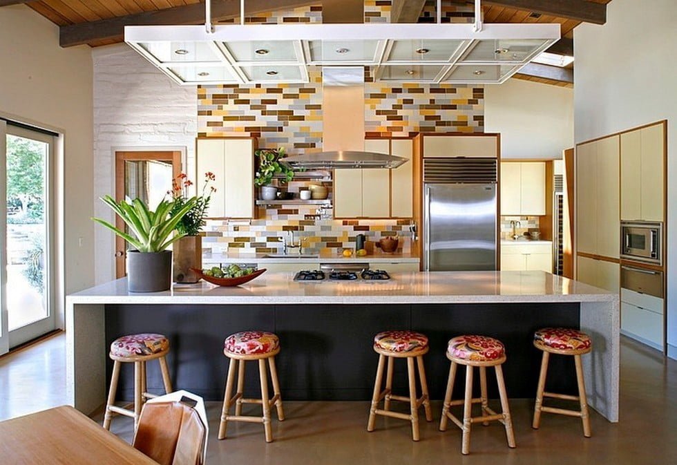
Some kitchens just remind us of home–cozy, comforting, and warm. The designer of this kitchen has invoked that feeling by mixing vintage styles with modern elements. The use of subway tile is a classic element that the designer of this kitchen has used to create a more modern mosaic of different earth tones on the back wall. Utilizing vintage-form cabinetry kept the home’s classic feel, but the stainless steel appliances and vent hood update the look. A modern dropped lighting feature blends old and new styles together for a unique look. The Corian kitchen island top is accentuated by bar stool upholstered in a vintage fabric to keep a homey feeling in the space.
27. Only Slightly Green With Envy
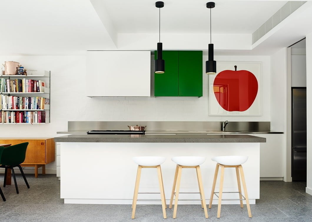
A kitchen doesn’t have to be extravagant to be modern. Even small spaces can take on a modern look with the right design. This kitchen keeps it simple with white walls, white cabinets, and a white island base. The island’s top is made of a gray granite counter and serves double duty as a prep area and seating area with basic wood and plastic bar stools. A stainless steel countertop and backsplash keep things simple on the back counter. The real strength of this space comes from the deep green color of the single cabinet on the back wall. This combined with the red apple art print provides the simple amount of color needed to turn the space from bland to bold. This design demonstrates that keeping things simple works just as well as creating a complicated design.
28. The Wooded Wonder
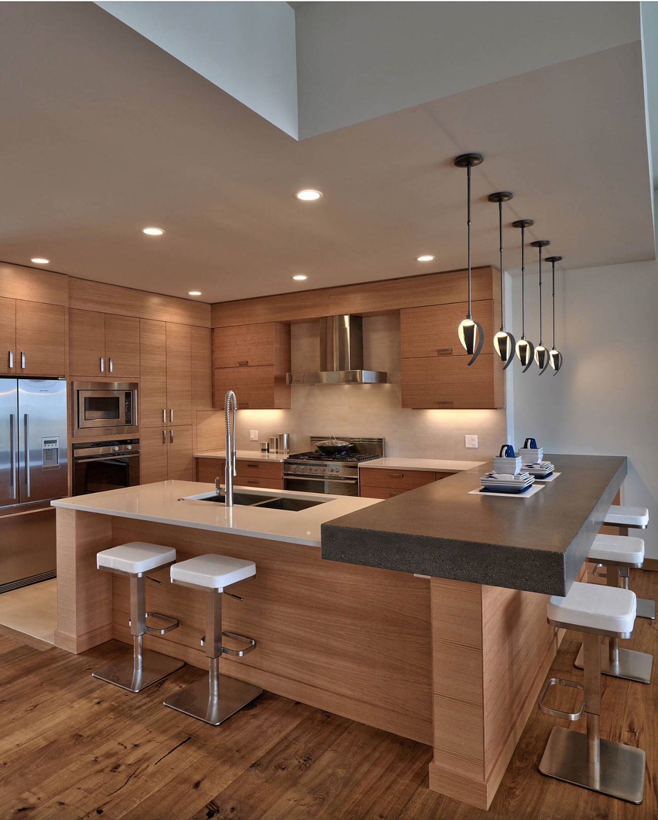
The elegance of light wood in this space combined with the dark island counter and the creamy lightness of the countertop and backsplash make a striking combination. Keeping the wood surfaces unpainted allows the perfect grain of the wood to shine on its own in the cabinets and island face. On its own, the wood surfaces could be from any era of design, but the modern countertops and stainless steel appliances bring the look to the modern era. Ultra-modern bar stools and artful pendant lights fully accessorize the room and ensure a contemporary style.
29. The Cube
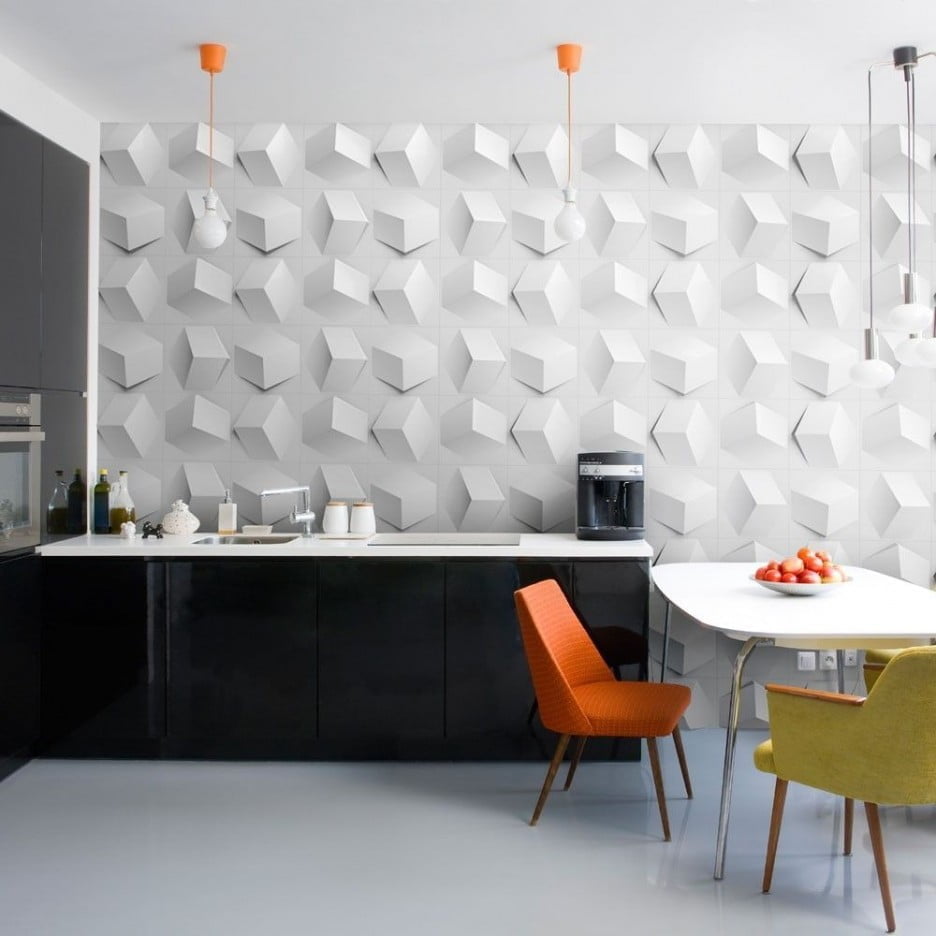
Originality is a big part of modern kitchen design. The wall paneling used in this design assures a uniqueness that cannot be matched. Three-dimensional cubes jump out from the wall in random orientations for a rare composition. Shiny black cabinets and white countertops keep things simple to avoid any distraction from the geometric feature of the room. For a flit of color the designer has added incandescent pendant lights which hang from bright orange fixtures. The pop of orange has been carried into the room with the upholstery of one of the chairs while the other chair’s golden color complements the palette.
30. A Kitchenette Keeper
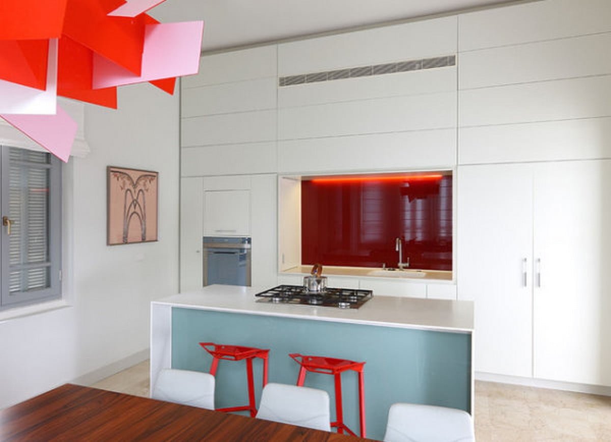
It can be difficult to give kitchenette spaces a modern makeover due to their small size. However, two tricks have been utilized by this designer to make a modern small space. First, the most efficient use of space not only ensures there will be enough storage for kitchen gadgets and tools, but also makes the space seem larger. The designer has created as much built-in storage as the space will hold. Extending the cabinetry to the ceiling makes the room look much taller than it actually is while eliminating any wasted space. The second trick used in this space is the use of a bright color and keeping the tones used in the room to a minimum. Utilizing white for the walls and cabinets opens the room while the use of two small areas of accent color adds depth without shrinking the space. The light blue on the front of the island keeps the palette cool. The dark red backsplash wall adds extra dimension to make the room seem as though it recesses deeper into the wall.
31. Modern Mesh
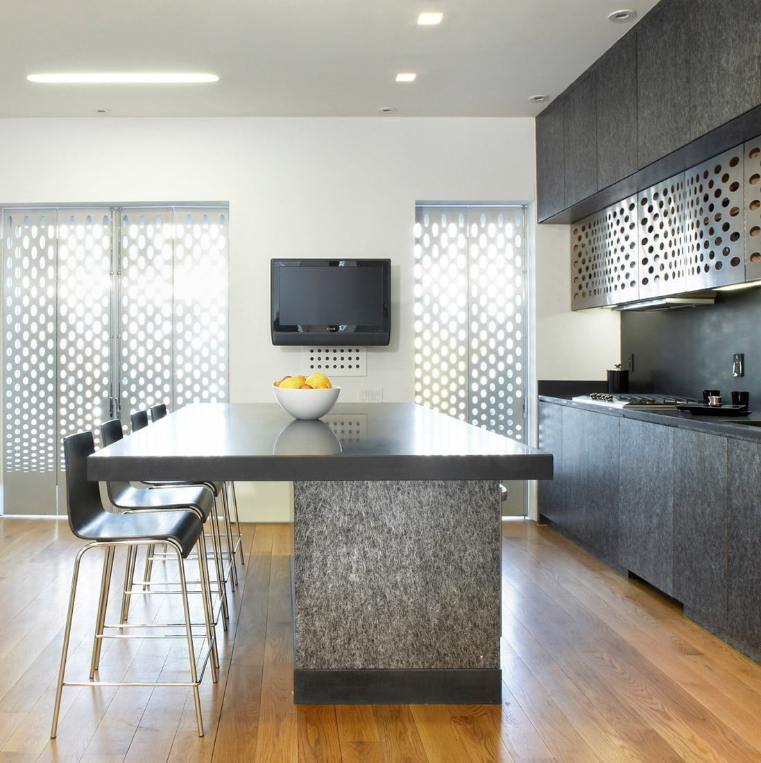
It’s rare to find the use of metallic mesh as a design material in a kitchen, but this design shows how when used appropriately it can add an original look to an otherwise plain space. To complement the light wood floor, the designers chose dark cabinetry. Cabinet and island faces have been finished in a granite-style veneer typically used on countertops. The oversize kitchen island provides more than ample seating ability and is topped in a dark marble. Stainless steel mesh is the cabinet face of one set of cabinets and the same style of mesh with a black powder coating plays with the light through the windows while serving as folding window shutters. The combination of materials not normally used in kitchen designs creates a unique look in this space.
32. Totally Jaded Kitchen Idea
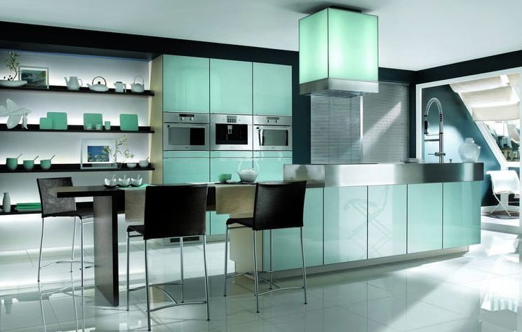
The black and white elements of this room provide a nice level of contrast as the backdrop to the jade accents. The design begins with a deep black wall color on every wall of the space. This is opposed by white in two areas: the white wall of the inset shelves on the back wall and the smooth white floors. Stainless steel appliances and accenting on the island provide a third texture to the design. However, the true beauty of this kitchen is the jade backlighting and the inclusion of jade accessory pieces on the shelving unit. Jade-green acrylic paneling installed on the back wall, vent hood, and the face of the island are backlit with LED lighting emitting a soft green glow not unlike the tint of antique uranium glass. Asian influence is clear in this design from the color scheme to the choice of accessory pieces on display.
33. The Tight Treasure
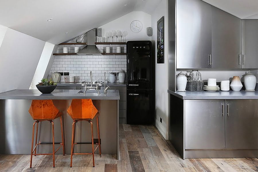
Tight spaces and odd shapes can present a challenge when thinking about modern kitchen ideas. In order to make this space appear larger, the designer has used a reflective surface, stainless steel, to provide optical depth and to resonate the existing light. Some spaces can be made to appear larger with the use of mirror glass, but the shape of this space and its unique orientation may have looked like a mirror maze if surfaces were too reflective. Subway tile on the as the backsplash helps the back wall appear wider and grout lines separate the back wall from the white side wall. The use of a jet-black refrigerator keeps the stainless steel look from becoming too overwhelming. Reclaimed barnwood style flooring installed lengthwise contributes to the illusion of depth. The island stools incorporate both copper metal legs and a wood color that has just enough orange tint to provide a nice accent to the room.
34. Glamorous in Gray
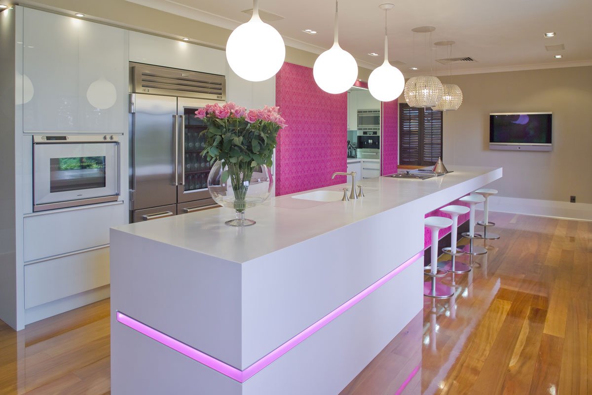
A gorgeous gray combines with pink and fuchsia in this space for a glamorous ambiance. In some instances, the use of gray tones in a space appears more masculine, but a coating of shiny lacquer on the cabinet faces adds just enough femininity to the look to create a glamorous styling. A kitchen island that might otherwise look plain is accented by a pastel pink inlay to cut the plane of gray in half while a frilly fuchsia wallpaper makes the back wall and island front stand out. The hard, clean corners throughout the room are contrasted by the round globe pendant lights above the island counter. Their drop-like shape reminds one of a glowing water balloon filled to the brim. Two crystal mini-chandeliers over the island’s built-in dining space add a bit of elegance and a softer lighting source for a glamorous dining experience.
35. First-Class Forever
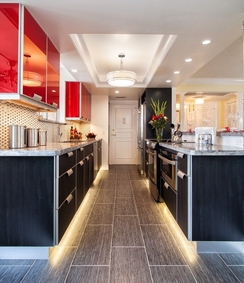
The jet-setter inspiration is clear in this space. The curved stainless steel cabinet hardware is reminiscent of those on overhead bins in a luxury airliner while the shape and acrylic facing of the deep red upper cabinets evoke memories of a flight attendant’s galley area. Gorgeous lower cabinets finished in a dark veneer draw the eye toward a floor of wood-grain influenced dark gray tile. Under cabinet lighting close to the floor calls to mind the runway lights of a busy airport at landing and takeoff. A unique backsplash wall composed of small rounded bulging tiles shares similarity with the shape of a luxury jet. In modern kitchens inspiration can come from anywhere and this designer’s vision is clear as the clear blue skies.
36. Century 22
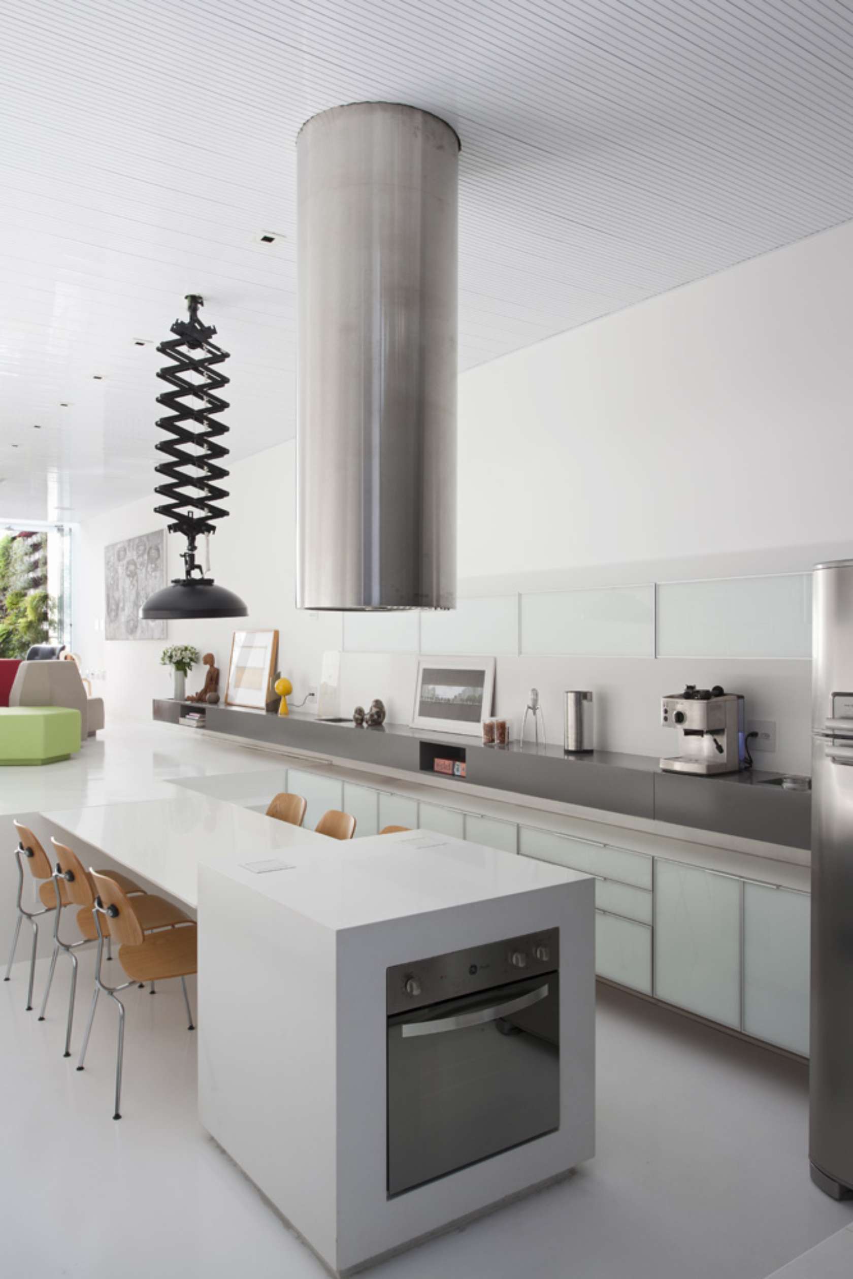
The futuristic architecture of this home becomes a design element used to unite the kitchen and living area in a creative use of space. The color scheme falls closely in line with minimalist standards with white being the prominent color throughout. However, there are clearly other colors in use as well. A large gray shelf separated from the lower cabinetry by a distance of about six inches lines the wall and serves as a countertop. Stainless steel appliances and a black accordion extension light break up the white space as well. A vent hood ahead of its time comes down through the ceiling to keep the area fresh. The most unique aspect of this design is presence of an open room immediately adjacent to the kitchen. This room’s floor is elevated to about half the height of the kitchen walls and is entered by walking up a small set of steps. The table top of the kitchen’s dining area is actually an extension of this second room’s floor uniting the two spaces while still keeping a bit of separation. Lots of natural light provided by large plate glass windows in the living area help to keep both spaces open and well-lit.
37. Fresh Woods
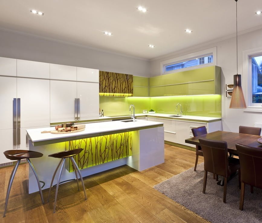
The open floor plan of this design is broken up by a one-of-a-kind kitchen island. The color play between white, chocolate brown, and chartreuse is a very pleasing combination. White wall storage units provide ample storage while keeping the focus on other features in the room. Chartreuse cabinets and backsplash provide a lovely complement to the white storage units and countertops. This same beautiful chartreuse green is included in a small band under the countertops and under the island top to break up some of the whiteness. The true feature of the design is the wood print stencil work on the front of the island and above the range top. The way the chocolaty brown pops out from the chartreuse provides an eye-catching art piece. While most of the room’s light comes from recessed ceiling lighting and backlighting under the cabinets and island, retro-inspired pendant lights hang above the dining table like 1960s space vehicles.
38. Black and White and Red All Over
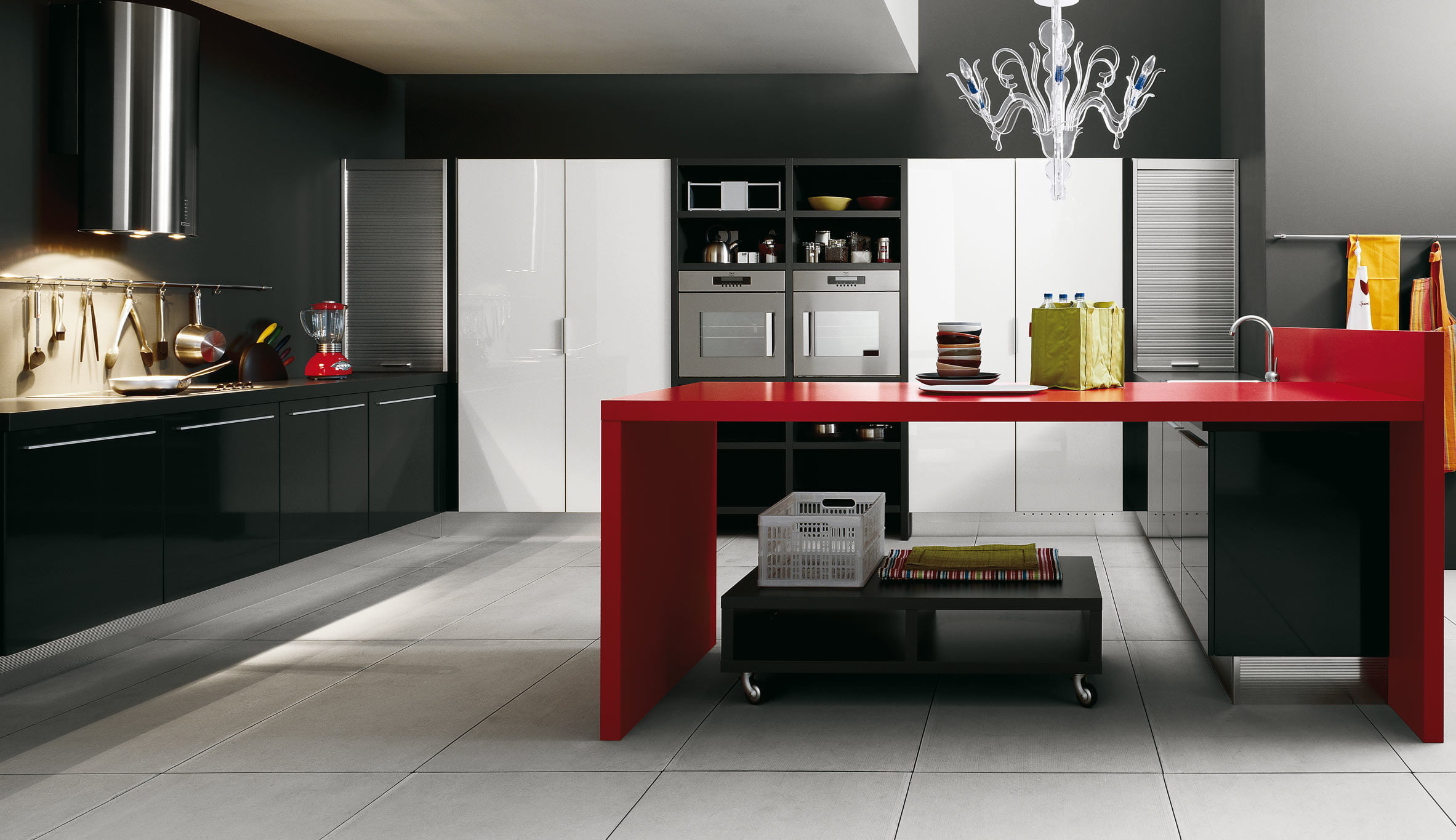
Painting a room black was once frowned upon in the design field. However, in modern designs black has become the new black. The dark wall and cabinet color in this space helps to make a large space appear even larger. White roll-out storage cabinets along the back wall break up the darkness of the black while providing superior storage options. Roll-down stainless steel doors in each corner provide additional storage as well as including a design element not typically found in home kitchens. A hot red peninsula area is perfect for entertaining or use as a prep area. The use of high gloss paint on all cabinets, doors, and the peninsula creates a fresh, modern look. Bright lighting from a futuristic range hood provides excellent lighting on one end of the kitchen while an artistic acrylic chandelier over the peninsula provides a stylish source of light on the other.
39. Room With A View
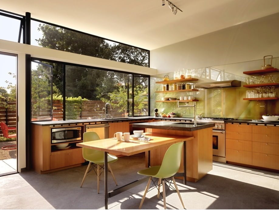
With a full wall of large windows and a gorgeous view, this room is all about openness. Rather than upper cabinets that might restrict the view, the designer has opted for open shelves to keep the open flow. These are hung on a backsplash made of clear acrylic panel to allow the walls original color to show through. Gray Corian countertops sit atop lower cabinets finished in a shade of stain that pulls in elements of the outdoors inside. The kitchen island provides a small prep area, but the majority of the island is reserved for an open, table-like dining area. Light green plastic and wood chairs also bring in some of the green hues seen through the crystal clear windows. With so much natural light, the designer has opted to keep lighting options simple with a strategically-placed set of track lights in the center of the room. Simplicity in this room is what makes the design work without detracting from the outdoor view.
40. The Warm Winter Day
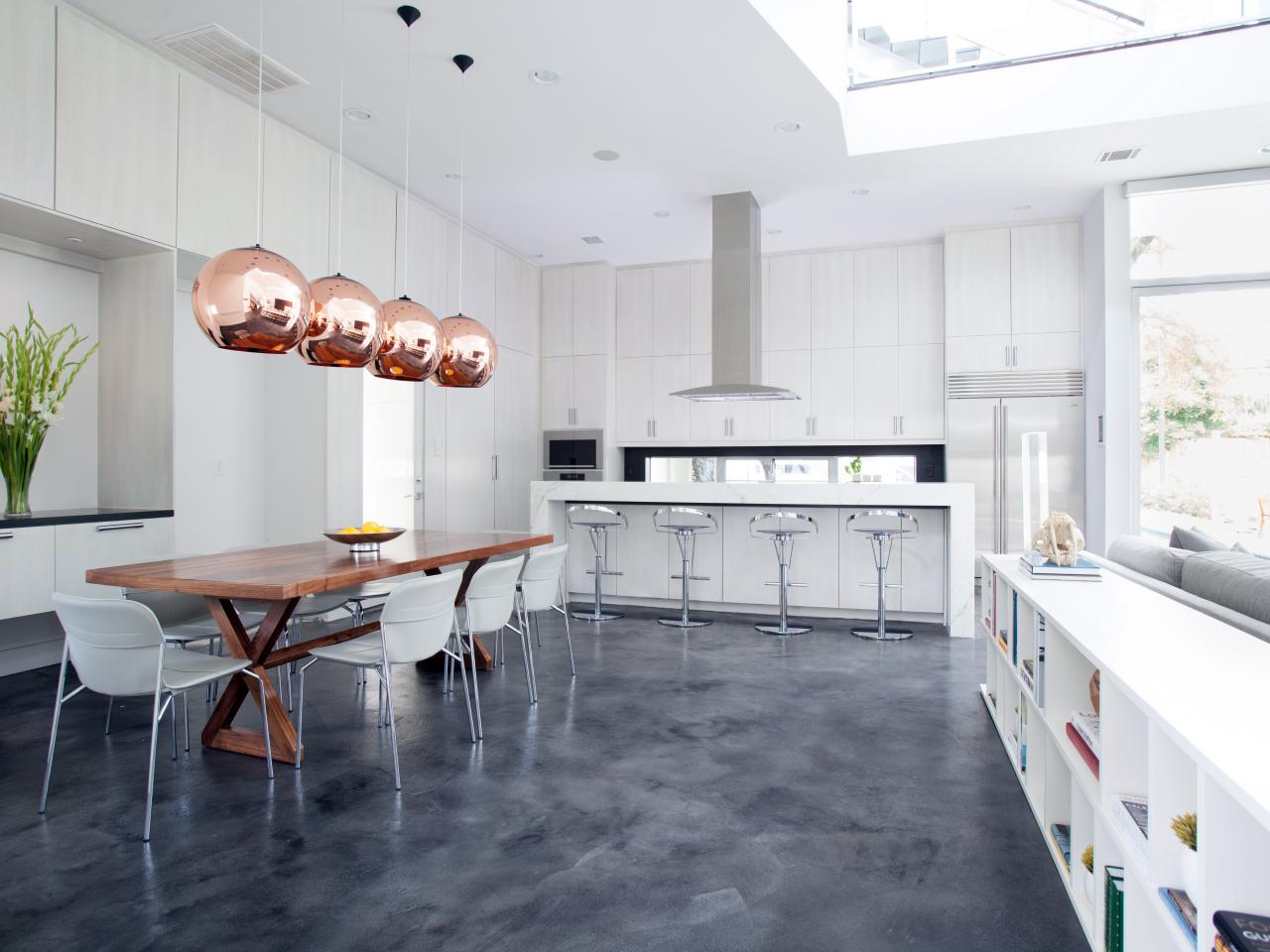
White walls, cabinetry, and shelving create a blizzard of beauty in this fully open kitchen and dining space. The large marble-top island provides an additional luxurious seating option away from the massive 8-person dining table. While the island helps to keep the cooking area separate from the dining space, the openness still allows a flow of conversation between the two. A set of four brass light fixture hang from the ultra-high ceilings to provide an intimate lighting scheme over the dining table. Cubic storage shelving in the dining area grants additional space to display books and decor to personalize the space. Painted and polished concrete floors provide a base upon which the pure, white winter scene is set.
41. The Market
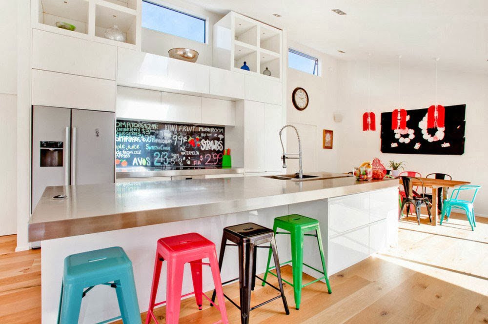
Built-in white cabinets and shelving reach to the high ceilings of this space providing storage and the opportunity to display design accessories. A backsplash made of a fruit and vegetable market chalkboard has been covered in a clear acrylic panel for a fun and unique design element. This same fun element is reflected in the metal bar stools and dining chairs painted in bold colors to match the chalkboard text. The stainless steel island top and countertop keep the market feel going through the entire design. Finally, a light pine floor resembles those on the floor of many old-fashioned fruit markets.
42. Slicked Black
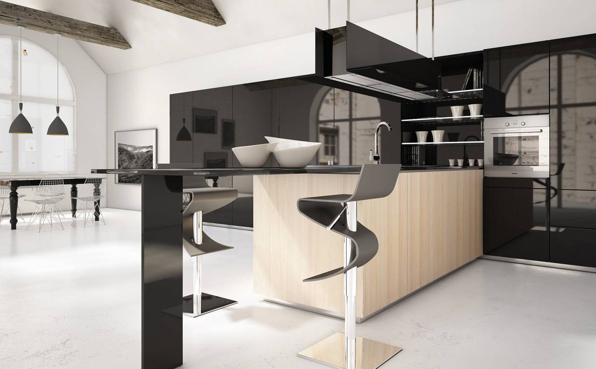
A nearly-full wall of jet black acrylic cabinets and panels and a black acrylic lighting feature gives this space a sexy modern mood. The interplay of white walls and floors against the black adds to the sexiness and kicks up the contrast. Light wood facing on the island tones down the divisiveness of the two colors in the room just enough to help them get along. Zig-zag shaped stools at the thin-lined dining bar add to the seductive nature of the room.
43. Splat
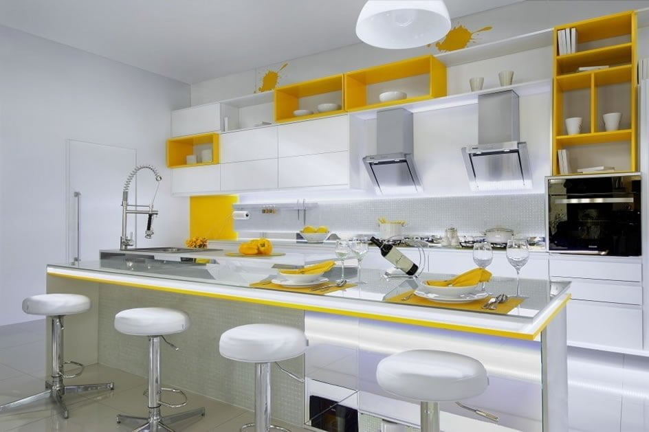
Modern designs can take a basic, plain space and enhance it by adding a simple element. Bold and bright yellow placed here and there in an otherwise white space provides the perfect brush of color on a seemingly blank canvas in this kitchen. Picture the space without the yellow accents and you can quickly see how the simple addition of a bold color has turned the look of this room from basic to daring. This daring move is continued with two fun paint splatter stencils above the cabinets to keep the design from being taken too seriously. A mirror island top and perfectly-placed under cabinet lighting and modern bar stools only serve to give the space even more personality.
44. Fully Exposed
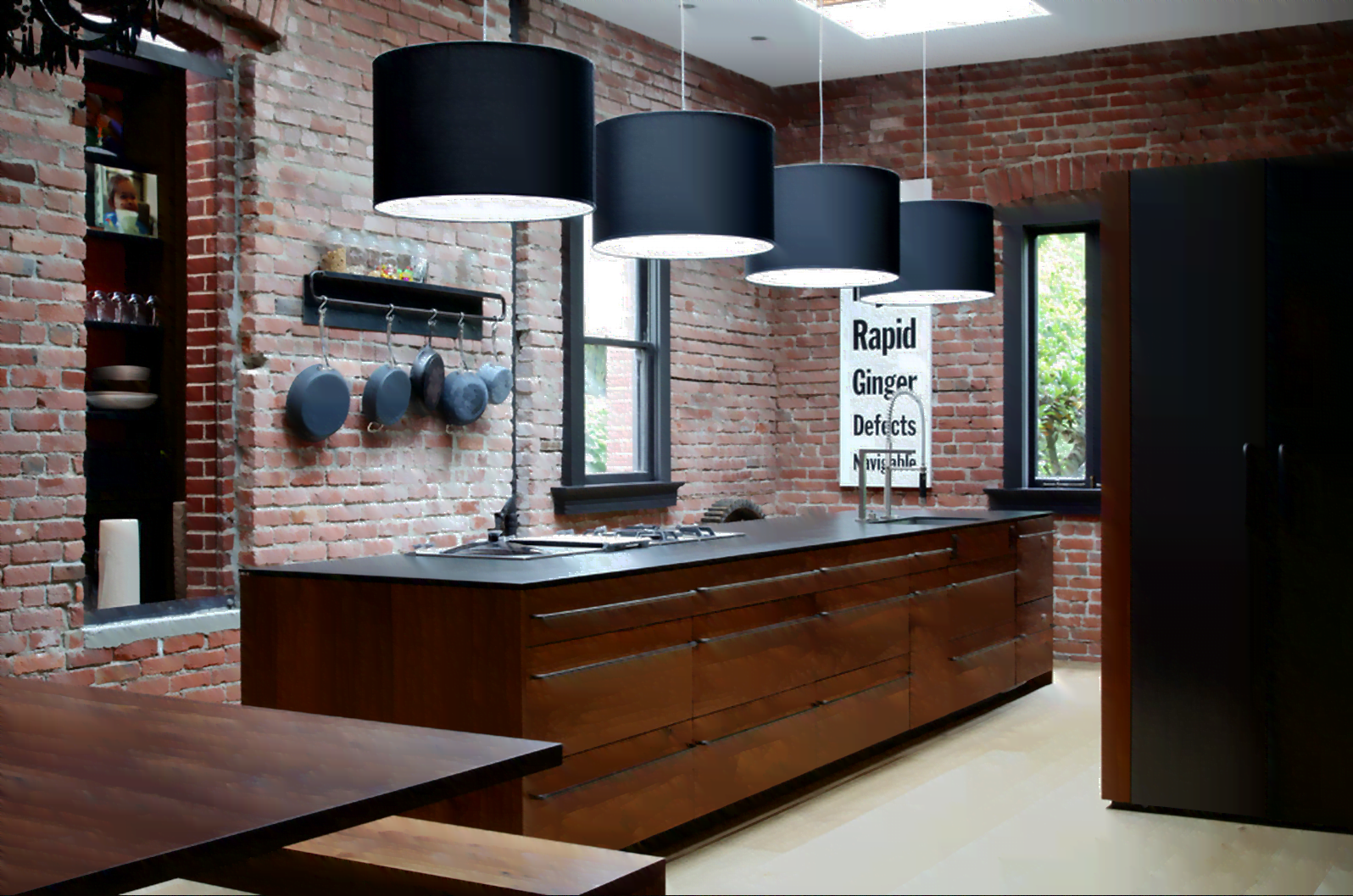
Exposed brick makes a beautiful backdrop for a modern kitchen. The material works so well with so many colors and textures that it is difficult to go wrong in a brick-lined space. The medium dark stain on the wood pieces in this room play off the dark red in the bricks to make a classic combination look new again. Black trim, countertops, and accessory pieces match the tone and texture of cast iron to remind of days when brick was the building material of choice. Looking at the room with only these elements, it would be hard to tell whether the kitchen was from an old photograph or a modern design. However, the addition of large, black barrel shade light fixtures leaves no question that this design is a 21st century look.
45. Basic Geometry
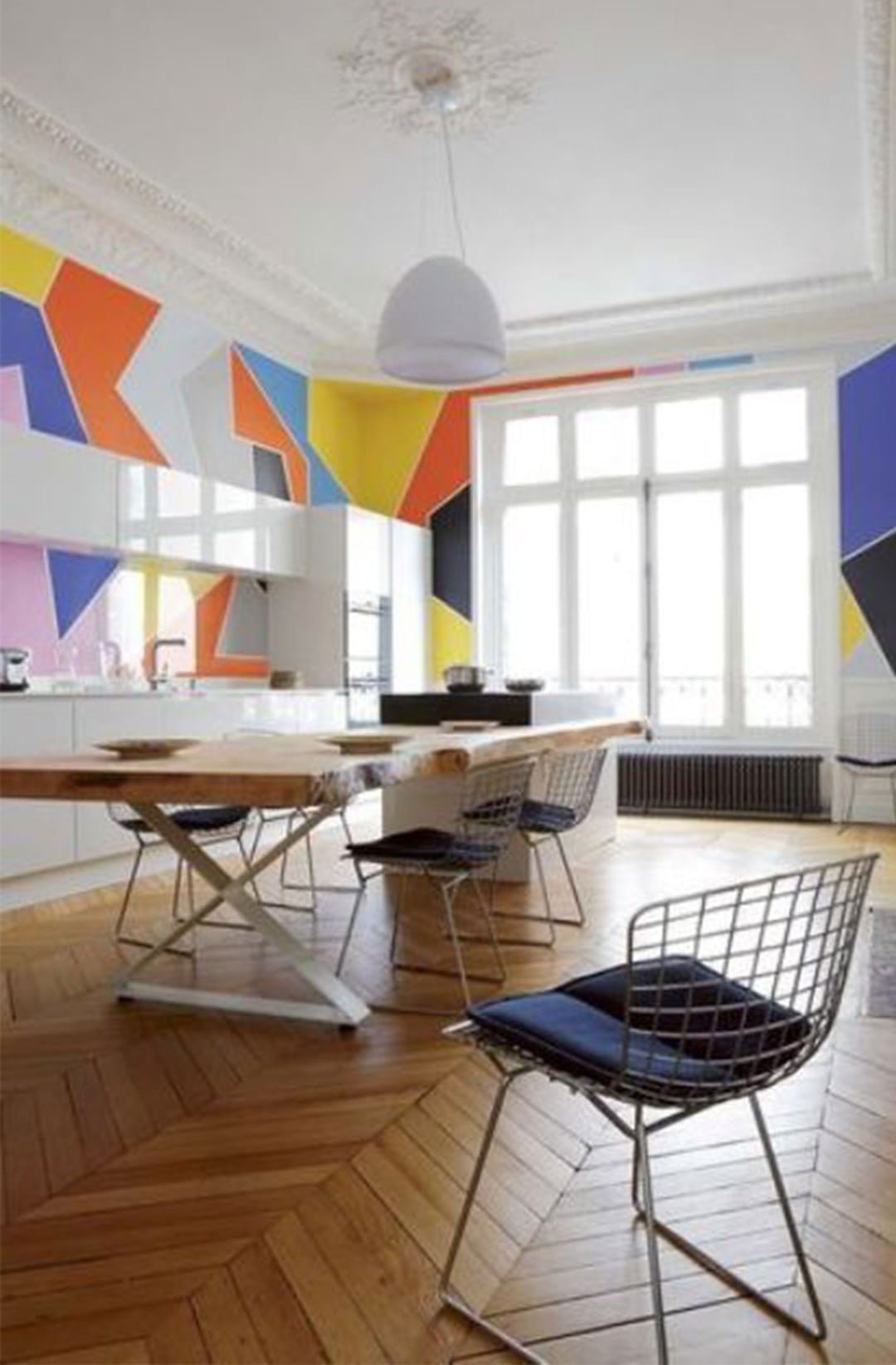
Geometric shapes have been utilized in design for decades coming in and out of fashion. With modern design, they are definitely back in. The plain white cabinets in this space have been enhanced by the addition of random geometric shapes in slightly muted tones. It is a revival of the art deco style of the 1920s, but bold colors have been slightly subdued in modern designs and the patterns have been limited to accent pieces. The chevron shapes of the wood floor add to the classic feel and push the eye to the large open window at the end of the room.
46. The Tasty Two-Tone
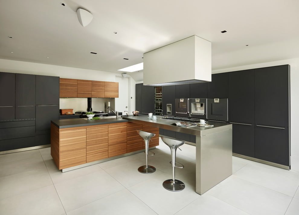
Black cabinets throughout this space stand out in contrast from the white walls. But the real eye catcher here is the two-tone cabinet design. A mix of dark and light woods in horizontal lines face the cabinets and part of the kitchen island. The remaining part of the island is composed of stainless steel and is joined by modern stainless bar stools to add to the modern ambiance. A large block light feature protrudes from the ceiling and casts an intimate source of light over the island’s dining area.
47. Puddle Of Steel
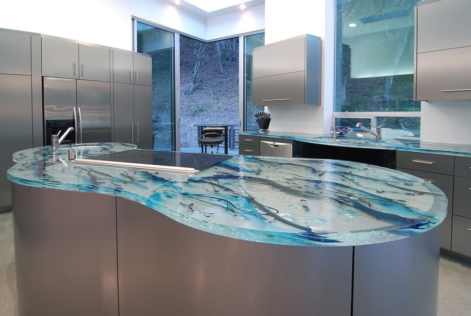
Stainless steel cabinets line the entirety of this modern kitchen and a puddle-shaped kitchen island carries the same stainless steel material. The coolness of this steel wonder is enhanced with countertops made of artistic glass. Pollack-inspired paint drips in different shades of blue seem to be frozen inside the icy glass tops. With its chilly feel, this kitchen looks like the perfect place to find cool refreshment on a hot summer day.
48. Perky Paneling
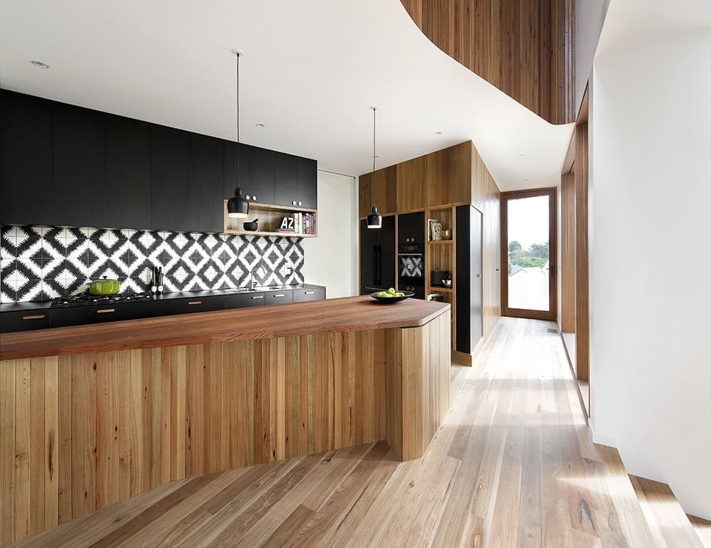
Faced with a gorgeous multi-tone wood paneling, the large island in this kitchen pulls inspiration from the wood paneling throughout the remainder of the home. A butcher-block style countertop on the island ensures this wood theme continues on every side. Black matte cabinets line the back of the kitchen adding to the modernity and to avoid overdoing the paneled look. A diamond design has been tiled onto the backsplash using tiles with a black and white scribble pattern. The black and white create a modern version of an accent wall to draw the viewer deeper into the long but narrow space.
49. Radioactive Marble
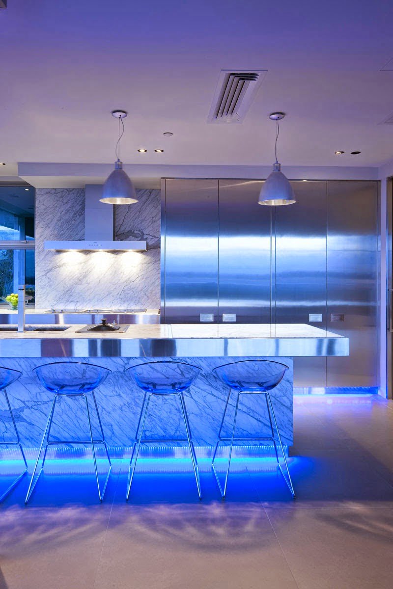
Lighting plays a huge role in designing a modern kitchen and can mean the difference between a basic design and an amazing design. No design demonstrates this more than this space. Stainless steel floor-to-ceiling cabinets cover half of the kitchen’s back wall. A cream and gray marble backsplash covers the remaining wall adding a sophisticated air. This same marble has been used as the top to the large kitchen island and stainless steel edging ensures both materials are used together to add to the look. The real surprise of this design, however, is the backlighting used behind the thin sheet of marble on the front of the island. The blue LED lights shine through the marble casting an eerie but spectacular glow through the room. These same lights are utilized in under cabinet lighting for full effect.
50. Taupeing It Off
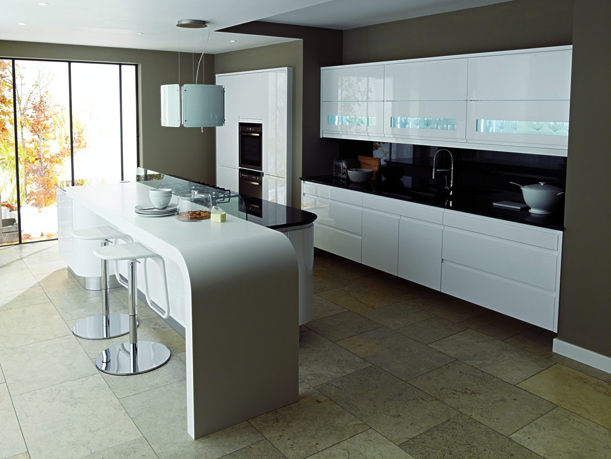
Dark taupe walls provide a dark beauty against the bright white acrylic cabinets. Shiny black countertops and a jet black backsplash pitted against these cabinets and the taupe walls provide a nice gradation of tones. The kitchen island of this home features a one-piece dining bar with rounded corners and bar stools which match the rounded shaping. These rounded corners are carried through the design with the edge of the inside of the island being rounded at the edges and in light fixture above the range top. Stone tile floors add diversity to the textures of the room by straying from the smoothness of other surfaces.
Want a celebrity-style kitchen? Modern design is the key
As seen in these examples, modern kitchen makeovers can run the gamut from basic to complicated. A mixture of textures, materials, colors, and styles can be defined as modern, so don’t feel restricted by rules. These examples show that modern kitchen ideas can be inspired by nearly anything–shapes, objects, colors, and even available light can factor into modern design.
With such a plethora of design materials available on today’s market, designers are not as limited as they once were. Using these materials as the first step is a great way to start a room makeover design.
Many modern design styles are revivals of classic designs that have gone out of style but have returned in a new format or with new materials. Finding inspiration from those classic styles can help you plan something beautiful and original.
One thing that should be clear from these kitchen designs is that lighting can often be the biggest factor in whether a modern design is successful. Today’s lighting options mean an opportunity to truly transform a space with light play.
There is no single color palette or material that fits every design, so feel free to experiment with style and choose what fits best in your space.

