Creating a kitchen design that is functional, beautiful and comfortable can be a challenge. Check out our gallery of fifty original and unique design ideas, tips and inspirations to help you construct a plan to revamp your kitchen! Whether you are looking for simple decoration changes or motivation for a full renovation, we’ve provided a variety of looks, styles and combinations to ponder and peruse. If you rent or own, are urban or rural, happy to craft or prefer ready made, we’ve brought you kitchen inspirations to boost those kitchen dreams into design realities.
Check Out 50 Inspiring Ideas to Design Your Kitchen this Year
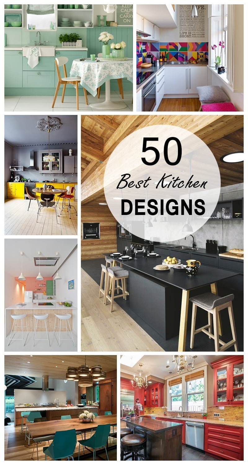
The kitchen is the heartbeat of your home – whether entertaining large groups or brewing a cup of tea, your kitchen is where precious memories are made. This is the space where meals are created, new tastes and cooking methods are explored, and special conversations are had. The epicenter of your home should be comfortable and functional, but it can be difficult to create a kitchen design idea that perfectly blends practicality with the style you are searching for. Transforming this vital room in your home does not require a pricey professional interior designer – it’s just a matter of discovering unique solutions and fun aesthetic touches to make your kitchen more usable and beautiful. There are even a myriad amount of kitchen design ideas that can easily be utilized in your rented house or apartment, to help add a touch of individuality and personalization to your space. The following kitchen design photos are collected to introduce you to some delightful designs to inspire your internal designer. That inspiration and a few unique kitchen design tips will help you to create a welcoming space for food prep, entertainment and more.
1. Bright Colors Add Great Impact
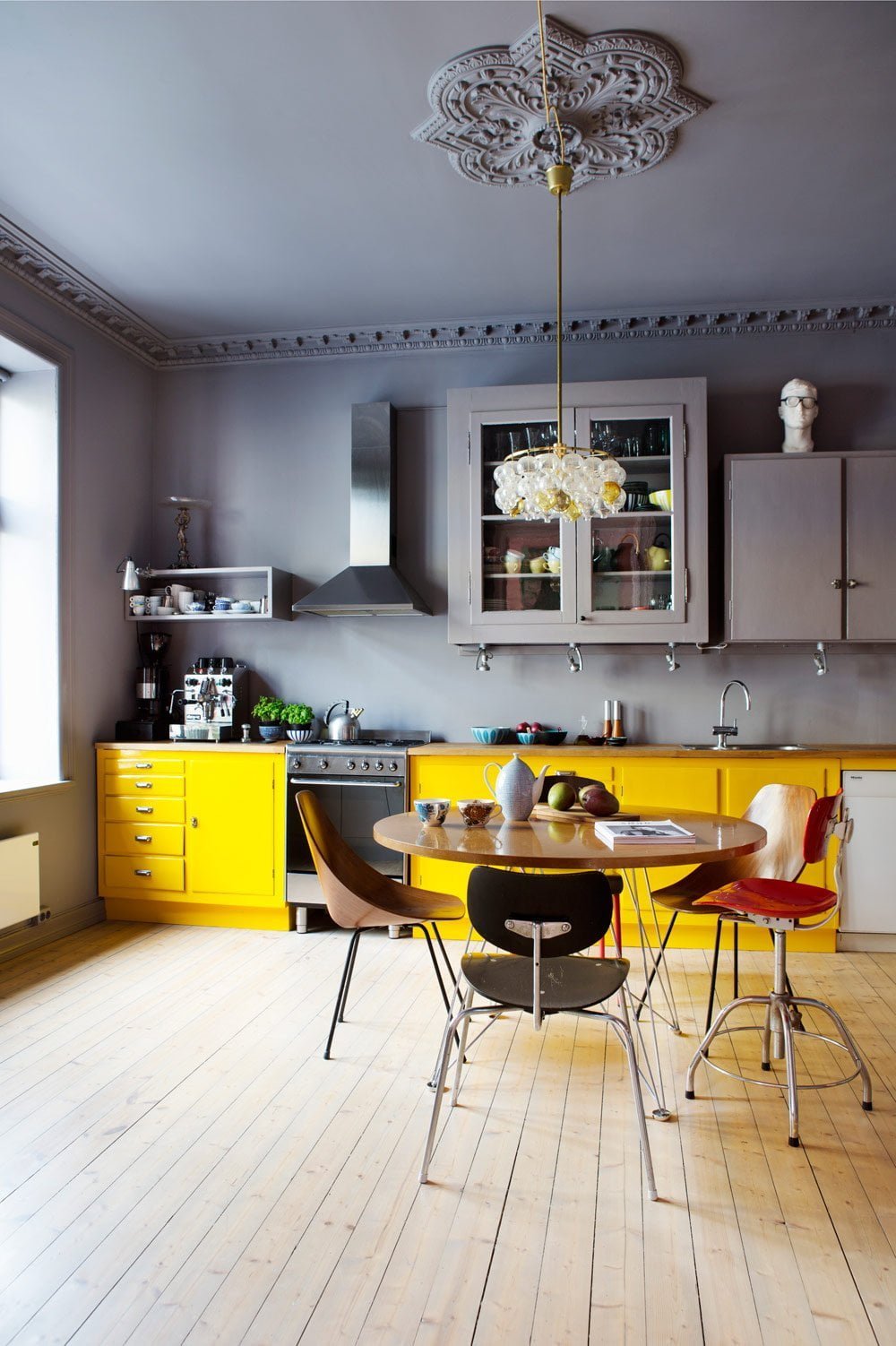
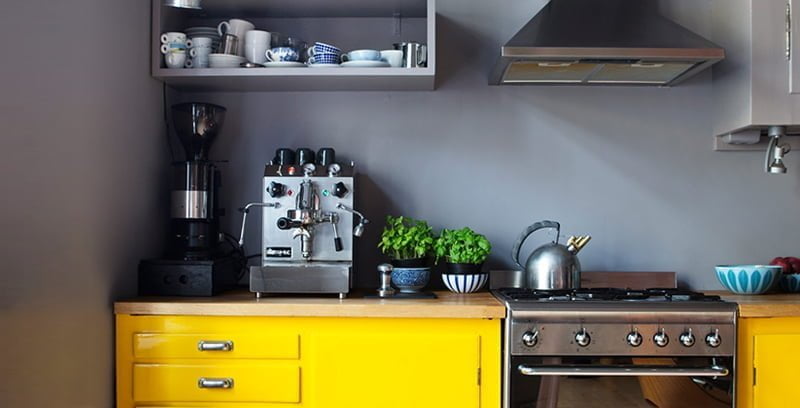
Bright colors don’t have to be restricted to your garden. Bring the cheery yellow of a fresh daisy into your kitchen and be wowed by the glowing difference it creates. As you can see, simply painting the lower cabinets a bright shade adds a great new dynamic to this kitchen, especially against the grey background. Keeping the upper cabinetry a similar shade as the walls and ceiling places even greater focus on the sunshine-esque accent and makes the kitchen seem much taller. This is a great technique to use in kitchens where not all the fixtures quite blend – the yellow, even sized cabinets draw the eye away from the mismatched, grey wall storage.
2. Hidden Touches for Sleek Style
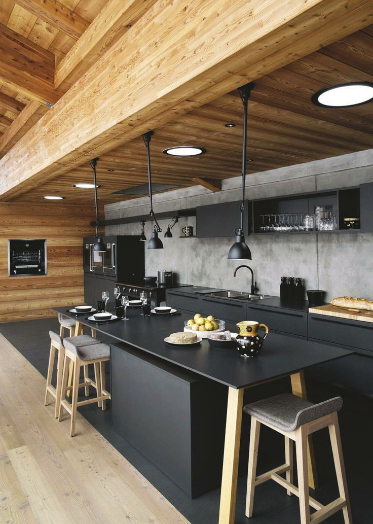
Make preparing meals practically effortless with a style that tucks away all your gadgets with ease. This kitchen design in this picture features recessed lighting to make sure you cuts are clear and your measurements are accurate. Storage underneath the table utilizes the space effectively while keeping the room tidy. The deep matte black of the cabinets and surfaces provides a sleek backdrop to the beautifully detailed wood grain. It would be easy to switch out accents such as hand towels and serving bowls for whatever color fits your mood or the season. Matching appliances that are either perfectly aligned with the cabinets or set into the wall present a polished kitchen any host or hostess would be proud of.
3. Minty Fresh Appeal Kitchen Design
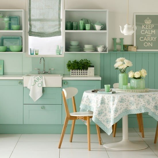
There’s a reason that mint green has been frequently appearing up in fashion lately. This lovely pastel is fresh, fun and flattering. This particular kitchen design picture shows a space that has utilized many shades of the mint green for a sweet and homey feel. A closer look shows some simple touches add to the overall effect, such as replacing the drawer pulls with funk mint hardware and towels that match the wall art. Are you renting and aren’t able to paint your walls? Or love the look of colored wainscot but don’t want to commit to that large of a renovation project? There are wainscot panels you can purchase, paint to your desired color and then affix to your walls in a manner that can easily be removed.
4. Black That Is Anything But Basic
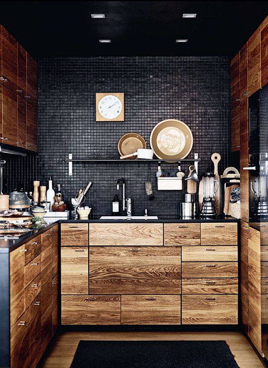
This stunning kitchen design image perfectly examples how a small space doesn’t limit you to small options. While most people don’t think of utilizing black in their kitchen, the black tile wall creates stunning texture while the black counters and toe kick form striking lines to best display the golden wood drawers and doors. The asymmetrical sizing and placement of the drawers add interest and functionality – imagine having drawers that perfectly fit that silverware tray, or a pullout shelf that would contain those miscellaneous lids? Choosing a dark finish for the faucet and storing rack helps keep the memorable contrast between the black base and gold highlights.
5. Quirky Touches for a Fresh Look
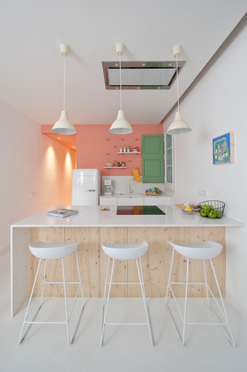
Sometimes, the simplest way to revamp a kitchen is to think outside of the box. For example, when replacing bar stools, seek out comfortable scoop shape seats instead of the more common round stools. Replacing your refrigerator? A rounded, retro look fridge is a fun and interesting divergence from the stainless steel norms. In this adorable kitchen, unusual shapes are still featured in white, allowing the contrasting juicy colors of melon and clover to brightly pop. Simple white floating shelves and pegs on the wall allow for additional storage without adding bulk. A crisp white counter/eating area combination makes great use of the space while providing a canvas for further decorating.
6. Tiny Space Can’t Hold You Back
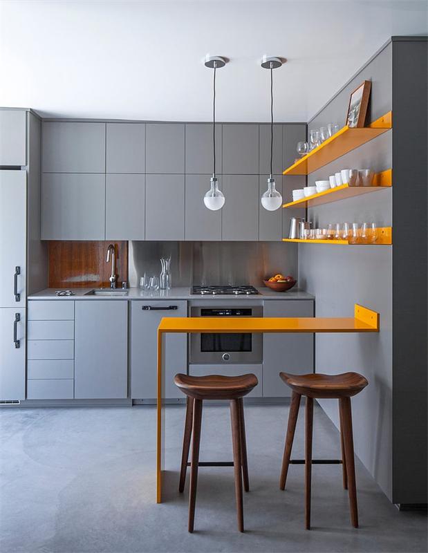
Are you working with restricted space and can’t seem to find furniture that will fit? This image is unique among the other kitchen design pictures, as the tiny kitchen area has been perfectly planned to maximize the available space while maintaining effortless function. Notice how even the cabinets and drawers are without excess hardware, keeping clean lines and an overall minimalist presentation. The light grey color used throughout the walls, ceiling and floor add depth without creating too much background noise. Vivid yellow punctuates the orderly shelves and the innovative table, showcasing the unique way this tiny space has solved the need for a table and storage. Softly accenting this miniature masterpiece, the wooden back splash and seating flow with the gentle pattern in the floor, keeping the overall impression from appearing too industrial.
7. Mixing Materials Makes Magic
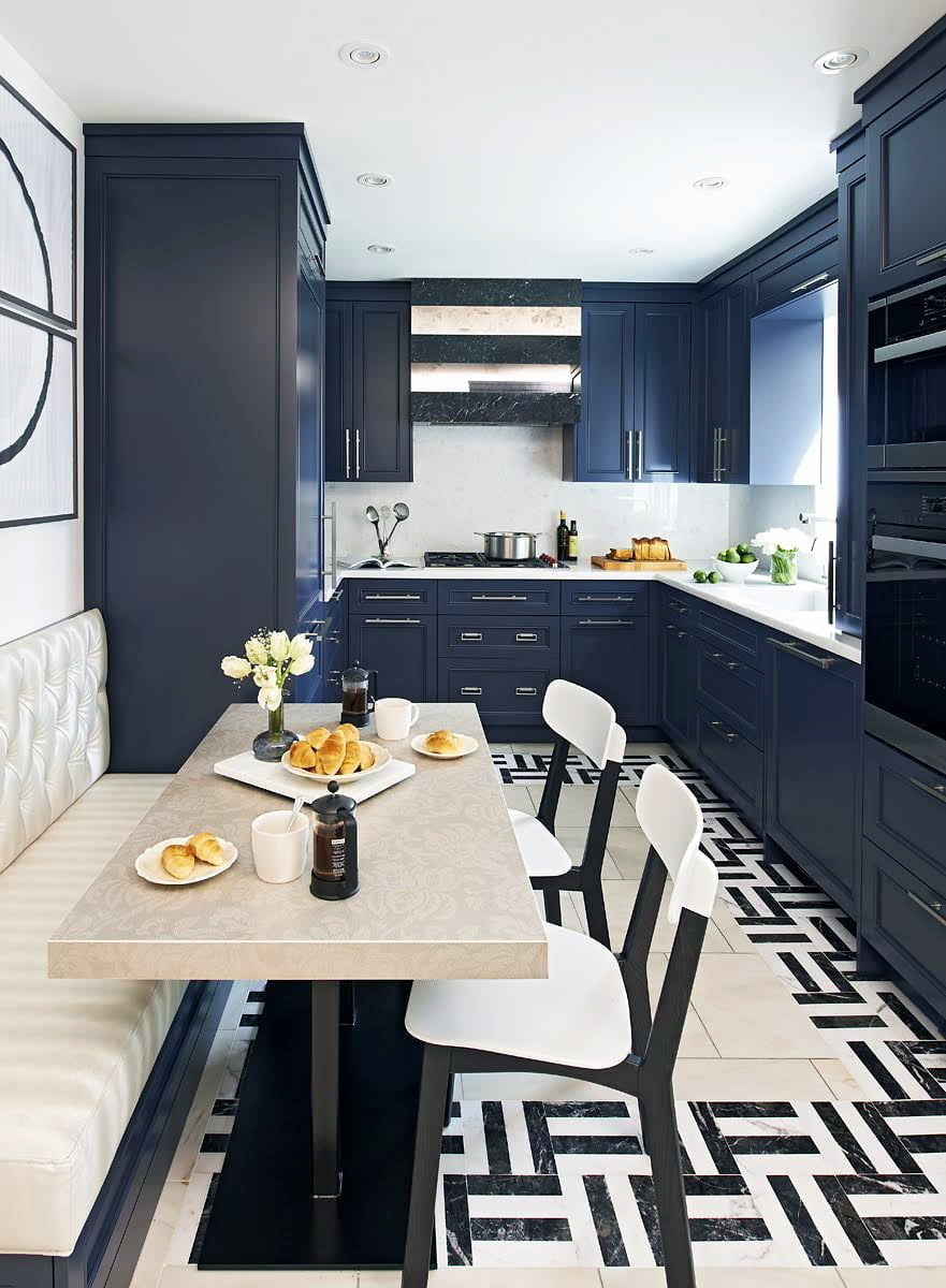
It can be easy to revert to common combinations while planning your new kitchen, but let yourself dare to dream of the unexpected. These gorgeous navy cabinets look right at home next to the marble counters, while not overwhelming the limited space this galley style layout provides. An underutilized kitchen design idea, this border tile in a eye catching pattern is a simple way to ramp up the interest without tearing out and replacing your entire floor. Another novel piece that blends in beautifully here is the stunning hood, made of marble and mirror and nestled among the upper cabinets seamlessly. Switching out curtains and towels can be a simple fix, but switching up an item like this hood is memorably magnificent.
8. Let Your Personality Shine!
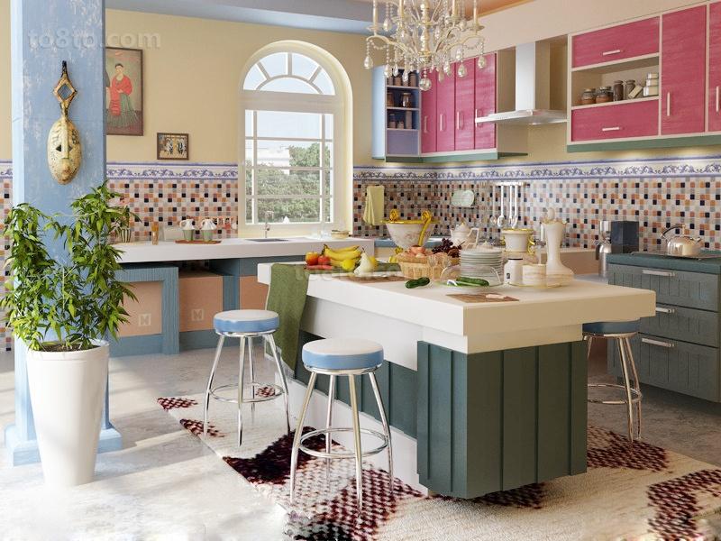
Personalizing your space doesn’t have to be relegated to decorating a bedroom. There are no set rules for how a kitchen has to look, so use pieces that will catch your eye and admiration. In this expressive example, the whimsical chandelier is just one of a variety of conversation pieces to feast your eyes on. The geometric print rug complements the colored pixel print tile on the walls without clashing with the neutral island. Pinks and purples on the upper cabinets flow with the flourishes of the border tile and a lovely arch window opens the room with natural lighting.
9. Seek Out Local Options
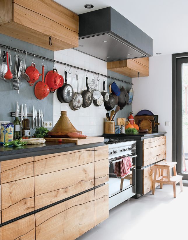
There are a number of big box home improvement stores that sell a variety of inexpensive and pre-made options for your kitchen remodel. However, consider this kitchen design tip – research local options first! This will provide you with a truly personal touch of your community within your home. The kitchen design in this image, for instance, is absolutely one-of-a-kind! Cabinets crafted from a single elm tree placed in waxed iron, offset by traditional rustic tiles tell the tale of this Dutch homes’ origin. The undulating golden lines of the wood are perfectly showcased against the dark metal – which matches well with the kitchen gadgets hanging along the wall. Oftentimes craftsman can create gorgeous custom pieces using local products.
10. Neutral Tones Create Classic Elegance
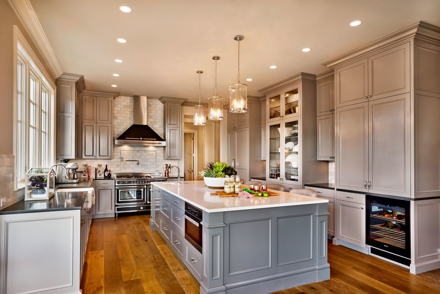
This timeless kitchen has many of the most desired kitchen necessities – plentiful counter room, generous storage space and even a wine refrigerator! What sets this apart from other dream kitchens, however, is the use of light and neutral tones to craft a timelessly elegant space. The subway tile wall detail is comprised of multiple tones combining the appealing cream of the island surfaces and the deeper neutral beige of the cabinets. Recessed lighting in the ceilings adds to the crystalline lighting in the middle of the kitchen, which is all accentuated by a bank of windows above the spacious sink. This stunning room would be worthy of hosting even the fanciest of feasts.
11. Gilded Glamour Kitchen Decoration
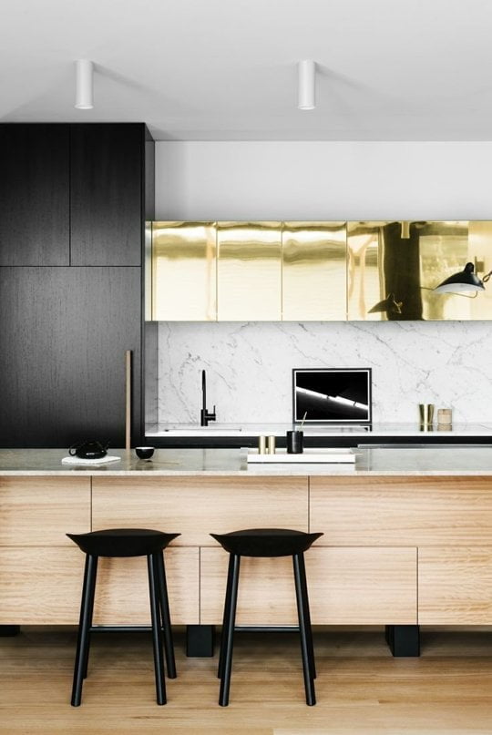
The image above combines several common kitchen design ideas – bar seating in front of classic marble surfaces, unobtrusive lighting and clean lines. What escalates this room from familiar to fabulous, however, are the unexpected metallic gold cabinets. It just takes one such statement piece to give your kitchen an air of opulence. Simple gold accessories help tie the room together, and styling the remainder of the kitchen in contrasting black and white keep this glamour from going gaudy. Adding a focal point such as this shimmering storage is certain to grasp the attention of your guests, without costing its’ weight in gold.
12. Farmhouse Familiarity, Revamped
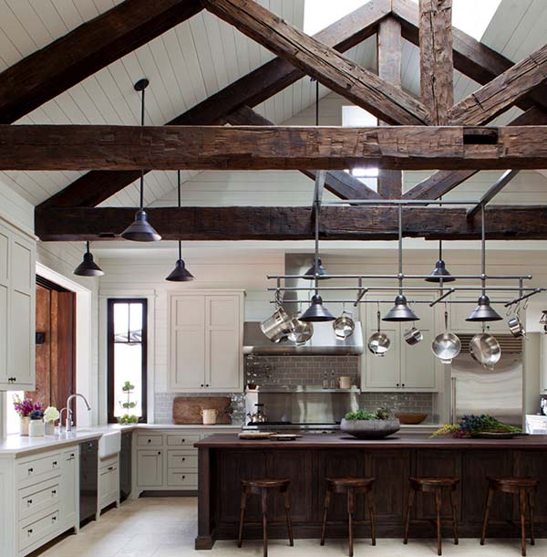
Many of the most precious memories are forged in kitchens, with traditions that date back generations. Farmhouse style structures are visual reminders of generous portions of comfort food, enjoyed with large groups of family and loved ones. Bring that traditional aesthetic into your home by mixing the familiar feel of worn wood and exposed beams with modern conveniences such as a stainless steel rack for cooking pots and crisp lighting. Clean white cabinetry and neutral subway tile allow for the character pieces to proudly stand out. Accenting the counters with live plants helps provide the feel of farm fresh ingredients, even if you’re residing in the middle of the big city.
13. Make a Statement
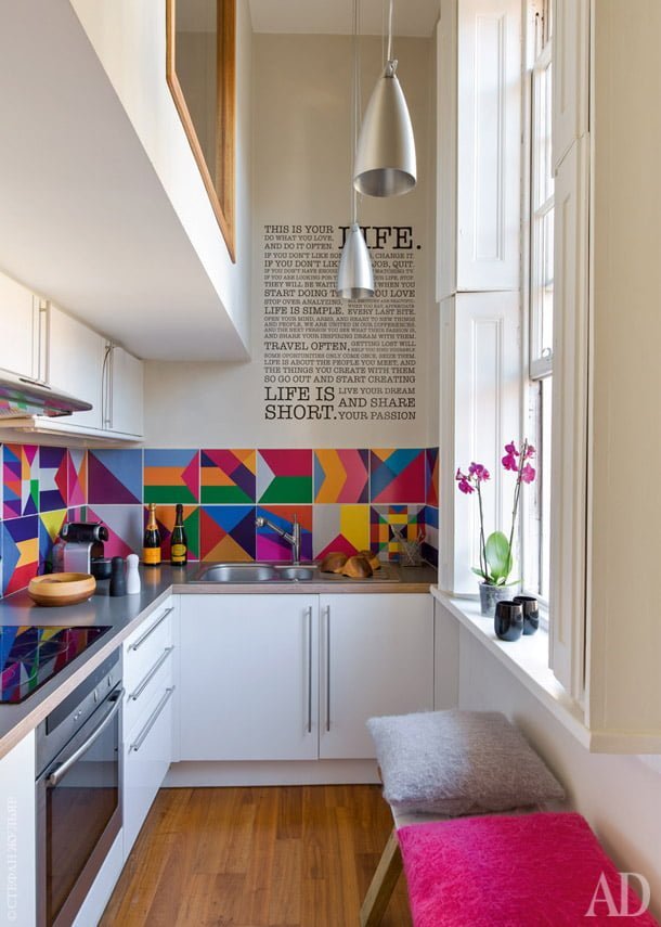
Inspirational messages and brightly colored graphics are certain to add an extra smile to that morning cup of coffee. With so many options available for home decor stickers, rub-on decals and inexpensive prints, you can easily incorporate lively quotes and exciting illustrations into your home. Many traditional kitchen design images depict simplicity in a small space, but this example showcases how bolder can be better! Keeping the cabinets and walls white morphs this kitchen into a blank canvas ready for that creative touch. Lovely orchids in the window and soft, comfortable seating keep this area comforting, and the multitude of colors ensures this design will never get boring.
14. Hints of an Island Paradise
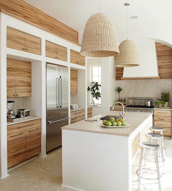
Rustic wood grain, wicker baskets and lush foliage bring to mind relaxing vacations in gorgeous tropical locations. Bring touches of that enriching environment into your home and recondition your bustling kitchen into a calming getaway. The large overhead pendant lighting with wicker covers bring attention to the fibrous texture above the functional island and smooth stone floors. Clutter is tucked away behind the striking natural wood cabinets while stainless steel appliances subtly blend in. The simple pots with verdant foliage lend to the impression that a tropic paradise is waiting for you just outside the door.
15. Personalize with Found Items
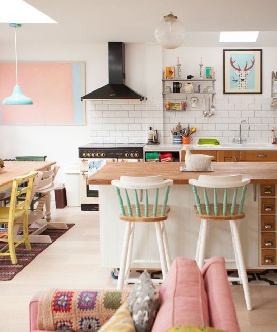
Trying to piece together your favorite kitchen design ideas can be a struggle, but letting pieces themselves inspire you could be the key to finding the right fit. In this darling home, there are no mass produced items to be found. A comforting granny square afghan is just in reach of the pastel accented bar chairs. The quirky water fowl accented as the centerpiece could have come from a high end boutique or be the perfect yard sale find. A print on the wall ties together the various colorful flourishes in the room, while a rack on the wall holds precious kitchen gadgets. While this look isn’t one you could necessarily go order an exact replica of, it shows how various pieces that speak to you can be combined into a very comforting epicenter of your home.
16. Patterned Walls Set Off Painted Cabinets
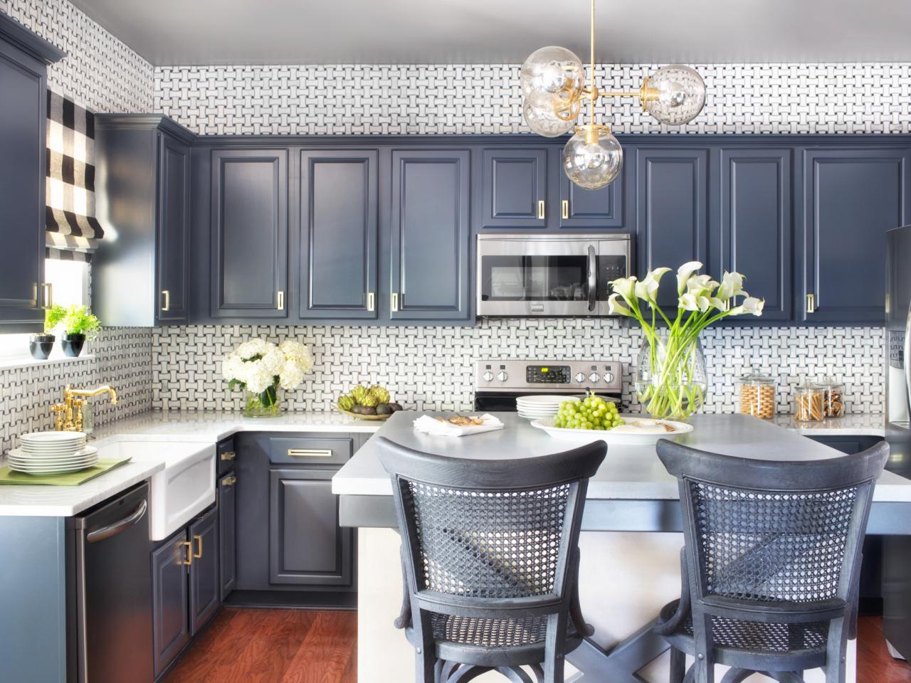
A dull kitchen can seem like an intimidating and costly fix, but there are several options for revitalizing your home yourself! This kitchen appears complicated at first, but a second glance shows that the fun patterned wall could be easily achieved with choice wallpaper, and those cabinets could easily be a weekend DIY project. Painting your existing cabinets may take a little research, but is a mere fraction of the cost replacement would incur. Find a hue that complements the wallpaper of your dreams and your guests will marvel at the perfect pairing. Add chairs with a similar texture, a statement piece such as that bubbly light fixture and your kitchen will be a drab space no more!
17. Artfully Transform Walls Kitchen Decoration
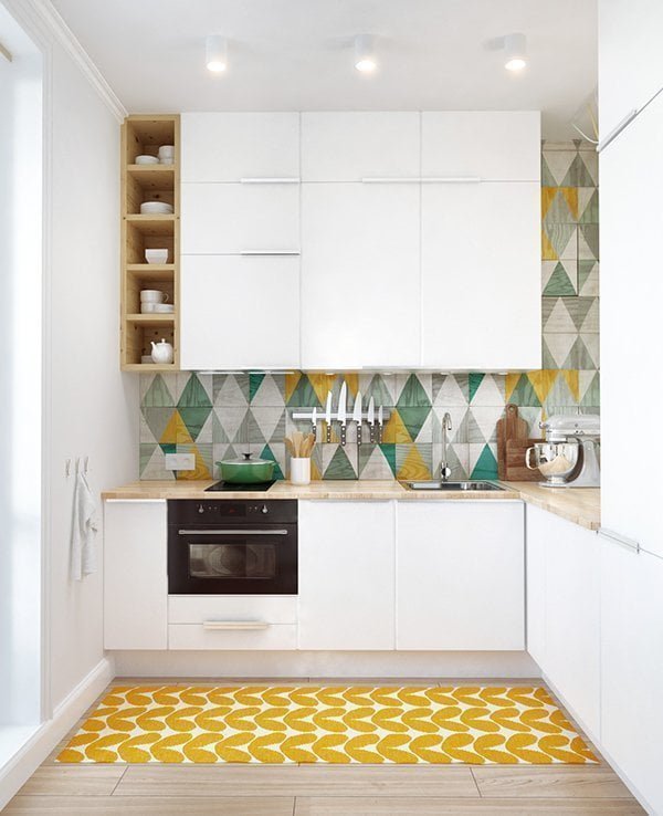
Artwork does not need to be confined within the borders of a frame. Utilize the largest spaces in most kitchens by adding glorious graphics to your walls and flooring. In this delightful kitchen, the accent wall is illustrated in a calming geometric print. Punches of color throughout the design correlate to the fresh mustard print on the rug. Open shelves continue the underlying motif of light wood grain, while the minimalist white cabinets above and below provide the solid structure of the room. Wondering how you would ever match that unique design? Simple white dishware and accessories would add simple function without distraction.
18. Never Underestimate the Versatility of Wood
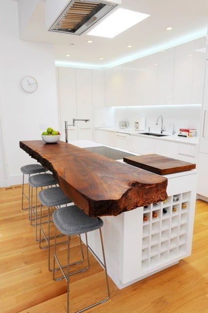
Nowadays, Sheetrock and prefab structures have replaced the rough hewn buildings of ages past. However, the incredible detail and stunning beauty of raw wood cannot be denied. Many fancy kitchen design ideas could be simplified and enhanced by introducing a raw wood statement piece. This massive kitchen counter possesses the varying thickness and inconsistent edges inherent to a slab of wood, yet still looks distinguished against the uniformly white kitchen it graces. The warmth of the wood transfigures this sterile space into an approachable and inviting area for entertaining. Instead of seeming prehistoric, the stone seats balance the liveliness of the wood for a handsome combination. Such an impressively detailed slab would provide hours of study while serving as a sturdy, solid serving surface.
19. Fashionable Function and Comfort
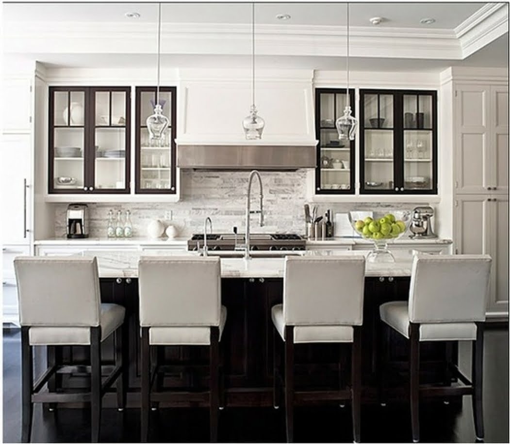
When entertaining, it’s important for a venue to be aesthetically pleasing. However, when that venue is in your home, it’s imperative that appeal is countered with comfort. The kitchen design in this picture features monochromatic beauty and fashionable function. The cool marble island provides both a gorgeous eating surface and a home for a deep sink with enviable dual faucets for easy cleanup. The island area continues its’ timeless appeal with an elegant take on the trendy pendant lighting. The variegated wall design ties together the white cabinetry and silver-finish appliances, while the darkest colors are used to accent the glass pane cabinets and provide a foundation for the island. Cushioned chairs lined up at the counter are comfortable enough to support deep conversations and long meals, while extended counter space provides essential organizing space.
20. Be Daring With Dramatic Pieces
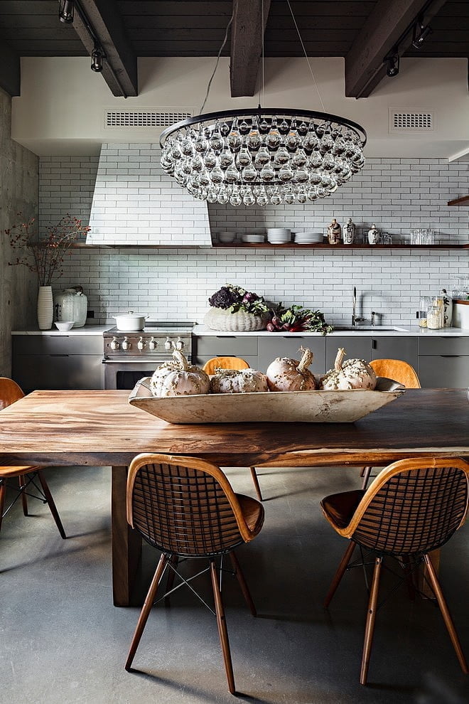
Neutral grey flooring and cabinets are a harmonious combination with pearly subway tile. However, that standard pairing can also serve as a solid base for some dramatic details. The sensational structure of the light fixture centered in this kitchen would be a guaranteed conversation piece in any home. Suspended from bold exposed beams, such an eye catching accessory instantly heightens the interest in any room. A sturdy wooden table with rippling grain pattern add to the pattern of delightful details within this kitchen. While formulating your own kitchen design idea, don’t immediately shun an item that carries a strong impact – it could be just the right spice needed in an otherwise basic design.
21. Brick Brings Warming Touches
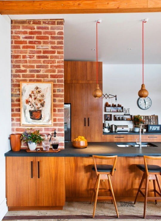
Exposed brick brings to mind the warmth and contentment of a roaring fireplace on a chilly day. Bring that cheerful imagery into the kitchen by incorporating exposed brick into your kitchen design idea. Whether you choose an entire wall or just a beam, the rustic earthy tones of the brickwork provides a vibrant palette of coloring to work with. In the above image, the fiery hue of the brick brightens the rich honey tone of the wooden cabinetry. A painting in the same sunset colors as the exposed beam bring life to the kitchen structure, while dark counter tops and hardware stand out among the russet tones.
22. Farm Fresh Appeal Kitchen Decoration Idea
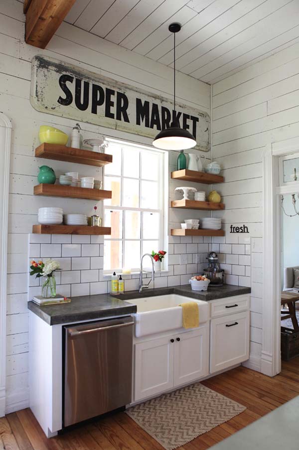
Country style doesn’t have to mean gingham and cutesy chicken prints. Harness the charm of a sweet farmhouse kitchen with minimal effort. The best kitchen design tips for this style are keep it simple, keep the space functional, and bold, themed graphics will work in your favor. In this image, the space is small but easily utilized. Exposed shelves keep dishware and serving bowls in easy reach, and a small cabinet allows for storage of the appliances that don’t look as darling on the shelf. Fresh flowers and pops of cheerful colors help keep the innocent appeal of yesteryear, while a compact dishwasher and large, deep sink help modernize the chore of cleaning up. A couple of panels of basic white tiles and farm themed graphic signs keep the country home theme strong, even if you’re located in a high rise apartment complex.
23. Emphasis on Entertaining
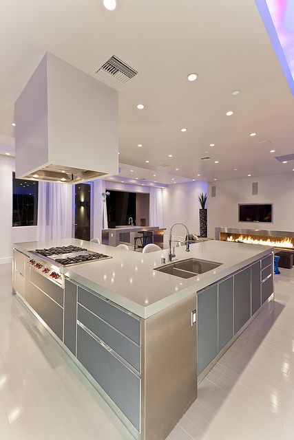
This modern kitchen screams sleek, chic and sophisticated. Broad, smooth surfaces are designed for serving large platters of delicious delectables, while the state of the art appliances ensure you’ll be prepared for producing an feast for dozens of friends and family as well. An industrial hood and sturdy stove top provide restaurant quality tools for creating your meal masterpieces. The combination of matte finish and metallic accents add the anticipation of grand presentation, while the various lighting gives the feeling that the space could effortlessly change from a dinner party to a dance floor. Large windows framed with gossamer curtains add to a feeling of openness and grandeur in this kitchen designed for exceptional entertaining.
24. Delicate Details for Darling Dining
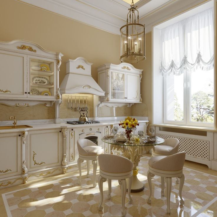
Hearkening back to the tea parties of history, this delightful kitchen blends a regal color palette with luxurious touches to present a design of almost doll-like perfection. The lovely color scheme of gold and cream creates an inviting atmosphere, while gilded flourishes give the effect of a fairy tale room come to life. A large window with gathered sheer curtains lets in natural light upon the round kitchen table. Each chair features curled feet and deep cushions, guaranteed to provide comfort through even the heftiest dinner conversation. The glass tabletop is supported by an extravagant plumed base, while a faux candle holder lights the dining area. This kitchen design is perfect for anyone who loves a bit of old world high society style.
25. Combining Textures Presents Handsome Results
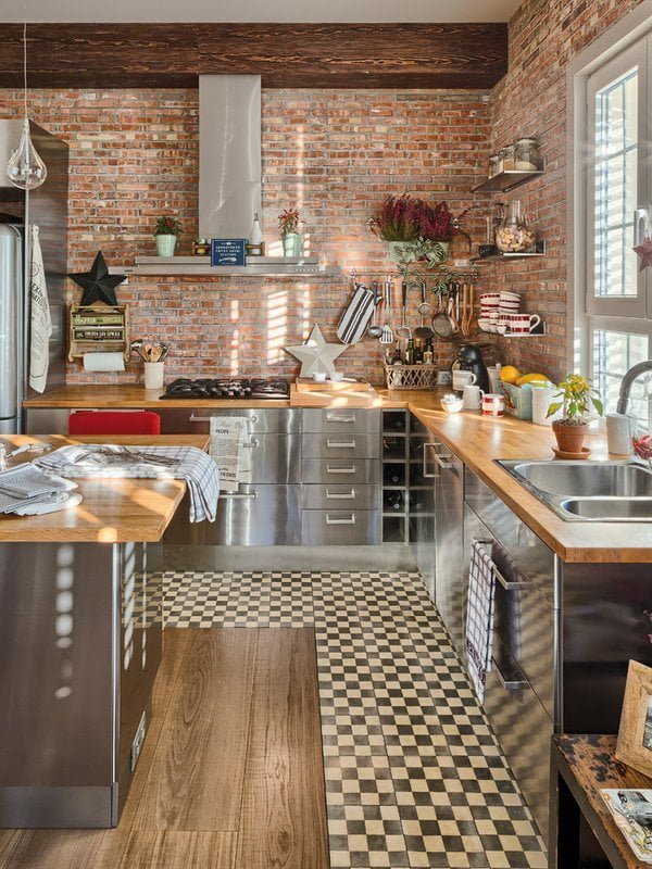
This spectacular spacUe has interest points in every corner. An important kitchen design tip to realize from this image is to not avoid mixing patterns. Here there is the rustic beauty of exposed brick, smooth finish of metallic cabinets, neat order of a checkered border and three shades of wood surfaces. The industrial feel of the silver cabinets is off set by the charm of the star decorations and the harshness of the brick is softened by the wooden touches. Several shelves and racks allow for an accumulation of kitchen gadgets without feeling cluttered, and the overall effect is of a well run meal preparation station. This is a space where personal touches are valued and wonderful meals are constructed.
26. Turquoise for Added Interest Kitchen Design Idea
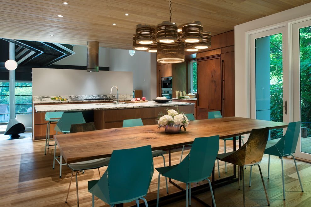
Choosing the warmth and glow of a wood with a prominent grain can bring life and natural appeal to your kitchen. However, when using wood for the ceiling, cabinets and flooring like in this image, it’s important to break up the space. This way, the wood maintains its’ unique beauty without becoming just part of the background. A prominent light fixture with the appearance of found items illuminates the space and angular chairs in striking colors like turquoise and a gold patina provides that needed pop of interest.
27. Subway Tile Revamped
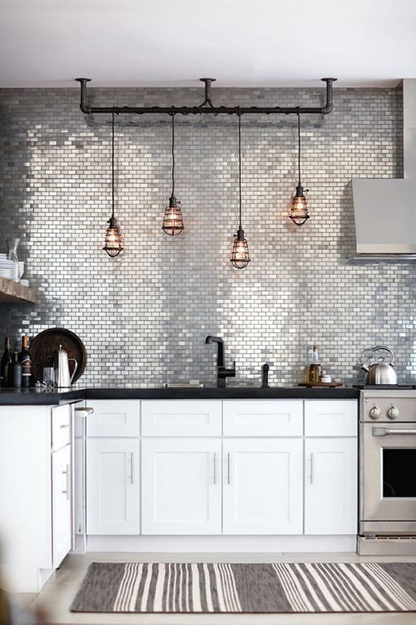
Subway tile is a well known kitchen design staple. However, that doesn’t mean it’s a tired concept. This subway tile has a metallic sheen to it, which creates a fantastic depth for this kitchens’ back drop. Industrial pendant lights are arrayed along a striking rack, looking more like displayed artwork than the functional lighting. The cabinetry is classic cool white and the silver hood over the stove blends in. It’s always a great kitchen design tip to add a printed rug. Although most people are hesitant to add textiles in with a food heavy area, the designs of a graphic rug help tie your design pieces together.
28. Ebony and Brass Combine for Stunning Results
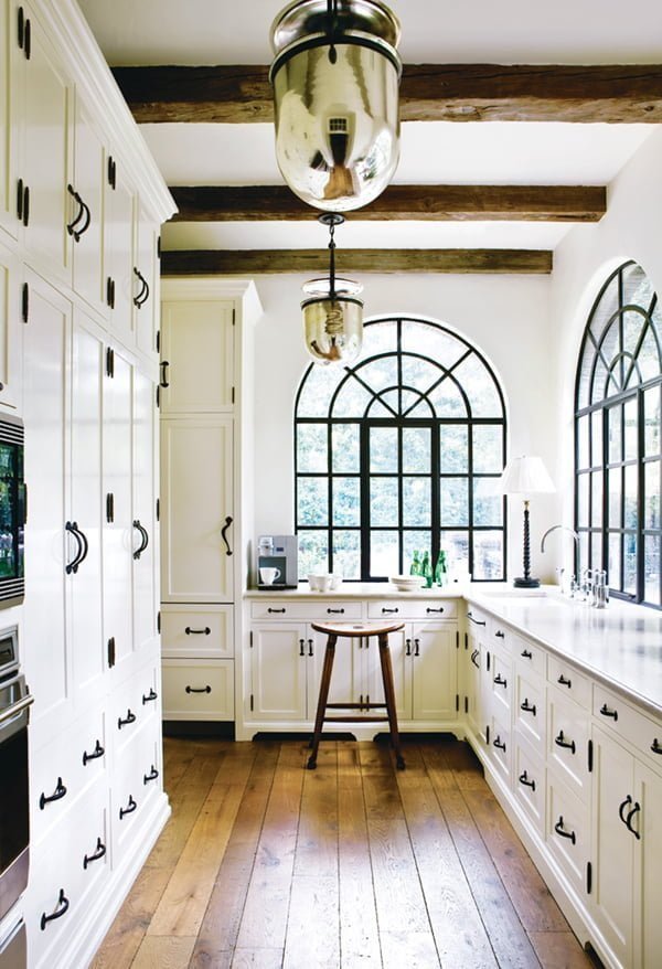
This kitchen design is an excellent inspiration for both a full renovation or just some DIY touches that would reach a similar result. The cabinets stretching to the ceiling and uniform plank flooring may not already be in your home, but the details that make this room really stand out could be. Replacing standard hardware with pieces in an ebony finish helps create an elegant presentation. The trim around the windows is in a matching inky color, outlining the natural line pouring in. Finally, switching out boring lighting for bright brass pendants gives a deluxe finish to a classic room.
29. Island as the Focal Point
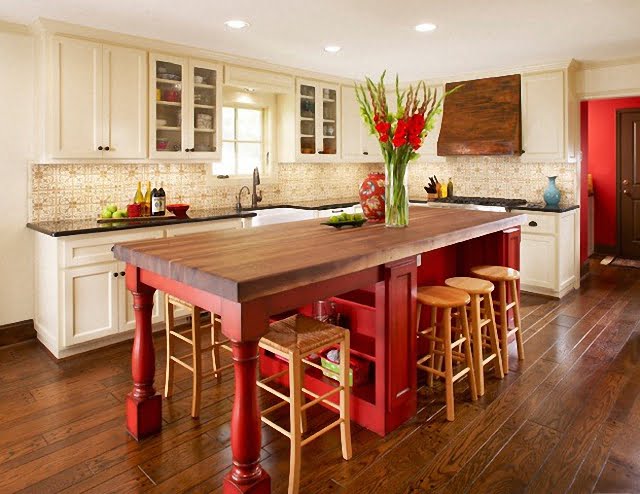
The main function of most kitchens is to create nourishing meals for you and your loved ones to enjoy. When finding the right kitchen design idea, it can be easy to focus on the cabinets and the appliances and forget where all of your hard work will end up – where you eat. Shouldn’t the surface that enjoys your efforts be gorgeous as well? In this kitchen, the sturdy island in a riveting rust red allows for extra working room, with plenty of room for loved ones to gather around and eat or chat while you prepare. A hood that matches the dark finished island countertop brings those warm colors around the room and creates an area ready to be filled with laughter and fond memories.
30. Elegant Presentation with Noteworthy Details
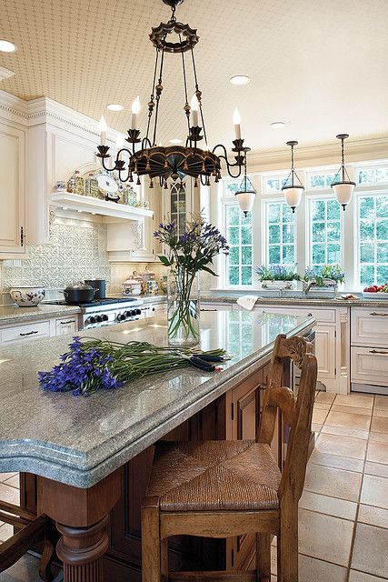
At first glance, this kitchen appears to be another generically opulent, elegant space. However, the details that have been invested in this room personalize this grandeur and create a comfortable environment. Woven chair seats add a natural touch in contrast to the shining stone countertops. The pendant lighting combines with the gorgeous chandelier to provide several points of interest above eye level. Finally, a deeply textured backsplash and ornamental centerpiece above the stove bring liveliness and personal touches to this open and airy kitchen.
31. Blending Modern with Livable
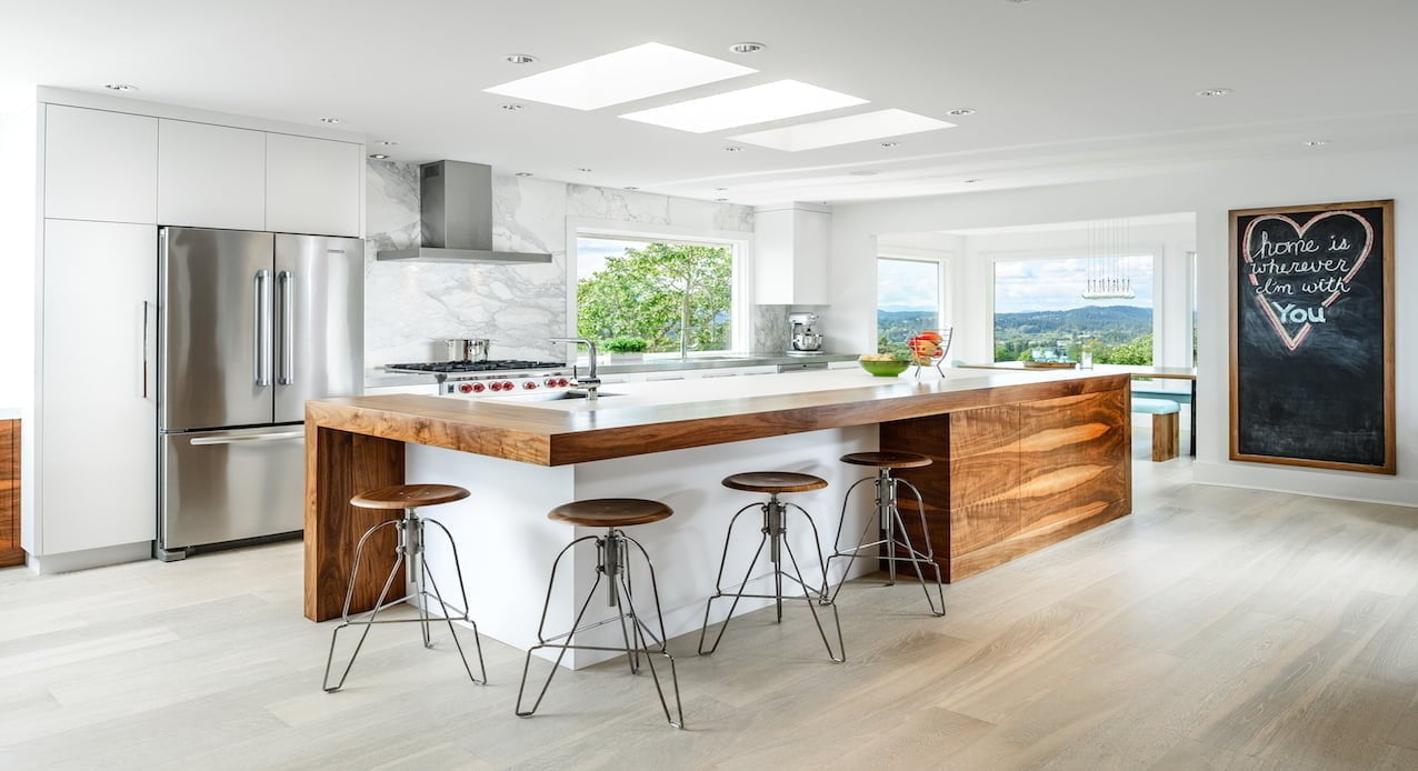
An important aspect of creating your dream kitchen is the function of creating food, but also the appear for you and your loved ones. It’s one thing to curate beautiful ideas,s but quite another to make sure those great pieces will fit with your everyday life. This modern kitchen has the long island that doubles as a seating and eating area that utilizes space to the maximum. Sleek cabinets and flush appliances add to the tidy effect, and bright red knobs on the stovetop add a lively flourish. What makes this kitchen seem particularly real life ready is the large chalkboard. This interactive piece allows for menu planning, brainstorming, impromptu artwork and more. Consider including such homey touches in even the most utilitarian kitchen plans.
32. Think of Creative Ways to Use Surfaces
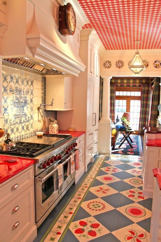
Most of us fail to incorporate the ceiling into our design planning. This room shows how such a simple addition can have an enormous impact! Adding such a fun and intricate flooring in a complementary pattern makes this kitchen seem completely put together, and provides a vibrant theme that is carried through the rest of the room as well. Red counters and stove knobs are an easy way to keep the overall look flowing, and the statement back splash adds even more interest. Wanting for wall space in a galley kitchen such as this? Notice how the hood is used for clock placement and decorations are placed above the doorway. Using the surfaces you have available creatively can create a room everyone will remember.
33. Mixing Media
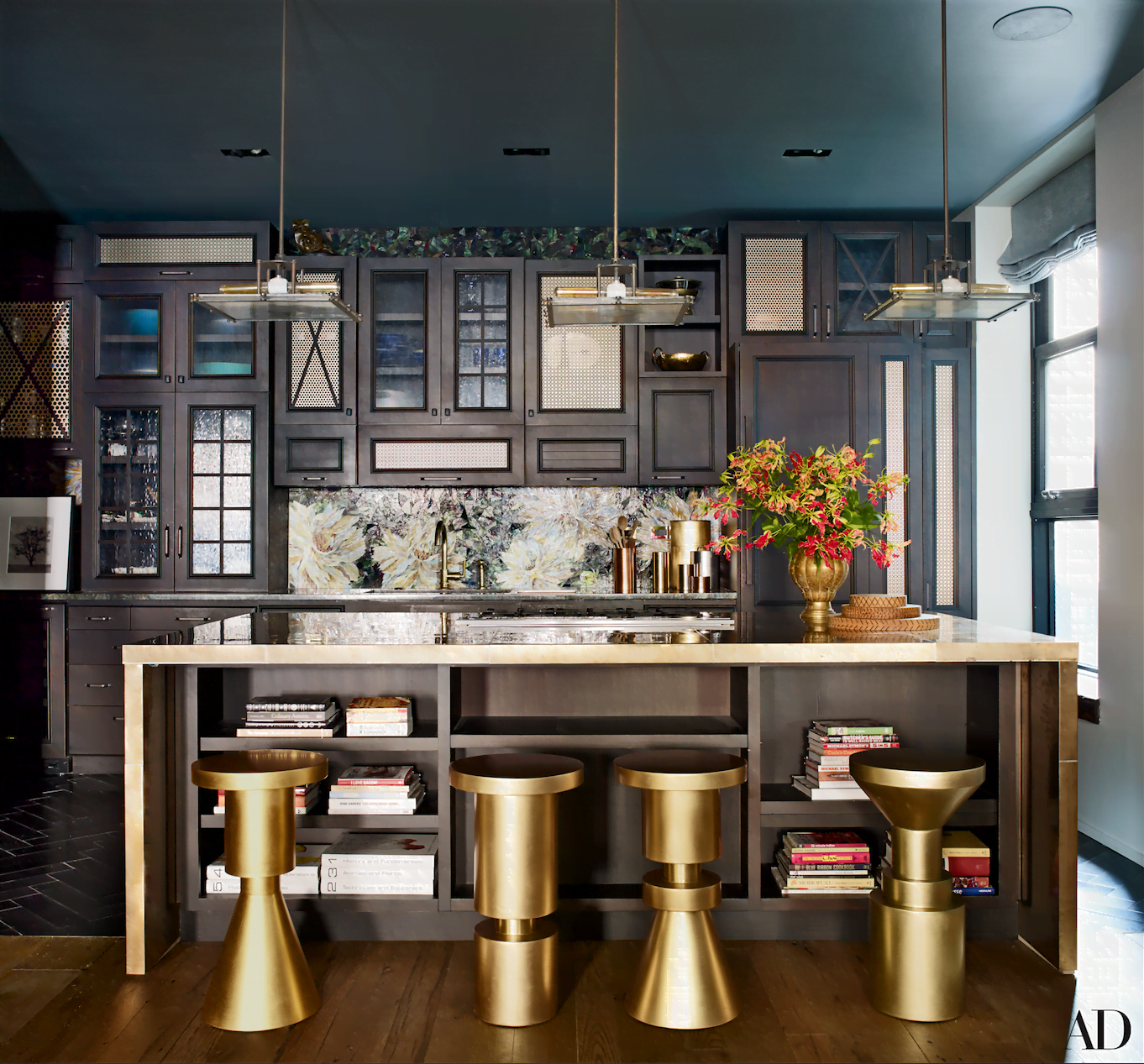
When considering the best combination of surfaces and accents in your kitchen, resist the urge to revert back to what feels the safest in terms of design. This kitchen shows that thinking outside of the box can result in a dramatic, yet cozy effect. The vivid gold seating is an excellent display of the metallic trend in kitchens that is so popular right now. Mixing frosted glass, clear panes and detailed doors on the cabinets allows you to pick and choose which of your kitchen items you want displayed and which can be hidden away. Instead of letting the deep, rich tones of the painted cabinets and walls make the biggest impact, this kitchen packs a huge aesthetic punch with an unusual accent wall with metallic strikes and interesting design.
34. Chalkboard Surface Serves Many Purposes in the Kitchen
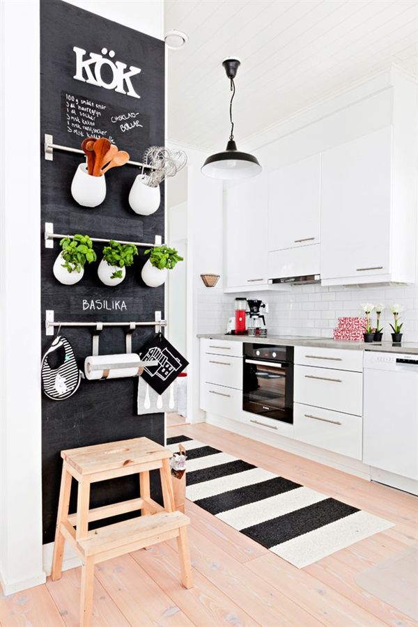
This small kitchen still presents an adorable display, with the help of a large chalboard panel. This home maker has taken up most of a wall section with a chalkboard panel. However, that space has not been lost! Nickel finish racks have been placed across the space, allowing for storage in an otherwise sparse kitchen. The line of potted plants is particularly appealing, with the bright green leaves adding a bright effect to the otherwise monochromatic color scheme. The chalkboard surface allows for great graphic design, and with it stretching to the floor, even little ones can enjoy creating temporary artwork along the wall.
35. Herringbone Leads the Way
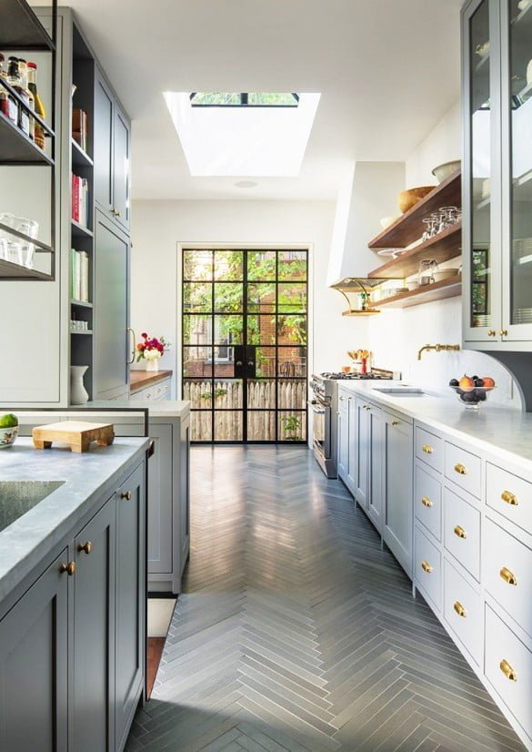
A classic design that is underutilized is the herringbone pattern. The intricately appealing pattern on this galley kitchen floor helps mvoe the eye through the narrow space and gives the appearance of a much larger kitchen. The bright white cabinetry allows the grey herringbone to remain the focal point, while bright, brassy hardware adds details of color. Exposed shelving allows for maximum storage and display, while a prominent skylight allows in that lovely light from above. Think about using an unconventional design when picking out flooring. It could be just the interesting extra that your kitchen needs.
36. Dramatic Back Splashes Add Easy Interest
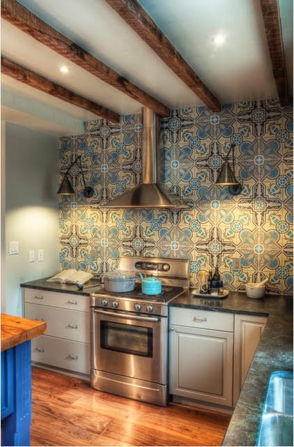
An often overlooked kitchen design tip involves incorporating a backs plash into your design planning. However, you don’t have to pick a simple or monotone design. The possibilities are endless, with various mediums, materials, and sizes available. This kitchen features a prominent back splash that does most of the design work for you! With this ceiling high accenting the space behind the stove and hood, other wall decorating ideas can be left out. The deep brown lines in the pattern help showcase the exposed beams, and the variety of blues and yellows make kitchen accessories easy to pick out. The gorgeous granite counters compliment the color scheme and this small space is beautiful in every corner.
37. Colorful Kitchen Design Tip
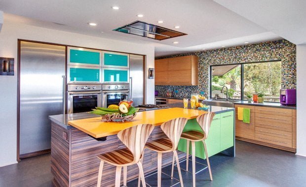
In this fun and fascinating space, everywhere you look has a bright color peeking back at you. The island and chairs are made of a striking, heavily variegated wood that provides ashy gold, rich browns and hints of bronzed orange. The storage above the dual ovens shines with a lacquered turquoise and the doors along the island storage draw the eye with a lime green. With a sunflower yellow eating table top on the island, this many colors could seem chaotic. However, the brilliant accent wall made up of a mosaic of tiny colors gives a feel of the room being connected after all. More vibrant accessories like sunny kitchen towels and a punchy purple counter appliance keep the flow of bold colors going.
38. Subtle Stylings
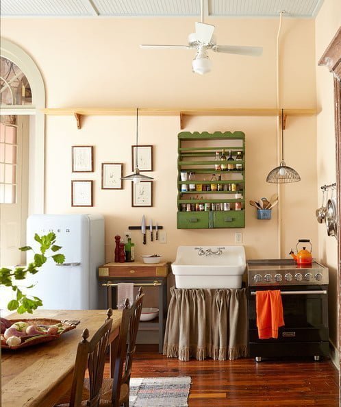
Desiring a mostly neutral kitchen doesn’t necessitate crafting in whites alone. A warm tan throughout this entire kitchen gives a greater warmth and coziness than a stark white would. The darling touch of a gathered cover below the sink and framed line drawings on the wall show the personality of the owner. The rich green of the wall shelving is noticeable but not overbearing and connects well with the plants on the table. This neutral base allows for a select few statement pieces – that flaming orange teapot is just the right funky focal point, with a matching tea towel to keep it from looking out of place.
39. Melding Styles and Forms
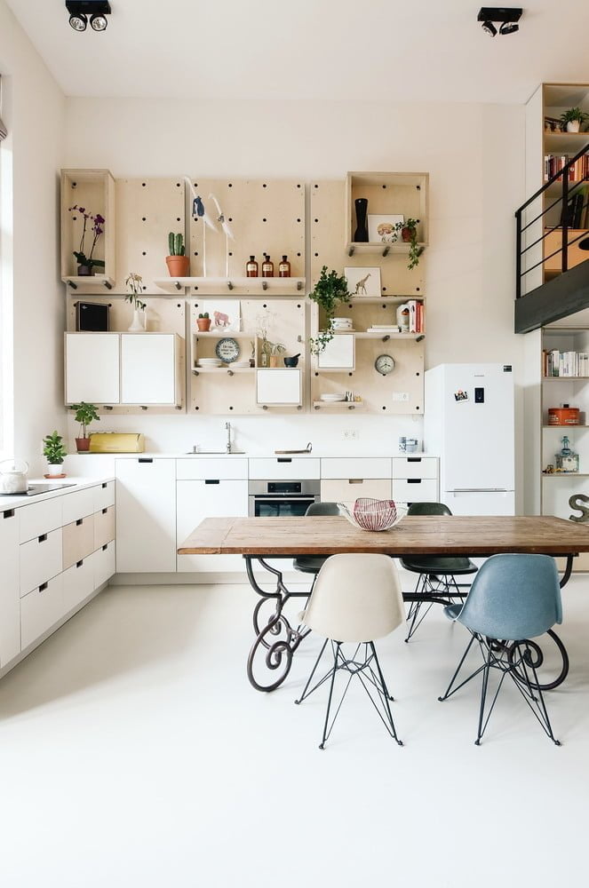
This bright kitchen space is contending for attention with the dramatic loft lines above. This doesn’t stop it from impressing in its’ own right, however. Notice how the curlicue base of the table presents large, flowing spirals. Countering those are the sharp angles of the chairs and the geometric drawers throughout the cabinets. There’s no need for hardware with these easy to pull drawers, and the shelving on the wall serves both as storage and an enormous piece of wall art. Interchanging the light wood with the bright white keeps the eye flowing throughout this light and airy space.
40. Present the Cleanest Kitchen
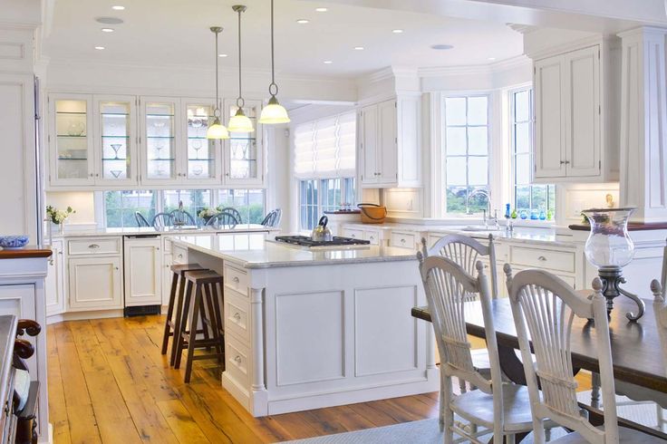
Nothing appears quite so pleasingly clean and tidy as a fresh white surface. So why not incorporate that appeal throughout your entire kitchen? Using white as your design scheme means that you’ll never have to question if an item will match while out shopping, and always gives the appearance of being fresh and new. Combining clear glass throughout this kitchen keeps light pouring through, and the wide plank flooring in a warm honey does not distract from the added detail and framing on the cabinet doors. With several seating spots throughout the kitchen and dining area, you’ll be able to gather all your friends at once for a memorable dinner party.
41. Vibrant, Bold Colors for Your Kitchen
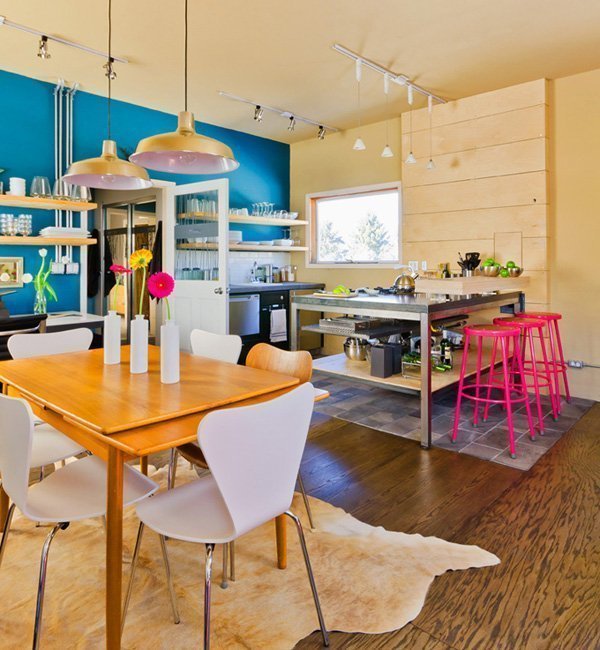
Why pick out a baby blue or pastel pink when you can electrify our space with a rich royal and neon fuschia? The brilliant blue wall in a statement itself, with floating shelves in the same wood as another wonderful wall piece near the island. Mixing metals and wood, a fur rug and laminate floor panel all come together with the added effort of these vibrant accent pieces. Unconventional lighting combines track lighting style and trendy pendants, while a simple window helps keep the vivid colors intense.
42. Decorative Detailing
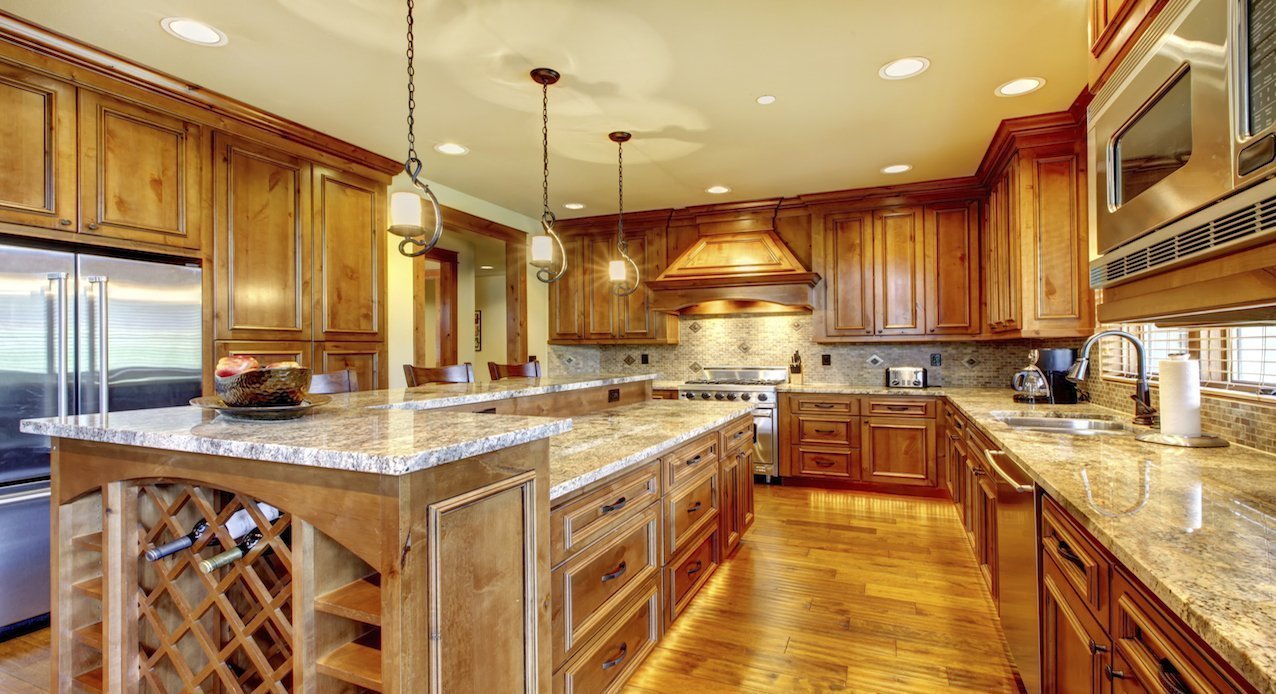
This luscious, glowing room exudes golden light from the lovely honey hues used throughout the floors, cabinets and furnishings. Ending the functional island with the criss cross design of the wine rack and featuring curling lights above breaks up the otherwise square lines. Decorative moulding across the top of the cabinets adds a high class feeling and the golden hood melds in beautifully. The stone counters mixed with the stone backsplash complements the golden hues without contrasting. What really sets this kitchen design idea apart is the custom look framing on each cabinet door and counter drawer. These added details keep each surface exciting while maintaining the uniform theme.
43. Berry Beauty
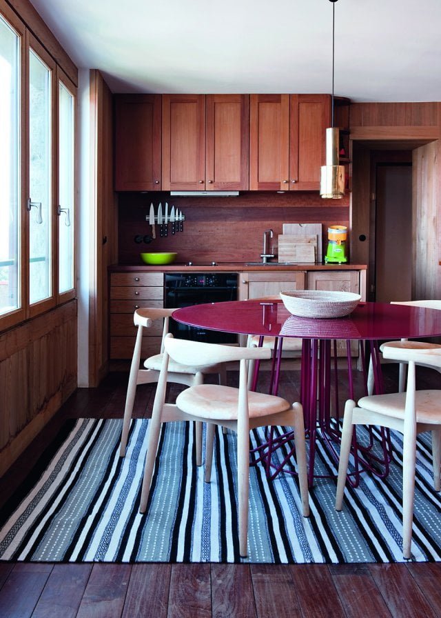
This smaller kitchen space combines the deep tones of berry with a richer wood and bright accents for a space that seems uniquely personal. The wooden walls and cabinetry provides a cozy atmosphere, while the cabinet doors that embrace the uniqueness of the wood add dimension. The use of a patterned rug truly adds to the appearance of this kitchen, providing the lovely textile texture with a bold print to offset the otherwise dark tones. Fretting over matching a statement table with chairs? Don’t. These bright white chairs against the berry make that table more spectacular than ever.
44. Metal Doesn’t Have to Seem Industrial
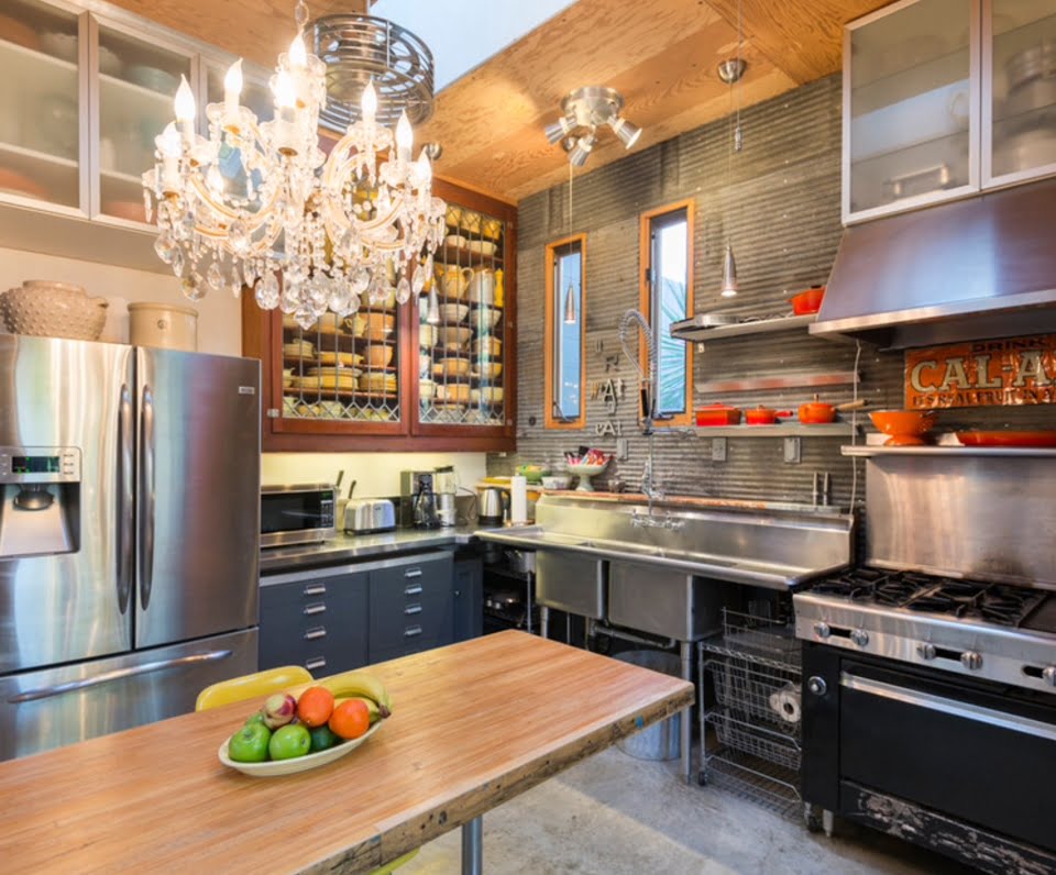
Metal finish hardware is customary in most kitchens, but broadening out to larger metallic design elements can be intimidating. The key is to mix harsh lines with curling accents, to result in a shining surface that doesn’t feel like a warehouse. The sheet metal look of the rippling wall is the perfect base for the sharply accented orange trim and accessories. Instead of going with solely straight lines in the cabinet doors, the crossing pattern at the bottom and top adds interest and breaks up the geometry. The mismatched lighting in this area also keeps the look interesting, and that whimsical chandelier is anything but industrial. An orange tin sign above the stove manages to combine all the elements of this kitchen together with one unique decoration!
45. Working With Black
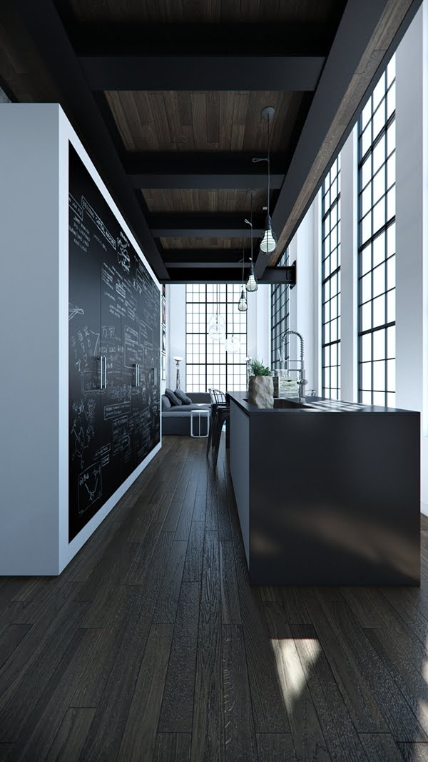
One of the top trends in kitchen design ideas this year is incorporating black into the plans. What formerly would have been viewed as too dark or gloomy has been proven to be a striking way to set your kitchen apart from the rest of your home. In this kitchen, the steely grey of the flooring mirrors the framed ceiling above. The black lines of the ceiling beams match the minimalist counter, which is set against awe inspiring, ceiling high windows. Chalkboard surface across all the tall cabinet doors allows for a personal touch, and the white of the chalk musings ties in with the white of the walls and cabinet itself.
46. Work With the Furniture
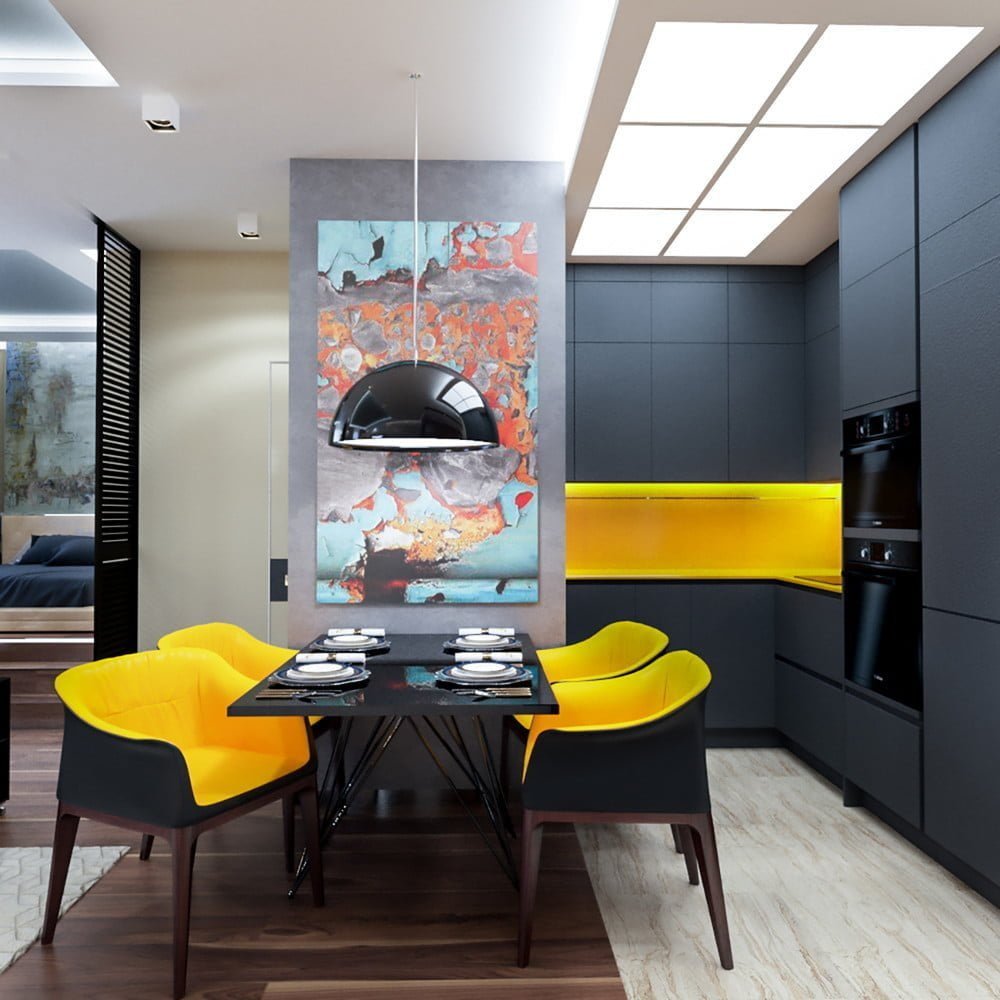
This dashingly handsome kitchen appears to have worked with the planning process in reverse. The intriguing chairs with the dandelion yellow are the focal point of the room. The kitchen structure itself features this same motif – deep grey outer form revealing a vibrant yellow inlay. Maybe you found the perfect set of chairs but aren’t sure how to incorporate them into a design plan. This is an excellent example that sometimes one piece can sprout the idea for the remainder of the room. That’s not all this room has to offer, however. The wall art featuring reds and blues, with rippling lines and flowing forms serves as a foil to the otherwise strict lines of this kitchen. Don’t turn away a piece of wall art that appeals to you simply because it won’t perfectly match – sometimes the difference is exactly what a room needs.
47. Historic Style with Modern Grace
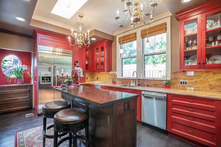
The kitchen in this historic Victorian home combines the graceful details of the century past with modern conveniences. The chandelier style lighting is unobtrusive and elegant, and the bar stools clothed in leather and gold details are reminiscent of distinguished libraries and studies. The limited space of old fashioned kitchens has been brilliantly utilized, with a fridge placed flush within a wall and golden stone counters are lining all available space. The real impact of this kitchen is the lovely dark coral shade that has been used to paint all of the cabinets. It has uplifted this kitchen into a more modern feel, while still maintaining the timeless appeal of the original structure.
48. Spirals Garnish this Glamorous Space
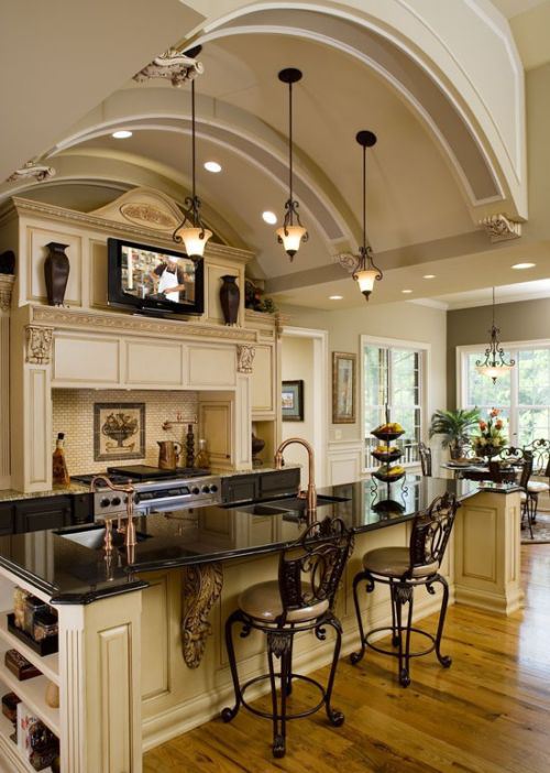
This kitchen is an absolute dream, with ornate details and spiral designs throughout. The rich combination of light mocha with chocolate brown provides a calmer contrast than that of white and black, while the copper hardware matches throughout. Placing seating directly facing the stove allows for maximum socialization while you cook meals and prepare drinks for your guests. The TV placed above the cooking area will allow your family to enjoy entertainment while dinner is in its’ final stages, or will let you listen along to your favorite cooking show. The dramatic arch shape of the ceiling brings attention the the kitchen directly and helps to spotlight this intricately decorated space within a much larger open area.
49. French Country Kitchen Design
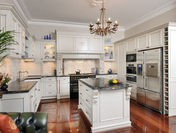
Bring in the stylings of a classing French country kitchen with the modern conveniences for a luxurious look and effortless function. A gilded chandelier centered in the room balances the glowing wooden tones of the flooring. A wine rack transforms the end of the cabinetry and frames the refrigerator with a delightful touch. Dramatic moulding kept in the same white finish is an easy way to add excitement to your kitchen without drawing the eyes away from the overall country chic effects. Thinking of including a square tile back splash? Notice how the orientation of the tile alternates between the main kitchen and the panel above the stove. This kitchen provides multiple small details that combine for a pleasing result.
50. Prim pastels
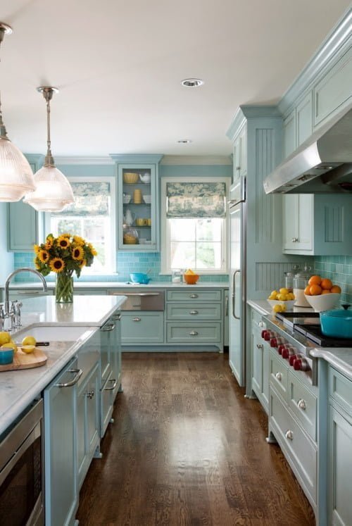
With such a large, wonderful space to work with, like in this kitchen, it’s important to find a style that won’t overwhelm the viewer. The graceful robin’s egg blue that was selected for this kitchen is easy to accessorize and beautiful to behold. When working with a space this large, remember to keep your kitchen functional. This room may be spacious, but the important accessories – refrigerator, stove, sink – are kept within a reasonable reaching distance of one another. This allows the lovely granite counters in other areas to stay open for display of a bouquet of fresh flowers or simply to frame the fresh tile border. A glass pane cabinet door allows display of complimenting dishware and footed cabinetry throughout add whimsical appeal.

